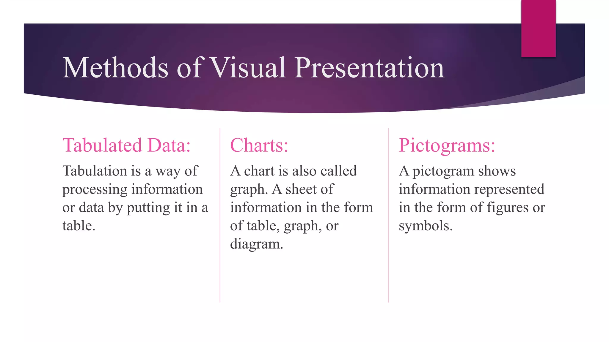
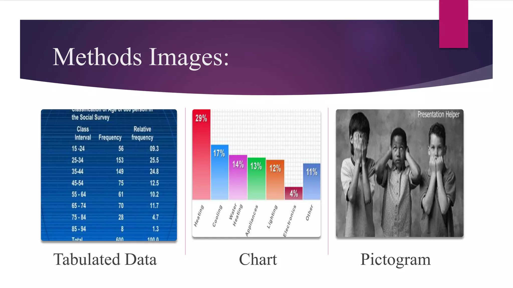
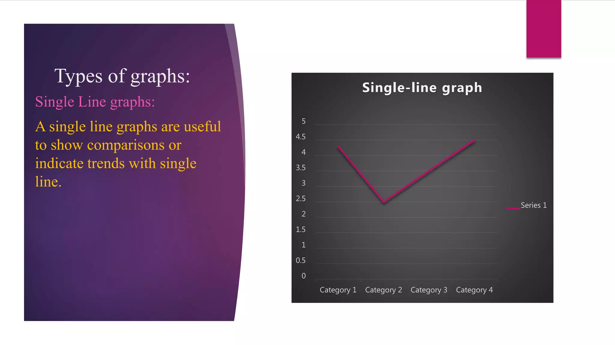
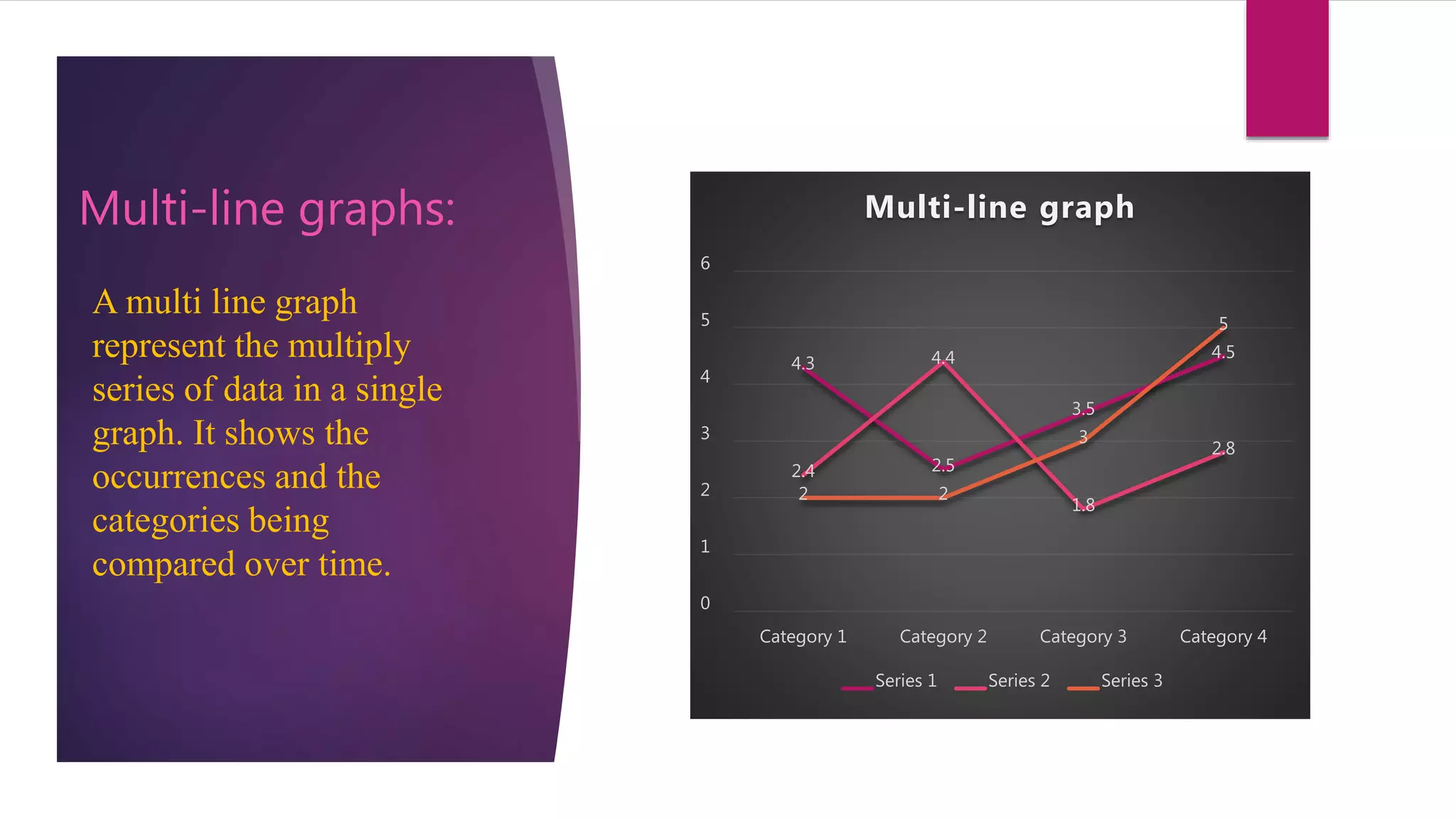
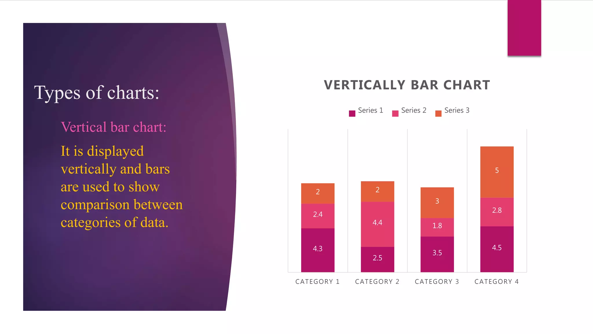
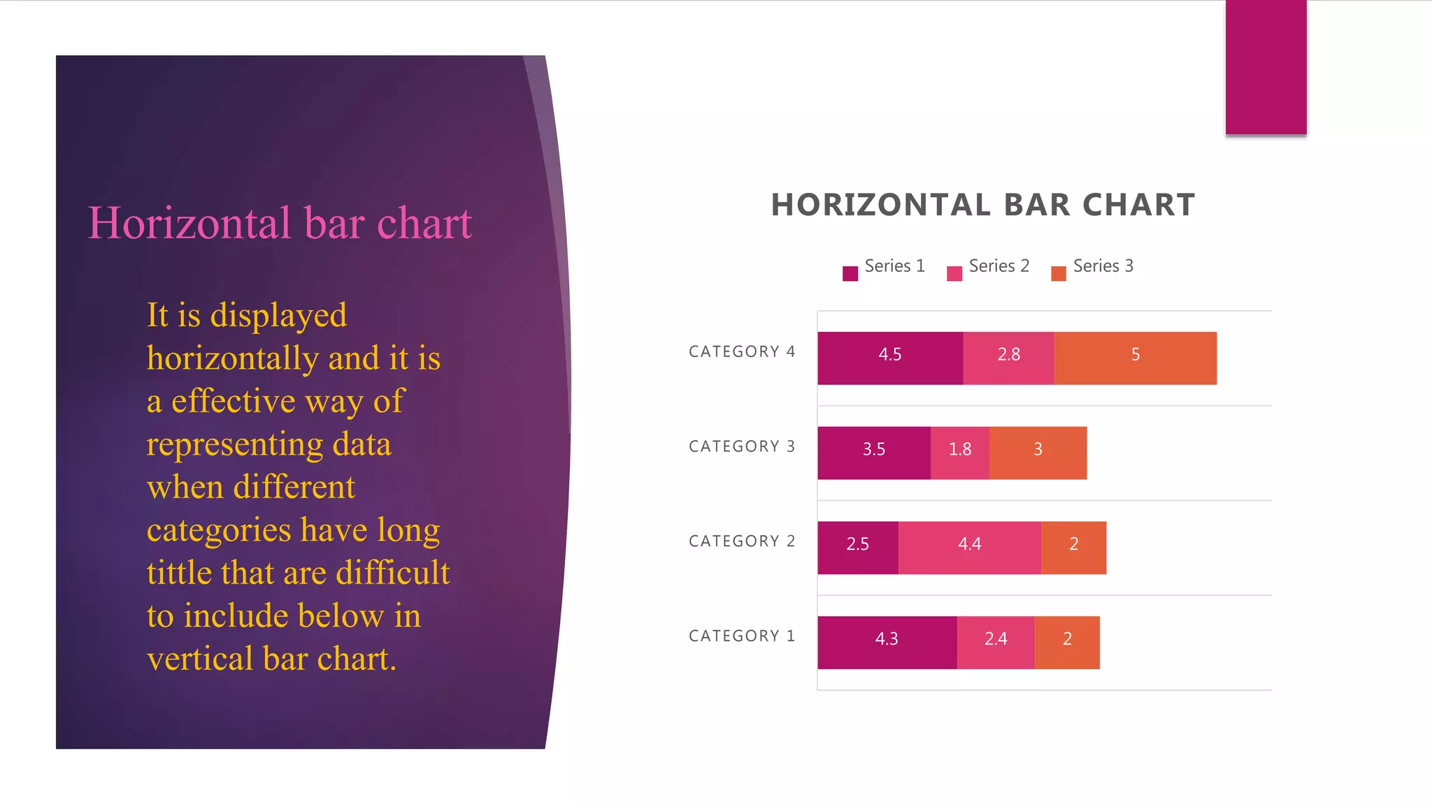
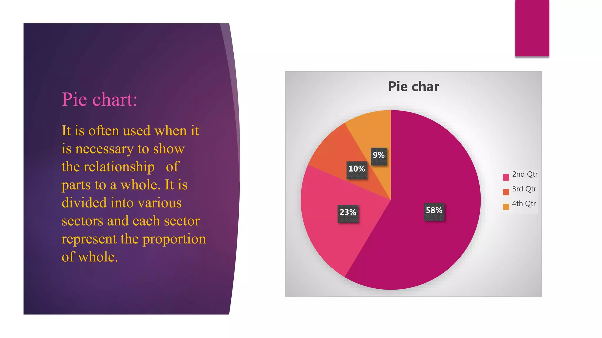
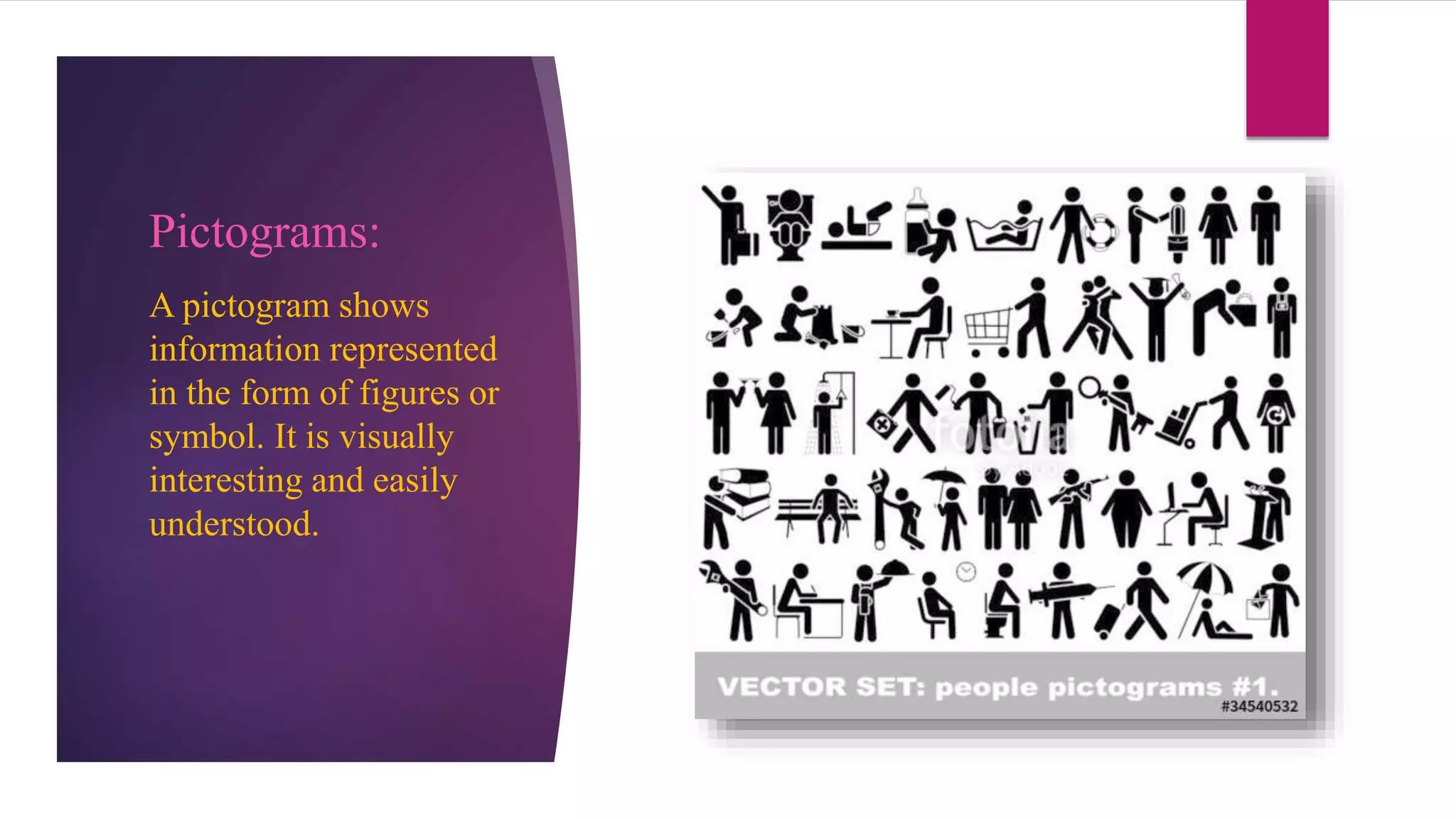
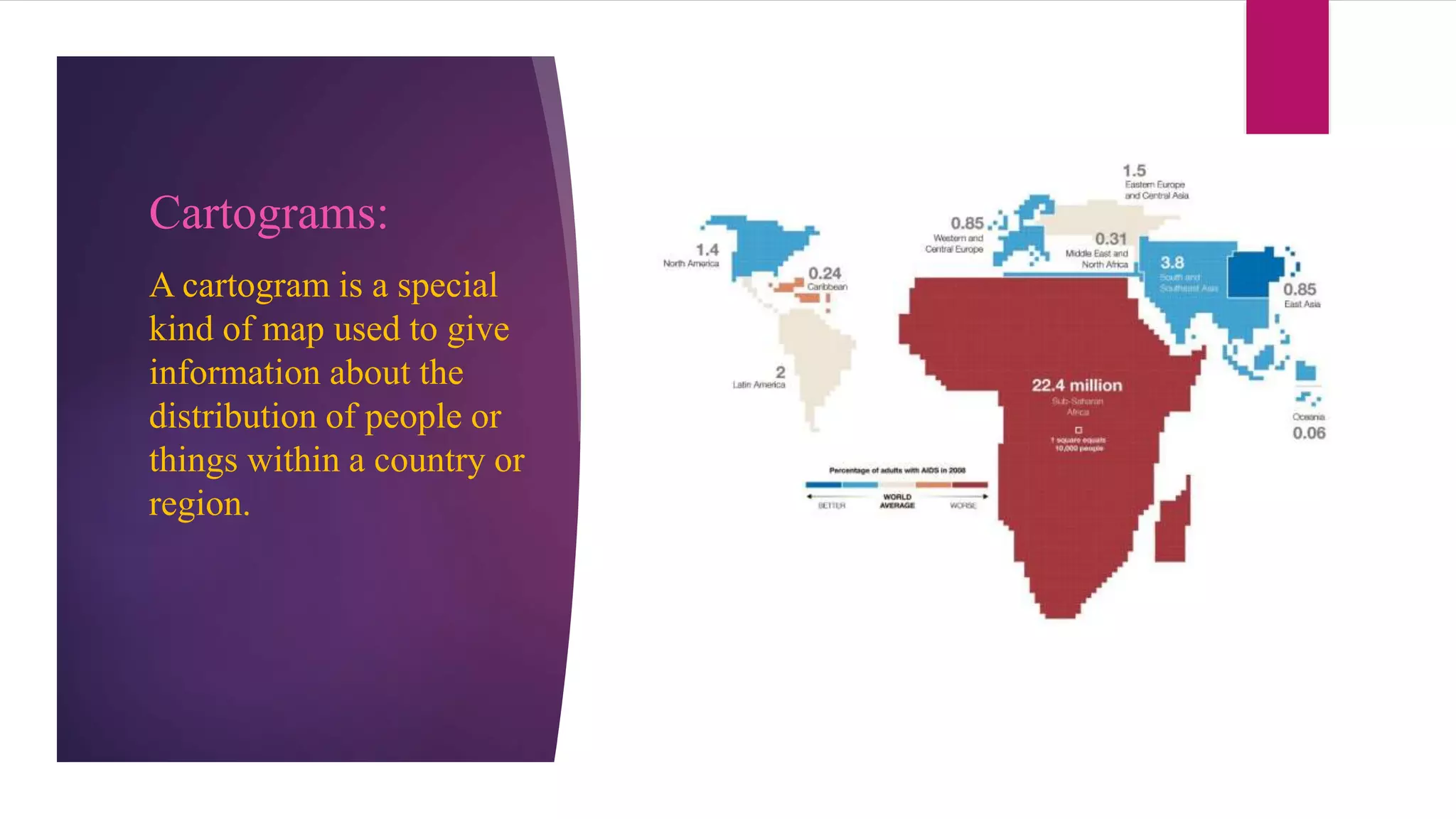
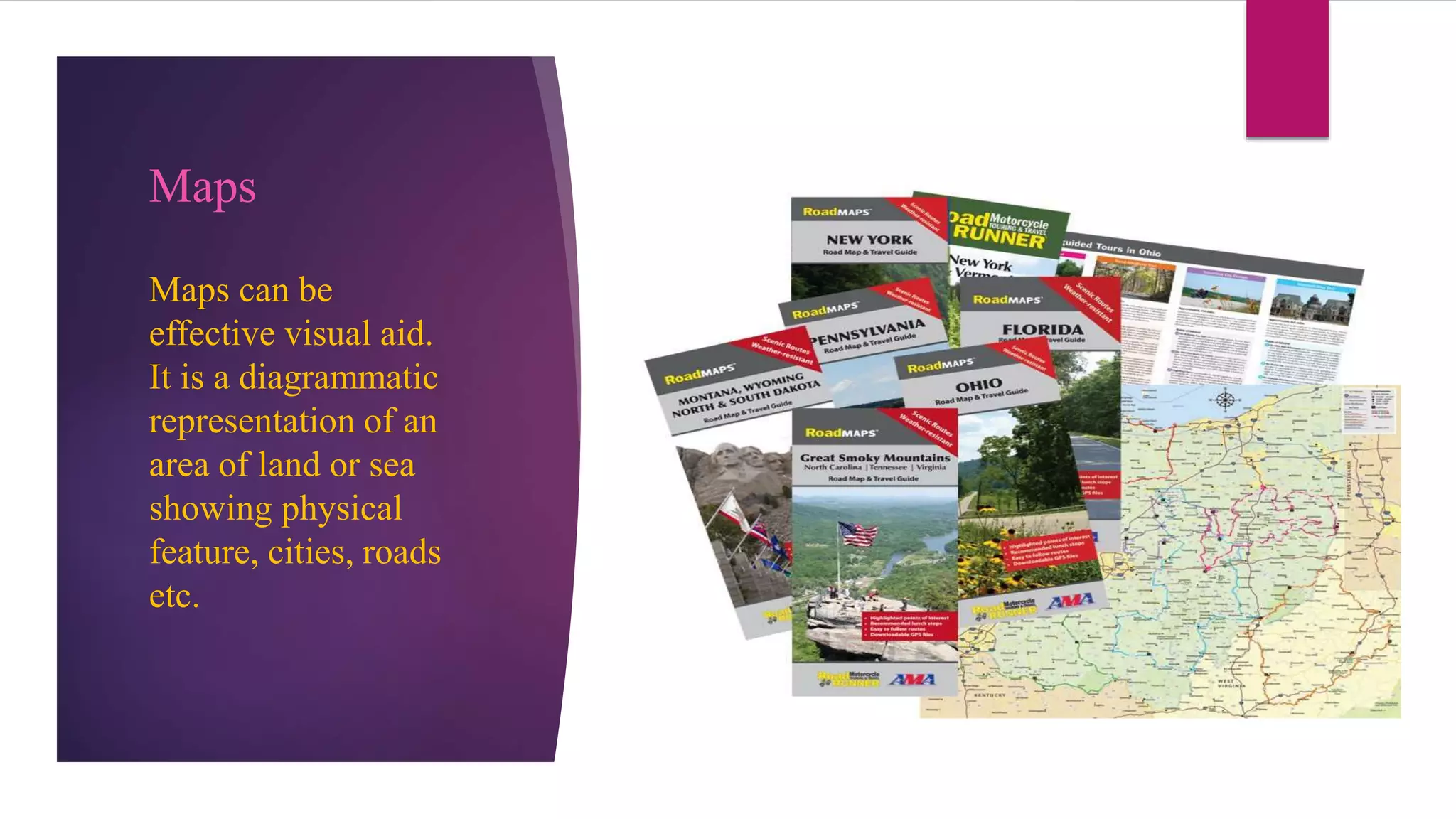
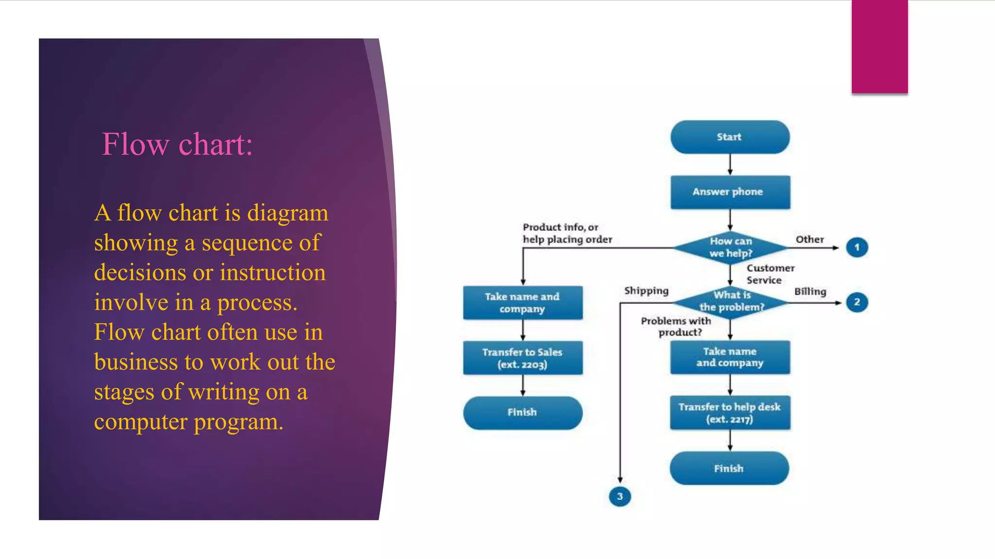
2. Contents
The appeal of visual presentation.
Methods of Presentation.
Tabulated data and charts.
Graphs and diagrams.
3. Definition:
Visual presentation is the expression of ideas about some matter using
visual aids i.e. direct orientation using visual multimedia. Visual
communication is everywhere today, from electronic media like Web
pages and television screens to environmental contexts such as road
signs and retail displays.
4. Appeal for Visual Presentation
Some points which make visual presentation appealing and effective
are as follows:
Visual interpretation of information.
Maximizing the presentation effectiveness.
Purely visual material.
Visual treatment of everything.
5. Methods of Visual Presentation
Tabulated Data:
Tabulation is a way of
processing information
or data by putting it in a
table.
Charts:
A chart is also called
graph. A sheet of
information in the form
of table, graph, or
diagram.
Pictograms:
A pictogram shows
information represented
in the form of figures or
symbols.
8. Multi-line graphs:
A multi line graph
represent the multiply
series of data in a single
graph. It shows the
occurrences and the
categories being
compared over time.
4.3
2.5
3.5
4.5
2.4
4.4
1.8
2.8
2 2
3
5
0
1
2
3
4
5
6
Category 1 Category 2 Category 3 Category 4
Multi-line graph
Series 1 Series 2 Series 3
9. Types of charts:
4.3
2.5
3.5
4.5
2.4
4.4 1.8
2.8
2 2
3
5
CATEGORY 1 CATEGORY 2 CATEGORY 3 CATEGORY 4
VERTICALLY BAR CHART
Series 1 Series 2 Series 3
Vertical bar chart:
It is displayed
vertically and bars
are used to show
comparison between
categories of data.
10. Horizontal bar chart
4.3
2.5
3.5
4.5
2.4
4.4
1.8
2.8
2
2
3
5
CATEGORY 1
CATEGORY 2
CATEGORY 3
CATEGORY 4
HORIZONTAL BAR CHART
Series 1 Series 2 Series 3
It is displayed
horizontally and it is
a effective way of
representing data
when different
categories have long
tittle that are difficult
to include below in
vertical bar chart.
11. Pie chart:
It is often used when it
is necessary to show
the relationship of
parts to a whole. It is
divided into various
sectors and each sector
represent the proportion
of whole.
58%23%
10%
9%
Pie char
2nd Qtr
3rd Qtr
4th Qtr
13. Cartograms:
A cartogram is a special
kind of map used to give
information about the
distribution of people or
things within a country or
region.
14. Maps
Maps can be
effective visual aid.
It is a diagrammatic
representation of an
area of land or sea
showing physical
feature, cities, roads
etc.
15. Flow chart:
A flow chart is diagram
showing a sequence of
decisions or instruction
involve in a process.
Flow chart often use in
business to work out the
stages of writing on a
computer program.