
Recommended
More Related Content
What's hot
What's hot (19)
Similar to City College Arts Magazine Contents Page
Similar to City College Arts Magazine Contents Page (20)
City College Arts Magazine Contents Page
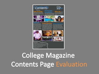
- 2. Colour Scheme Features The colour scheme of the The features are nicely contents page matches that of ordered and numbered and the front cover, which gives the the crossheads are bold and magazine consistency and noticeable. The text familiarity, which readers like. underneath the crossheads contain a little bit of information about each feature, without House Style overcrowding the page. The house style font again is the same as that of the front Imagery cover, maintaining a The images used in the familiarity, comforting the contents page are original reader, and giving the magazine images, all of them relate to an identity. The the features that they colours, grey, orange, blue and accompany, and the white can be associated with brightness/contrast levels City College Arts Magazine. as well as the hue/saturation have been Regulars upped, to make them stand The list of regulars works nicely, it’s out. been made smaller compared to the features for obvious Image Outline reasons, hopefully the reader would I used the pencil tool to draw around the find this list particularly useful if they images and to separate the regulars list in are a long-time follower of the the bottom left corner, I think it works nicely magazine. because it adds a sketchy, artistic feel to the design, which fits in with the target audience.
- 3. Magazine Title Although the title of the magazine is visible at top right of the contents page, I haven’t included the masthead from the White Space front cover, which should really In the bottom right hand side be in here. there’s a lot of white space that hasn’t been made much use of. I ran out of features to put in, and felt there was enough in my list of regulars, but could have maybe squeezed out one more just to fill the space. Footer/Banner I could have included a banner at the bottom, or some type of footer to display some advertisement, or just to neaten up the page and give it more of a structure.
- 4. There wasn’t much about making the contents page that I found particularly difficult. Having done the research and gathered my images I put it all together quite quickly. The most challenging thing, much like when making the front cover, was writing about each feature without going into to much detail, but I feel I managed to do that well enough.
- 5. The whole design process was quite easy, especially after having designed the front cover, all the colours, fonts etc were already decided, s all I had to do was gather my images from my camera, crop them, played around with colour levels and scape my layout. I tried to keep each feature a similar size, and overall I think everything fits quite nicely on the page.
- 6. I learnt a lot designing the contents page, mostly about the common features, terminology, how to lay things out on the page, what sort of information to convey and how to involve more text in a design situation. I also learnt what sort of features are commonly used as a regulars, as well as ones that are used as special features (one offs.)
- 7. I could have included an If I had the time, I would have issue number and date my magazine name, as well as in the top right hand the masthead, intricately corner, just to add design and isolated at the top consistency to the of the page. magazine. I would make certain features, for example the debut EP feature I would maybe use a bigger than other background image features on the page so instead of a plain grey that the reader knows background to make the what the main story is. page that little bit more interesting. I would have included advertisement at the bottom of the page, to make it look more professional and realistic.
- 8. My magazine contents page could be compared to GS magazine. The background colour is similar to mine, and images have been framed in an order, with page numbers displayed on top of the images. The text is in list form, much like my regulars section, and the magazine title features in the top left of the page as well.