George Michael is featured prominently in the magazine to discuss his experience as a famous homosexual musician who faced criticism for his sexuality. The use of the color pink and portrayal of Michael emphasizes that it is acceptable for men to be associated with stereotypically feminine attributes. Featuring Michael also promotes the magazine's stance of supporting people of all sexual orientations.
Pari Chowk Call Girls ☎️ ((#9711106444)), 💘 Full enjoy Low rate girl💘 Genuine...
Media analysis big issue
1. Why George Michael?
George Michael was a worldwide singer songwriter
known for his millions of albums sold. George
unfortunately struggled with some criticism throughout
his career as he declared to the public he was
homosexual, which could be the main reason in why he
is presented in this particular ‘Big Issue’ magazine.
George in some ways represents all homosexual men
emphasing to the audience that no matter how famous
or well liked you are, you will still receive criticism as
many people believe it is ‘wrong’ however this
magazine tackles this issue and shows the audience
that it should be accepted. George Michael will also be
a huge selling point for this magazine as he is a well
known public figure and many people will be interested
in his story. The positioning of George Michael clearly
entices the reader as he’s almost ‘dragging’ them into
his experiences, but at the same time promoting a
‘proud’ ‘supported’ stance.
The use of the colour pink clearly connotes ‘sweetness’ and
‘flowers’, something that a female would be associated with is
used for a significant reason. This colour obviously relates to
George as being ‘feminine’ as pink is stereotypically a females
colour, and he carried around this reputation for many years
just for deciding to be homosexual. This magazine portrays that
people criticise in every way possible, and this magazine tries
to change peoples opinion that it is okay for male’s to be
associated with ‘females’ colours. The use of the colour pink
would also interest the reader as they would be curious of how
he dealt with such issues, for example being associated as
feminine, as this magazine represents him almost as the main
image of a females magazine. The Big Issue is very well known
to standing up and dealing with many issues and once again
this magazine represents them doing that by using a famous
icon in the music industry.
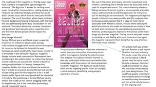
The masthead of this magazine is ‘The Big Issue’ logo
itself, is clearly a recognisable logo amongst the
audience. ‘The Big Issue’ is known for tackling many
issues faced within the population, making people very
intrigued by celebrities lifestyles and how they dealt
with a certain issue, which leads to many sales for the
magazine. The use of the colour white clearly contrasts
the pink background helping it stand out, with the bold
text also contributing to the easy visualisation for the
audience. The colour white also connotes ‘innocence’
and ‘goodness’ portraying he was a respectful artist
and therefore believe people should respect his
decisions.
The pull quote underneath allows the audience to
notice there are many other interesting stories
within the magazine, helping the sales increase.
This will give the audience another interest as
they can understand other events and widen their
knowledge with these variety of stories presented
inside the magazine. The Big Issue would include
other stories targeting specific issues as it targets
a niche audience, benefitting many people’s
awareness of issues.
This article itself was written
by Mark Ronson, a well known
DJ within the music industry.
This could create the article to
be representative as Mark
almost lived the same ‘music’
lifestyle as George, therefore
could demonstrate his ideas
and the stress artists receive
just from being famous. This
could help people understand
the increased pressure George
received for being homosexual
and this article clearly focuses
on this ongoing issue.