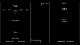
3. Image
(Setting)
Title
Tagline
Release date Netflix Logo
Teaser Poster
Name
Surname
Name
Surname
Name
Surname
(Protagonist)
Name
Surname
Name
Surname
Release date
Billing block
Netflix Logo
Main Image
Tagline
Title
Theatrical Poster
7. Mind Map
Poster Teaser
Theatrical
Quad
Colour pallet:
Red, Black, White, Grey
Colour pallet:
Red, Black, White, Grey
Colour pallet:
Red, Black, White, Grey
Images:
Full body picture
of Protagonists
Close up of
Antagonists
head looking
down slightly –
visuals blocked
by shadow
Long shot of
setting (Arcade)
looking dirtier
Images:
Long shot of
setting (Arcade)
Images:
Full body picture of Protagonists or side profile picture looking towards
center of poster
Close up of Antagonists head looking down slightly or side profile
looking towards center of poster – visuals blocked by shadow
Long shot of setting (Arcade) looking dirtier
8. Colour Board
Colour Palettes:
Red, Black, Greys, White – Show horror genre and fit common horror features and ideas
Neon – Yellow, Orange, Purple, Blue – Show time period and common ideas within my film
Adjectives:
Dark, cold, gloomy, danger, fear, death,
In your face, appealing, luminescent, happy,
I will be using the darker pallet consisting of red, black and grey as they are common colours used in horror and they will help show
genre, and these colours can help create the off-putting and frightening mood I intend to have through all my posters.
I will use the lighter colour pallet to help show time period as these colours are very common in things within the 1980s like arcades
and clothes.
9. Font Board For my billing block I will be using
universal accreditation from DaFont
as it looks very similar to the font
that professional posters use for it.
The Horror Retrowave font and
Another Danger font look very close
to what I want to use for the titles as
it is bold and easy enough to read
and have sharper edges which
would work well to show genre.
The Wolfs Bane font if less bold
would work for the sort of font I
want for the star names on the
theatrical and quad posters and the
release date on all 3 posters as once
again it has sharper edges which will
help show genre and will stand out
because of the difference in look
and style.