2. Using Color in Design
Colors are the native language
of the subconscious.
–Carl Jung, Psychiatrist“
”
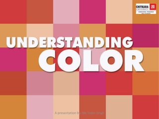
Understanding the principles of color theory
and its use in graphic design.
A presentation by: Mr. Inder Singh
3. Color is based on light
Color perception based on the two components: wavelength and luminosity
Color of light is determined by wavelength and how it hits a surface
http://www.skidmore.edu/~hfoley/images/spectrum.jpg
Using Color in Design
How We Perceive Color
A presentation by: Mr. Inder Singh
4. Color can exist beyond the spectrum visible to humans:
ultraviolet and infrared light are examples
http://science.nasa.gov/newhome/headlines/images/eta_car_pix/0099_infrared_lg.jpg
Using Color in Design
How We Perceive Color
A presentation by: Mr. Inder Singh
5. Hue: Any single color in the spectrum (red, yellow, blue, etc).
Using Color in Design
Terminology
A presentation by: Mr. Inder Singh
6. Value: The relative lightness or darkness of a color.
Using Color in Design
Terminology
A presentation by: Mr. Inder Singh
7. Tint: A color with whiteadded.
Shade: A color with blackadded.
Using Color in Design
Terminology
A presentation by: Mr. Inder Singh
8. Saturation: The relative intensity or brightness of a color
Bright, vibrant colors (reds or oranges) have a saturation
dull or muted colors (browns) have a low degree of saturation
Using Color in Design
Terminology
A presentation by: Mr. Inder Singh
9. Using Color in Design
Terminology
Saturation: The relative intensity or brightness of a color
Bright, vibrant colors (reds or oranges) have a saturation
dull or muted colors (browns) have a low degree of saturation
A presentation by: Mr. Inder Singh
10. Colors can be of the same hue and still have varying degrees of saturation
Using Color in Design
Terminology
A presentation by: Mr. Inder Singh
11. Warm colors
• The warm colors are red, orange,
yellow, and anything in between.
They are called warm because they remind you
of the sun or fire.
Warm colors seem to come out at you in
space.
A presentation by: Mr. Inder Singh
12. Cool colors
•The Cool colors are blue, green,
purple and anything in between.
•They are called cool because they
remind you of the earth or a cool creek.
•Cool colors seem to recede from you in space.
A presentation by: Mr. Inder Singh
13. Neutral colors
Neutrals don't usually showup on the color wheel. Neutrals include
black, white, gray, and sometimesbrown and beige. They are
sometimescalled “earth tones.”
There are a few different ways to make neutrals. You can blend black
and white to make gray. You can create brown in two ways—by
blending two complementary colorstogether or by blending all three
primary colorstogether.
A presentation by: Mr. Inder Singh
15. Primary Colors: Red, yellow and blue; the hues that form color wheel base
Secondary Colors: Green, orange and violet; hues that are mixed
by combining two primary colors.
Tertiary Colors: Colors created by mixing a secondary color and a primary
color. Examples are blue green, red orange, red violet, etc.
Color Design
Color Schemes
A presentation by: Mr. Inder Singh
16. Monochromatic: Composition using tints and shades of only one hue.
Easiest scheme to balance visually, but lacks high impact of other more
contrasting and complicated schemes.
Color schemes
Related
A presentation by: Mr. Inder Singh
17. Analogous Colors: These are based on hues that lie next to each other
on the color wheel. This scheme can have minimum of two colors and
maximum of three.
Using analogous colors in a design creates unity and harmony
Color Schemes
Related
A presentation by: Mr. Inder Singh
18. Double analogous Colors: Any four adjacent hues on the color wheel
make up a double analogous color scheme.
Color Schemes
Related
A presentation by: Mr. Inder Singh
19. Complementary Colors: Colors that are opposites on the color wheel that,
when combined, neutralize one another. Scheme provides strong visual
contrast and demands attention. For best use, de-saturate the cool colors
rather than the warm ones.
Color Schemes
Contrasting
A presentation by: Mr. Inder Singh
20. Double complementary Colors: Two adjacent colors and their
complements used together form a double complementary color scheme.
Color Schemes
Contrasting
A presentation by: Mr. Inder Singh
21. Tetradic (Double Complementary): This is the richest of all the schemes;
utilizes four colors arranged into two complementary color pairs
Can be hard to harmonize; if all four colors are used in equal amounts, this
scheme risks looking unbalanced and chaotic, so choose one color to be dominant
Color Schemes
Contrasting
A presentation by: Mr. Inder Singh
22. Split Complementary: Color scheme using a hue and the two colors that lay on
either side of its compliment on the color wheel
Provides more visual variety than complementary scheme; strong contrast
Harder to balance than monochromatic, analogous color schemes
For best results, use one warm color with a range of cool colors or vice versa
and avoid de-saturated warm colors
Color Schemes
Contrasting
A presentation by: Mr. Inder Singh
23. Triadic: Color scheme uses three colors equally spaced around the color wheel.
Provides strong visual contrast while adding balance and richness.
For best use, choose one color to be used in larger amounts than others;
experiment with color saturation and value
Color Schemes
Contrasting
A presentation by: Mr. Inder Singh
24. Accented neutral color scheme: This type of scheme in which most of the
areas of the room are in expanses of neutral colors, with small and bright color
used for accent.
Color Schemes
Contrasting
A presentation by: Mr. Inder Singh
25. Simultaneous Contrast: The concept of color perception based on
the other colors surrounding it.
Color can look completely different when set against different hues,
and is perceived in relation to its surroundings.
Color Design
Simultaneous Contrast
A presentation by: Mr. Inder Singh
26. Advancing/ Receding Color: Warm and bright colors give
the illusion of being closer to a viewer within a composition,
while cool and dull colors appear to be further away.
Color Design
Advancing and Receding Color
A presentation by: Mr. Inder Singh
27. Color Design
Advancing and Receding Color
Advancing/ Receding Color: Warm and bright colors give
the illusion of being closer to a viewer within a composition,
while cool and dull colors appear to be further away.
A presentation by: Mr. Inder Singh
28. Vibration: Complementary colors of equal saturation and brightness
compete with our eye for attention when seen in close proximity to
one another.
Color Design
Vibration
A presentation by: Mr. Inder Singh
29. Weight: Colors differ in visual weight based on their hue and intensity.
For example, red is considered a “heavy”color, and would demand
a viewerʼs attention, even if shown in only a small amount within a
composition.
Color Design
Weight
A presentation by: Mr. Inder Singh
30. Weight: Colors differ in visual weight based on their hue and intensity.
For example, red is considered a “heavy”color, and would demand
a viewerʼs attention, even if shown in only a small amount within a
composition.
Color Design
Weight
A presentation by: Mr. Inder Singh