
Recommended
More Related Content
What's hot
What's hot (18)
Similar to Whitney Houston Digipack
Similar to Whitney Houston Digipack (20)
More from Holly Payne
More from Holly Payne (16)
Recently uploaded
Recently uploaded (20)
Whitney Houston Digipack
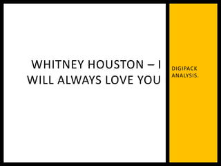
- 1. DIGIPACK ANALYSIS. WHITNEY HOUSTON – I WILL ALWAYS LOVE YOU
- 2. This cover presents Whitney as somewhat angelic, using lights behind her and arms outstretched as to demonstrate the ‘best of’ her. The title ‘I will always love you’ draws in the audiences who recognise this title from her chart topper from 1992. The text is in a sans-serif font, looking particularly structured and official, perhaps suggesting that this is an incredibly important and official CD. FRONT COVER
- 3. The contrast of bright lights against the black background attracts the audience instantly, as well as the sequins on Houston's dress reflecting further light. The gold writing creates the idea that this is a honour and achievement, making Whitney seem very accomplished. The star persona is very important on this front cover, suggesting that Houston isn’t as easily recognisable as she used to be/people know her name rather than what she looks like etc. FRONT COVER
- 4. The gold is again featured on this page just as on the front cover however the back cover is on a ombre background rather than a black creating a somewhat disjointed CD cover. This has an interesting way of showing the track titles however, carrying on the same font. All the titles are rooted on the middle of the page, creating a more intriguing cover however it may not be easier to read. BACK COVER
- 5. The colour scheme isn’t overly interesting however. The mixture of black and gold, whilst classic doesn’t really catch an eye, especially the title upon the background in some parts gets somewhat lost. The record label, album producer, credits and barcode etc. are all present, which is a common convention through all album covers. Usually, pop covers are incredibly eye-catching, however this convention isn’t notable in this cover. BACK COVER