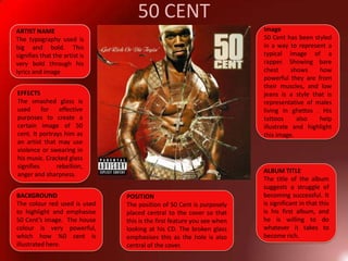
CD COVER DESIGNS
Florence + the machinePOSITION OF ARTISTThe framed position of Florence jumping in the air symbolises the essence of freedom, which is how she wants her audience and viewers to listen and perceive to her music.BACKGROUNDThe background has been edited to a neutral colour to highlight and compliment Florence and the colour of her outfit, which  gives a vintage appeal.BAND NAMEThe band’s stylised font is similar to a handwriting style. The purpose  of this is intently to provide her audience with a presumed idea of what genre of music she sits in.  ALBUM TITLEThe type of font used here is contradictory to that used of their branded name. IMAGEThe costume design for Florence has been purposely suited to the type artist she is and the style of her music. She has been styled to stand out from other current, contemporary artists to emphasise her own individuality. This corresponds with her iconography , which is how she is shaped and formed to match her target audience. For example, the clothing that Florence is dressed in, portrays a modernised, antiquated dress sense.
Alicia KeysALBUM TITLE/ARTIST NAMEThe typography used is sophisticated, which reflects Alicia’s musical ability of  playing the piano as well as her vocals. BACKGROUNDThe Background to the front cover is a wooden wall which reflects the wooden keyboard. As wood is a natural material, you could say that Alicia’s record company are trying to portray her as an all natural singer. It sets a calm and relaxing mood, which is may be how her music should be perceived. POSITION OF ARTISTHaving the front cover divided by herself and a keyboard is very effective. You could say that the image of the keyboard signifies Alicia due to her second name ‘Keys’. It also conveys to the audience the genre and style of music that the artist is based around.IMAGEAlicia’s image has been designed in a way to attract a wide audience. It portrays her as an ordinary woman as what she is wearing is an average look for women of her age.
50 CENTImage50 Cent has been styled in a way to represent a typical image of a rapper. Showing bare chest shows how powerful they are from their muscles, and low jeans is a style that is representative of males living in ghettos . His tattoos also help illustrate and highlight this image.ARTIST NAMEThe typography used is big and bold. This signifies that the artist is very bold through his lyrics and image EFFECTSThe smashed glass is used for effective purposes to create a certain image of 50 cent. It portrays him as an artist that may use violence or swearing in his music. Cracked glass signifies rebellion, anger and sharpness.ALBUM TITLEThe title of the album suggests a struggle of becoming successful. It is significant in that this is his first album, and he is willing to do whatever it takes to become rich. BACKGROUNDThe colour red used is used to highlight and emphasise 50 Cent’s image.  The house colour is very powerful, which how %0 cent is illustrated here.POSITIONThe position of 50 Cent is purposely placed central to the cover so that this is the first feature you see when looking at his CD. The broken glass emphasises this as the hole is also central of the cover.
Blink 182ALBUM TITLEThe typography here , represents a hand-written style. It makes the message ‘I Miss You’ more personal and realistic, as it appears to be written by the band themselves.BAND NAMEThe typography here , represents fonts that are typically used in tattoos. From this, we can gain an idea of the band’s genre of music, as tattoos are also associated with rockers.IMAGEThe image of the heart with kisses inside reflects and corresponds to the title of the album. It emphasises the message ‘I Miss You’, as a heart and kisses represent what you are missing.BACKGROUNDThe house colour black illustrates the content of the band’s songs. Black signifies deep emotion and subjects such as sadness, coldness, death and anger.
Christina Aguilera IMAGEThe artist has been stylised in a way that she attracts her audience through her appearance.  Her red lipstick and bright blonde hair is a stereotypical of a beautiful woman.BACKGROUNDThe background used is a pale colour in order to emphasise the artist’s looks.  ARTIST NAMEThe type of font used here is basic, which gives a simple look.  The artist’s name has been put in two different colours, black and white to show thatthe content of the her songs involve subjects that are contradictory to each other, such as happy and sad.POSITIONA Close-up of the artist is a convention used in the pop genre to sell the artist for her looks and appearance.
What I have foundFrom studying these 5 music CD covers, from different genres of music, I have acknowledged that  they have all been designed in a specific way to attract their target audience. The style of imagery, typography and house colours used, can represent the genre and content of the artist’s music.

CD Cover Designs

  • 1.
  • 2.
    Florence + themachinePOSITION OF ARTISTThe framed position of Florence jumping in the air symbolises the essence of freedom, which is how she wants her audience and viewers to listen and perceive to her music.BACKGROUNDThe background has been edited to a neutral colour to highlight and compliment Florence and the colour of her outfit, which gives a vintage appeal.BAND NAMEThe band’s stylised font is similar to a handwriting style. The purpose of this is intently to provide her audience with a presumed idea of what genre of music she sits in. ALBUM TITLEThe type of font used here is contradictory to that used of their branded name. IMAGEThe costume design for Florence has been purposely suited to the type artist she is and the style of her music. She has been styled to stand out from other current, contemporary artists to emphasise her own individuality. This corresponds with her iconography , which is how she is shaped and formed to match her target audience. For example, the clothing that Florence is dressed in, portrays a modernised, antiquated dress sense.
  • 3.
    Alicia KeysALBUM TITLE/ARTISTNAMEThe typography used is sophisticated, which reflects Alicia’s musical ability of playing the piano as well as her vocals. BACKGROUNDThe Background to the front cover is a wooden wall which reflects the wooden keyboard. As wood is a natural material, you could say that Alicia’s record company are trying to portray her as an all natural singer. It sets a calm and relaxing mood, which is may be how her music should be perceived. POSITION OF ARTISTHaving the front cover divided by herself and a keyboard is very effective. You could say that the image of the keyboard signifies Alicia due to her second name ‘Keys’. It also conveys to the audience the genre and style of music that the artist is based around.IMAGEAlicia’s image has been designed in a way to attract a wide audience. It portrays her as an ordinary woman as what she is wearing is an average look for women of her age.
  • 4.
    50 CENTImage50 Centhas been styled in a way to represent a typical image of a rapper. Showing bare chest shows how powerful they are from their muscles, and low jeans is a style that is representative of males living in ghettos . His tattoos also help illustrate and highlight this image.ARTIST NAMEThe typography used is big and bold. This signifies that the artist is very bold through his lyrics and image EFFECTSThe smashed glass is used for effective purposes to create a certain image of 50 cent. It portrays him as an artist that may use violence or swearing in his music. Cracked glass signifies rebellion, anger and sharpness.ALBUM TITLEThe title of the album suggests a struggle of becoming successful. It is significant in that this is his first album, and he is willing to do whatever it takes to become rich. BACKGROUNDThe colour red used is used to highlight and emphasise 50 Cent’s image. The house colour is very powerful, which how %0 cent is illustrated here.POSITIONThe position of 50 Cent is purposely placed central to the cover so that this is the first feature you see when looking at his CD. The broken glass emphasises this as the hole is also central of the cover.
  • 5.
    Blink 182ALBUM TITLEThetypography here , represents a hand-written style. It makes the message ‘I Miss You’ more personal and realistic, as it appears to be written by the band themselves.BAND NAMEThe typography here , represents fonts that are typically used in tattoos. From this, we can gain an idea of the band’s genre of music, as tattoos are also associated with rockers.IMAGEThe image of the heart with kisses inside reflects and corresponds to the title of the album. It emphasises the message ‘I Miss You’, as a heart and kisses represent what you are missing.BACKGROUNDThe house colour black illustrates the content of the band’s songs. Black signifies deep emotion and subjects such as sadness, coldness, death and anger.
  • 6.
    Christina Aguilera IMAGETheartist has been stylised in a way that she attracts her audience through her appearance. Her red lipstick and bright blonde hair is a stereotypical of a beautiful woman.BACKGROUNDThe background used is a pale colour in order to emphasise the artist’s looks. ARTIST NAMEThe type of font used here is basic, which gives a simple look. The artist’s name has been put in two different colours, black and white to show thatthe content of the her songs involve subjects that are contradictory to each other, such as happy and sad.POSITIONA Close-up of the artist is a convention used in the pop genre to sell the artist for her looks and appearance.
  • 7.
    What I havefoundFrom studying these 5 music CD covers, from different genres of music, I have acknowledged that they have all been designed in a specific way to attract their target audience. The style of imagery, typography and house colours used, can represent the genre and content of the artist’s music.