Lana Del Rey Print Ad Analysis: Medium Shot, Serif Fonts, Light Colors
•Download as PPTX, PDF•
0 likes•92 views

This print advertisement for Lana Del Rey's album uses a medium shot image of the artist looking directly at the camera to create a connection with audiences. The vintage-style image and simple fonts in blue and white distinguish the ad as indie. Lana's serious facial expression also positions her as indie rather than pop. The largest and boldest font is used for the artist's name at the top to indicate importance, while smaller fonts list the album name, release date, songs, and website in the center of the ad below the image.

Recommended
More Related Content
What's hot
What's hot (19)
Viewers also liked
Viewers also liked (15)
Similar to Lana Del Rey Print Ad Analysis: Medium Shot, Serif Fonts, Light Colors
Similar to Lana Del Rey Print Ad Analysis: Medium Shot, Serif Fonts, Light Colors (20)
Recently uploaded
Recently uploaded (20)
Lana Del Rey Print Ad Analysis: Medium Shot, Serif Fonts, Light Colors
- 1. Analysis of a print advert-Lana Del Rey
- 2. Lana Del Rey-Print advert
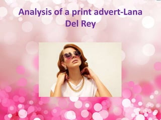
- 3. Image The image used is a medium shot of the artist which allows the audience to focus on Lana as she takes up most of the print advert. A medium shot allows for her top to be shown so therefore it avoids text being placed over her face which would occur if the image had been a close up and her white top allows the blue font to stand out to the audience. The artist is looking directly into the camera allowing the audience to feel a connection with her. Lana’s facial expression appears to be serious which therefore distinguishes between the pop and indie genre as if it was a pop advert the facial expressions are likely to be more fun as stereotypically the younger generation are more into pop therefore showing the targeted age range for Lana. There appears to be an almost vintage effect on the image which connotes the indie genre as from looking at digipaks and indie music videos such as Florence and the Machine ‘Dog days are over’ there is a vintage feel to them.
- 4. Fonts The font used for the artists name is a bold sans serif font. It is the largest font on the print advert to connote importance of the artist. The font is very simplistic which therefore connotes the indie genre. The font for the album name appears in a much smaller font than the artists name which therefore attracts the audience to the artists name rather then the album name itself. However the font is the same as the one used for the artists name. The font colours switch for the artists name and the album name which I think looks professional. The blue sky goes contains white font and the white blouse contains blue font which I think looks good. The fonts used for the smaller text which says the album release date and the songs it includes are in serif fonts being ‘swirly’ fonts. The sizing of fonts connotes the importance of the text. The choice of fonts are again simplistic. The font used for the website which is placed at the bottom of the advert is similar to the font used for the artists name and album name however it isn’t as bold. There appears to be 4 different fonts on the print advert which is the same for digipaks.
- 5. Colours The colours used on the print advert contain light colours. From the digipaks I looked at they contained black and white font however this print advert contains the colour blue however it isn’t a bold blue it is fairly light so therefore fits the indie genre. Indie print work only contains 2-3 colours to connote simplicity. The colour of the fonts are the colour of the blouse and the sky which I find interesting as the colours switch half way down the print advert from being a blue background with white font to white background behind the blue fonts. White connotes purity and is a font that stands out on most colours. Blue connotes authority and confidence. This colour goes with Lanas image as her facial expression connotes confidence and her fans idolise her therefore connoting power.
- 6. Layout The artists name is placed in large font at the top of the print advert as this is where the audience will first look. The album name is placed about half way down the print advert in a smaller size font which is the second thing an audience would be drawn too. All the fonts are placed in the centre of the print advert. The amazon logo is placed in the bottom left corner to show where the album can be brought from, however it isn’t very noticeable. On the bottom right there is the artists label however this too is very small connoting it isn’t that important. In the bottom centre of the print advert the artists website is placed to allow the audience to possibly buy merchandise, cd’s or find out more about her. The release date and some of the songs are placed directly underneath the album name again placed in the centre so it’s neat and professional. The artists image is placed in the centre of the print advert taking up the majority of it. This straight away draws the audiences attention to her as her eyes are looking directly into the camera and her head is directly underneath her name which stands out clearly.