
Recommended
More Related Content
Similar to extracted_Bar graph - Anwers.pdf
Similar to extracted_Bar graph - Anwers.pdf (17)
Recently uploaded
Recently uploaded (20)
extracted_Bar graph - Anwers.pdf
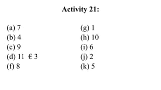
- 1. Activity 21: (a) 7 (b) 4 (c) 9 (d) 11 € 3 (f) 8 (g) 1 (h) 10 (i) 6 (j) 2 (k) 5
- 2. Activity 22: The Venn diagram given above represents three types of movies a group of girls of our school like to watch. There are 63 girls.
- 3. Activity 22: According to the details given in the above Venn diagram the majority of the girls watch action movies. An equal number of girls watch romantic movies and horror movies. 15 girls watch action movies only. Seven children watch horror movies and action movies only. There aren’t any girls who watch action movies and romantic movies only. Ten girls watch all the three types of movies. Nine girls do not watch any of the given movies.
- 4. Activity 22: As a whole, I can clearly say that action movies are the most preferred types of movies among the girls.
- 5. Activity 23: The Venn diagram given above depicts the number of memberships held in clubs by Grade 11 students of Ranpokunagama M.V. there are three clubs. They are The Sports Club, The Interact Club and The Philatelic Club.
- 6. Activity 23: According to the details given in the Venn diagram, the highest number of the Grade 11 students are members of The Philatelic Club. More students are members of The Sports Club than The Interact Club. 40students are members of The Sports Club only. 25 students are members of all the three clubs. However, 15 students are not members of any of the given three clubs
- 7. Activity 23: I can clearly find that The philatelic Club is the most popular club among the students.
- 8. Activity 24: The Venn diagram given above represents the desserts a group of people ate after lunch at a party. There ate three kinds of desserts. They were ice – cream, watalappan and yoghurt.
- 9. Activity 24: • According to the details given in the Venn diagram, the highest number of the people ate watalappan for dessert. 20 people ate yoghurt only. 80 people ate one dessert items only. Interestingly, 15 people ate all the three desserts depicted in the Venn diagram. However, 18 people did not eat any of the desserts given here. More people are ice-cream than yoghurt.
- 10. Activity 24: • As a whole, I can see that watalappan was the most preferred dessert among the people.
- 11. Activity 25: • The Venn diagram given above depicts the result of a survey conducted on using social media among a group of advanced level students in a school. There are three types of social media depicted in the Venn diagram. They are Facebook, Twitter and WhatsApp.
- 12. Activity 25: •According to the details given in the above Venn diagram, the majority of the students use WhatsApp . more students use Facebook than Twitter. Two students use Facebook and Twitter only. 15 students use all the three typs of social media. However, 13 students do not use any type of social media given above.
- 13. Activity 25: •According to given Venn diagram it is clear that WhatsApp is the most popular social media among the students.
- 14. Activity 26: (a) The table given above represents the term test marks obtained by Nayani at two term tests for 6 subjects. (b) the given table has three columns and each columns represent the subjects, the first term test marks and the second term test marks consecutively. (c) According to the detail given in the table Nayani had the highest marks for Science at both tests. (d) She had the lowest marks for history at the first term test. (e) She had equal marks for history and religion at the second term test.
- 15. Activity 26: (f) She had higher marks for English at the first term test than at the second term test. (g) She had lower marks for maths at the first term test than at the second term test. (h) Nayani scored equal marks for Science at both term tests. (i) I find that Nayani is good at Science and she needs to work hard for History.
- 16. Activity 27: The pie chart given above represents the leisure time activities a group of boys and girls of our school engage in. Each pie chart represents four leisure time activities.
- 17. Activity 27: According to the details given in the pie charts the highest percentage of the girls read books in their leisure time while the highest percentage of the boys play with friends. An equal percentage of both boys and girls watch TV in their leisure time. More girls read books than boys. A minimum of 5% of the boys help their parents. In contrast, 30% of the girls help their parents.
- 18. Activity 27: As a whole I can clearly find that the majority of the girls prefer reading books in their free time while that of boys prefer playing with friends
- 19. Activity 28: The pie charts given above represent the result of a survey conducted using a group of boys and girls of Harischandra M.V. On time they spend on smartphones separately during a week. Each pie chart represents five activities.
- 20. Activity 28: According to the details given in the two pie chart the girls spend the highest number of hours for Music while in contrast the boys spend the most part of their time for engaging in Social media activities. Girls spend an equal number of hours for News and Games. Boys spend a minimum number of hours for News. Girls spend more time on photography than boys.
- 21. Activity 28: It is clear that boys are most interested in Social media activities while the girls are most interested in Music
- 22. Activity 29: •The bar graph given above depicts the result of a survey conducted in the year 2022. It was conducted to find out the reasons for Sri Lankans to migrate. The “Y” axis represents the percentage of migration while the “X” axis represents the reason for migration.
- 23. Activity 29: • According to the detail given in the bar graph the highest percentage of the Sri Lankans migrated in 2022 seeking jobs. It was as high as 76%. In contrast, the least percentage of the Sri Lankans migrated due to political reasons. As a percentage it stood at 5%. An equal percentage of Sri Lankans migrated for higher education and business purposes. It was 40% each. More people migrated for other reasons than for travelling.
- 24. Activity 29: By analyzing the details given in the bar graph. I can find that most of the Sri Lankans were interested in seeking foreign jobs.
- 25. Activity 30: (1) d (2) f (3) h (4) j (5) a (6) g (7) b (8) i (9) e (10) c
- 26. Activity 31: The bar graph given above shows the average sale of six food items in our school canteen. The “Y” axis represents the average number of food items while the “X” axis represents the names of the food items. The food items are buns, sandwiches, rolls, doughnuts, pancake and hotdogs.
- 27. Activity 31: According to the details given in the bar graph fish – rolls have the highest average sale. In contrast, doughnuts have the lowest average sale. The sale of sandwiches is higher than that of hotdogs. Buns and pancakes have an equal average sale. It is 15 items each.
- 28. Activity 31: By analyzing the given bar graph I can conclude that fish rolls are the most favorite food items among the students of our school
- 29. Activity 32: (1) c (2) i (3) e (4) h (5) f (6) j (7) a (8) d (9) g (10) b
- 30. Activity 32: (1) c (2) i (3) e (4) h (5) f (6) j (7) a (8) d (9) g (10) b
- 31. Activity 33: The pie chart given above depicts the results of a survey conducted among the Grade 5 students of our school on their future ambitions. There are six ambitions depicted in the chart.
- 32. Activity 33: According to the details given in the pie chart, the highest percentage of the Grade 5 students wish to be a doctor. It stands at 30%. The least percentage of the students like to be a politicians one day. An equal percentage of the students like to be an engineer and teacher. It is 20% each. More students like to be a soldier than to be a businessman.
- 33. Activity 33: As a whole, I can clearly say that the most preferred ambition among the students is to be a doctor.
- 34. Activity 34: (1) d (2) g (3) j (4) c (5) h (6) i (7) a (8) f (9) l (10) b (11) e (12) k
- 35. Activity 35: The table given above represents the marks obtained by a group of students of Grade 12 A Commerce class of Sbec Collage for three subjects at the monthly test. The table has four columns and they carry the names of the students and the marks obtained for the three subjects separately.
- 36. Activity 35: According to the details given in the table Lakshani obtained the highest marks for all the three subjects. She obtained 94 marks for Business Studies. Thileepan scored the second highest marks for all the three subjects. Pasindu has 38 marks for Econ. That was the lowest mark obtained by a students among the 5 students. Abdul obtained equal marks for Econ and Business Studies.
- 37. Activity 35: According to the details given in the table Lakshani obtained the highest marks for all the three subjects. She obtained 94 marks for Business Studies. Thileepan scored the second highest marks for all the three subjects. Pasindu has 38 marks for Econ. That was the lowest mark obtained by a students among the 5 students. Abdul obtained equal marks for Econ and Business Studies.
- 38. Activity 35: By analyzing the marks, I can clearly say that Lakshani is the cleverest students in the class.
- 39. Activity 36: The line chart given above represents the number of dengue patients reported in the Gampaha district in the first six months of 2020,2021, and 2022. The Vertical axis represents the number of patients while the horizontal axis represents the months.
- 40. Activity 36: According to the details given in the line chart the highest number of dengue patients were reported in May 2020, 160 cases were reported in that month. The lowest number of 20 cases were reported in March 2022. There was an increase in dengue patients after April in all the three years. In contrast a gradual decrease in the number of cases could be observed after February.
- 41. Activity 36: As a whole, l can say, that there was a rise in the spread of dengue in 2020.
- 42. Activity 37: The line chart given above depicts the number of Covid 19 patients reported in a period of six months last year in The Western, The Central and The Southern Provinces.
- 43. Activity 37: According to the details given in the line chart the highest number of Covid -19 patients wre reported from The Western Province in May. In contrast, the lowest number of the Covid- 19 patients were reported in the same month from The Southern Province. There was a gradual increase in Covid 19 cases from February to May in The Western Province. The number of Covid – 19 cases were comparatively higher in The Central Province than in The Southern Province.
- 44. Activity 37: As a whole I can find that the health situation in The Southern Province was more satisfactory in the given period than the other two province.
- 45. Activity 38: (1) The horizontal bar graph given above depicts the sale of books at a book exhibition held last month. (2) The vertical axis depicts the types of books while the horizontal axis depicts the number of books sold. (3) There are five types of books. They are wild life books, biographies, adventure stories, novels and fairy tales. (4) According to the details given in the graph adventure stories had the highest sale
- 46. Activity 38: . (5) Biographies had comparatively a minimum sale of 100 books. (6) Wild life books and novels had an equal sale. That was 250 each. (7) The sale of fairy tales was higher than the sale of biographies. (8) I can clearly find that people are most interested in reading adventure stories.
- 47. Activity 39: The horizontal bar graph given above depicts the entrance of different type of motor vehicles to Colombo over the Kelani bridge last Sunday. The vertical axis represents the different types of vehicles while the horizontal axis represents the number of vehicles.
- 48. Activity 39: According to the details given in the graph the highest number of vehicles which entered Colombo over the Kelani bridge were motor cars. It stood at 20000 motor cars. More motor cycles entered Colombo than Vans last Sunday. The number of tipper trucks while entered Colombo was the least. The entrance of trishaws to Colombo stood the second highest.
- 49. Activity 39: As a whole I can see that the most preferred mode of transport to Colombo is motor car
- 50. Activity 40: The Venn diagram given above represents the number of students who faild three subjects at the OL exam in our school last year. The three subjects were English, Science and Math.
- 51. Activity 40: According to the details given the Venn diagram the majority of the students failed Math. The least number of students failed English. There weren’t any students who failed both Science and English only. Seven students failed both Math and Science only. 5 students failed all the three subjects. 20 students failed Math only. 10 students did not fail any of the subjects given in Venn diagram.
- 52. Activity 40: By analyzing the details given in Venn diagram, it is clear that the majority of the students were weak in Math.