Paraphrasing the Question
An essential skill for IELTS Writing Task 1
Why?
You can’t use the same words as the
question, so you need to be able to
paraphrase.
Paraphrasing means saying the same
thing in different words:
e.g.
• Their apartment is very big.
• Their flat is quite spacious.
How?
Look for synonyms of words in the
question:
• countries/ nations
• unemployment/ people without
jobs
Try writing from memory rather than
looking directly at the question.
How?
You can also take some details from
the graph or chart.
However, don’t include too much just
yet – the title or date range is fine.
You can also change word forms:
• production produce
• percentage proportion
The graph shows the proportion of the population
aged 65 and over between 1940 and 2040 in three
different countries.
How could you
paraphrase this
question to make
an opening
sentence?
The graph shows the proportion of the
population aged 65 and over between 1940
and 2040 in three different countries.
This line graph illustrates the percentage of people who are
aged over 65 in the USA, Sweden, and Japan over a period of
one hundred years.
The graph shows the percentage of elderly people in three
countries during a one hundred year period, from 1940 to
2040.
The line graph highlights demographic changes in three
countries by showing the percentage of people who are
aged over sixty-five across a century, beginning in 1940.
“ Don’t change too much.
Remember that the question will highlight
important features concisely. Be careful not
to alter it too much and miss the important
stuff.
Also, make sure that your new grammar is
correct. Do lots of practice rewriting questions
before an exam. Check out some sample
answers online.
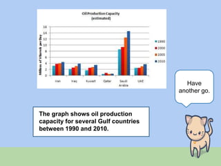
The graph shows oil production
capacity for several Gulf countries
between 1990 and 2010.
Have
another go.
The graph shows oil production capacity
for several Gulf countries between 1990
and 2010.
The bar chart shows the estimated oil production capacities of six
countries in the Gulf over a period of twenty years.
The graph illustrates the various capacities for producing oil in
six Gulf countries during twenty years, starting in 1990.
The bar chart compares changes, measured in millions of
barrels per day, of oil that is produced in a number of Gulf
countries over a period from 1990 to 2010.
The graph shows the unemployment rates in
the US and Japan between March 1993 and
March 1999.
Have a
try.
The graph shows the unemployment rates in
the US and Japan between March 1993 and
March 1999.
The line graph illustrates the percentage of people who are not
employed over a period of seven years in two countries.
The graph shows the proportion of people who are unemployed
in two countries between 1993 and 1999.
Last one.
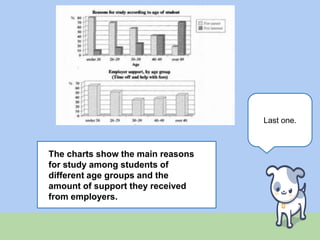
The charts show the main reasons
for study among students of
different age groups and the
amount of support they received
from employers.
The charts show the main reasons for study
among students of different age groups and the
amount of support they received from
employers.
There are two bar charts, one of which shows the reasons why
people choose to study, and one which shows the level of
support they receive from their employer.
The two bar charts give information about people who are
studying by illustrating why they study and to what extent
their employers support them.
Thanks for reading. Check out my IELTS
website and my teaching resources blog.

Paraphrasing for IELTS - writing task 1

  • 1.
    Paraphrasing the Question Anessential skill for IELTS Writing Task 1
  • 2.
    Why? You can’t usethe same words as the question, so you need to be able to paraphrase. Paraphrasing means saying the same thing in different words: e.g. • Their apartment is very big. • Their flat is quite spacious.
  • 3.
    How? Look for synonymsof words in the question: • countries/ nations • unemployment/ people without jobs Try writing from memory rather than looking directly at the question.
  • 4.
    How? You can alsotake some details from the graph or chart. However, don’t include too much just yet – the title or date range is fine. You can also change word forms: • production produce • percentage proportion
  • 5.
    The graph showsthe proportion of the population aged 65 and over between 1940 and 2040 in three different countries. How could you paraphrase this question to make an opening sentence?
  • 6.
    The graph showsthe proportion of the population aged 65 and over between 1940 and 2040 in three different countries. This line graph illustrates the percentage of people who are aged over 65 in the USA, Sweden, and Japan over a period of one hundred years. The graph shows the percentage of elderly people in three countries during a one hundred year period, from 1940 to 2040. The line graph highlights demographic changes in three countries by showing the percentage of people who are aged over sixty-five across a century, beginning in 1940.
  • 7.
    “ Don’t changetoo much. Remember that the question will highlight important features concisely. Be careful not to alter it too much and miss the important stuff. Also, make sure that your new grammar is correct. Do lots of practice rewriting questions before an exam. Check out some sample answers online.
  • 8.
    The graph showsoil production capacity for several Gulf countries between 1990 and 2010. Have another go.
  • 9.
    The graph showsoil production capacity for several Gulf countries between 1990 and 2010. The bar chart shows the estimated oil production capacities of six countries in the Gulf over a period of twenty years. The graph illustrates the various capacities for producing oil in six Gulf countries during twenty years, starting in 1990. The bar chart compares changes, measured in millions of barrels per day, of oil that is produced in a number of Gulf countries over a period from 1990 to 2010.
  • 10.
    The graph showsthe unemployment rates in the US and Japan between March 1993 and March 1999. Have a try.
  • 11.
    The graph showsthe unemployment rates in the US and Japan between March 1993 and March 1999. The line graph illustrates the percentage of people who are not employed over a period of seven years in two countries. The graph shows the proportion of people who are unemployed in two countries between 1993 and 1999.
  • 12.
    Last one. The chartsshow the main reasons for study among students of different age groups and the amount of support they received from employers.
  • 13.
    The charts showthe main reasons for study among students of different age groups and the amount of support they received from employers. There are two bar charts, one of which shows the reasons why people choose to study, and one which shows the level of support they receive from their employer. The two bar charts give information about people who are studying by illustrating why they study and to what extent their employers support them.
  • 14.
    Thanks for reading.Check out my IELTS website and my teaching resources blog.