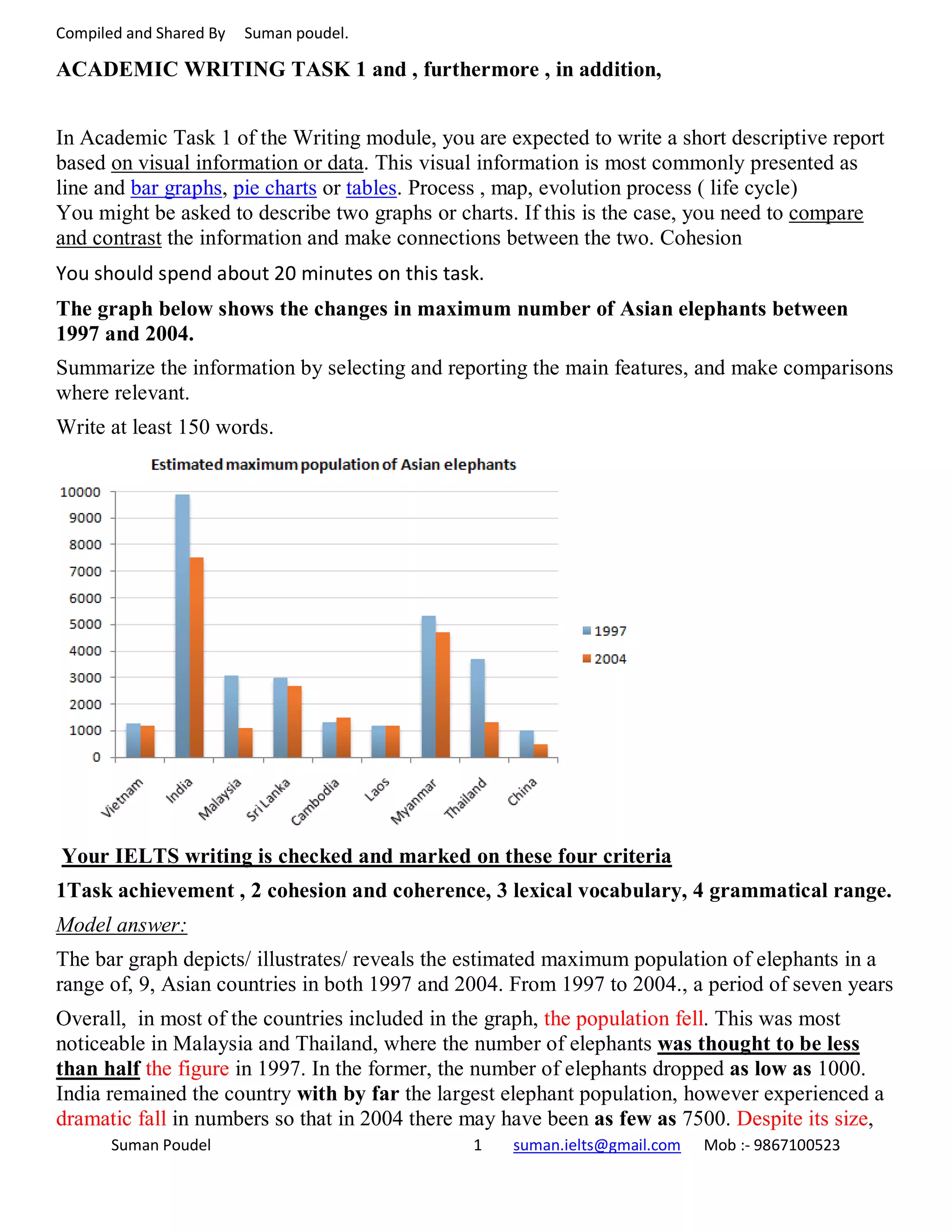


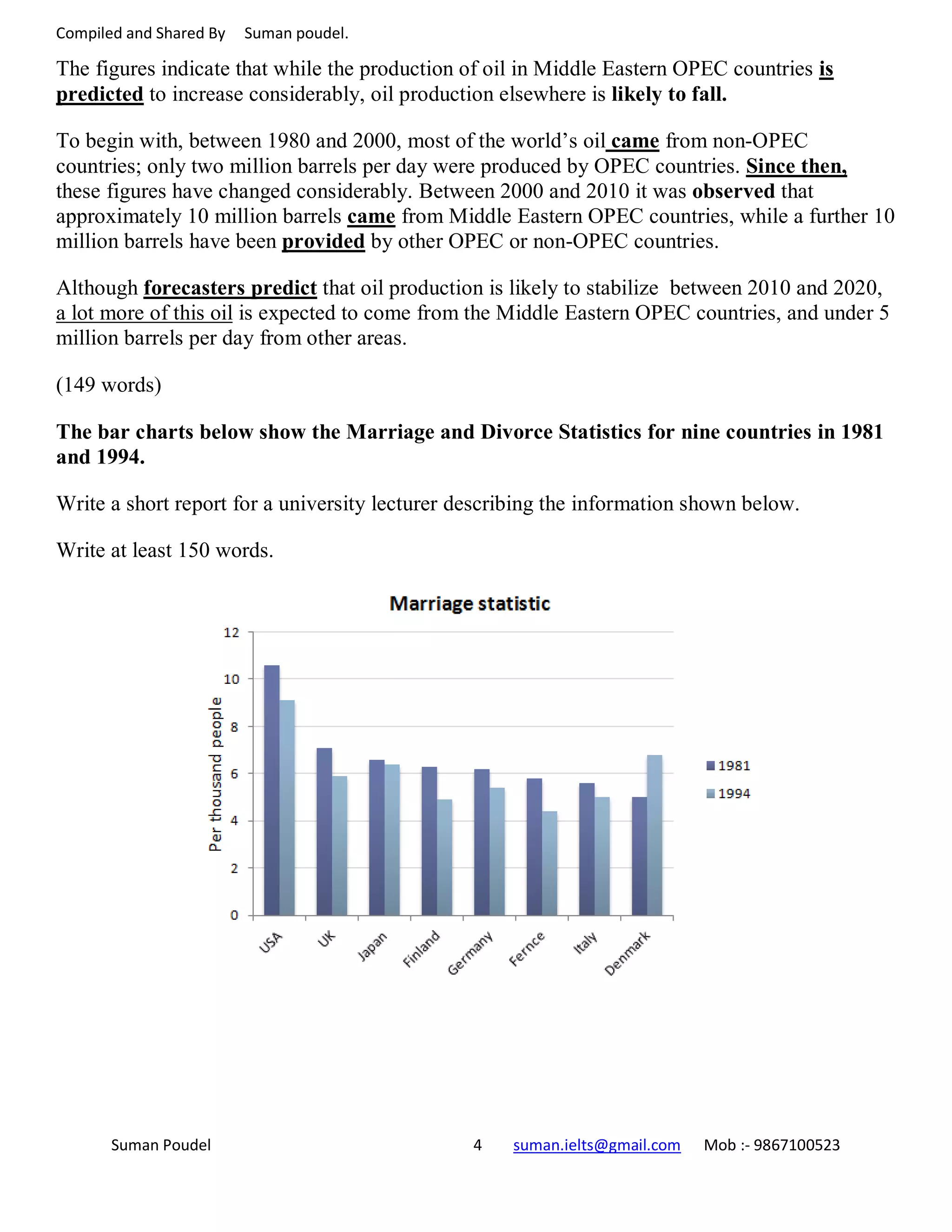

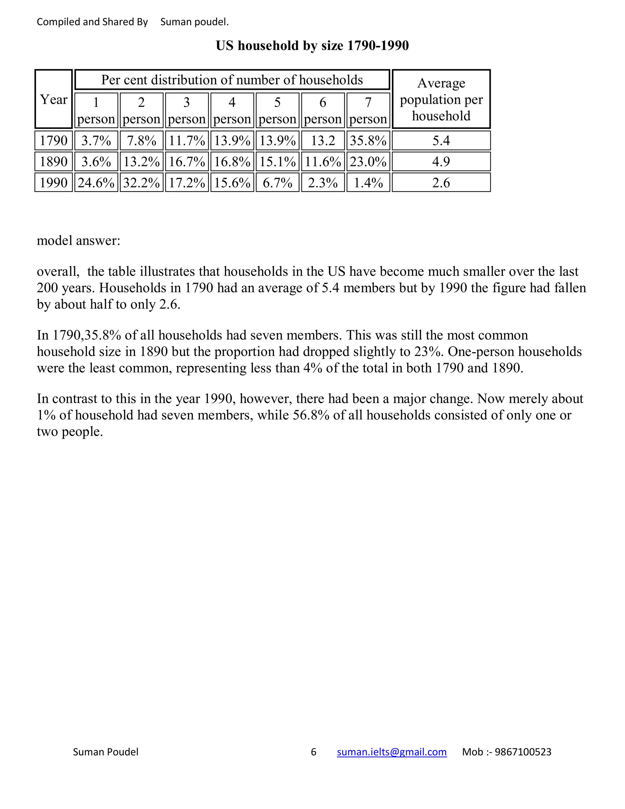

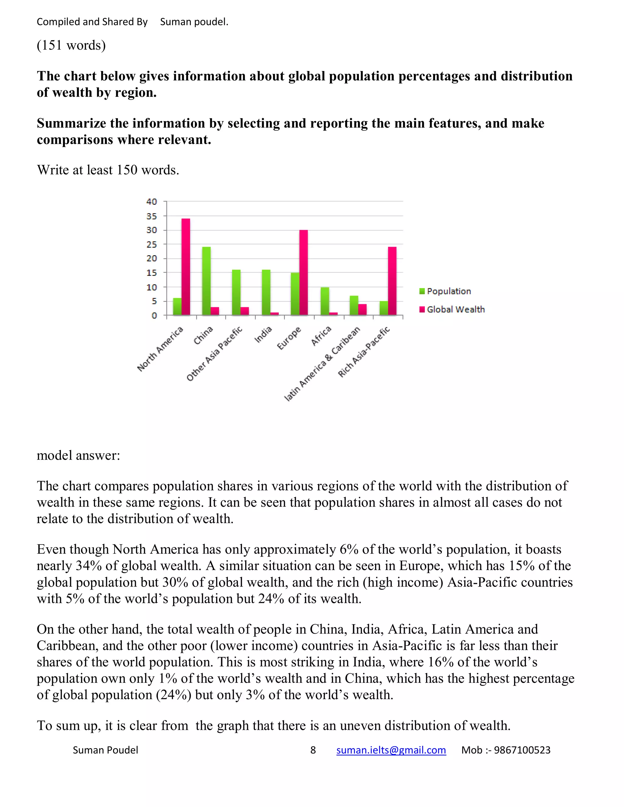


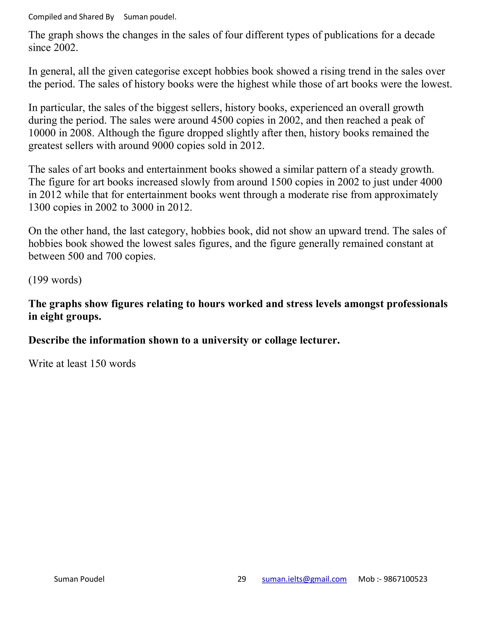
![Compiled and Shared By Suman poudel.
Write at least 150 words
model answer:
The bar chart shows the gender distribution of students doing computer scientific research
across a range of disciplines at a US university in 2011.
In five of the six disciplines, males outnumbered females. Male students made up a particularly
large proportion of the student group in subjects related to the study of programming objects:
mathematics, programming, and engineering. The gender gap was particularly large in the field
of mathematics, where there were five times as many male students as female students.
Men and women were more equally represented in subjects related to the study of computer
science: natural sciences, psychology, and linguistics. In natural science, there were nearly as
many women [approximately 200] as men [approximately 240]. This was also true of
psychology. Linguistics was the only discipline in which women outnumbered men [roughly
110 women vs. 90 men].
Overall, the chart shows that at this university, computer science subjects continue to be male-
dominated; however, women have a significant presence in fields related to psychology and the
computer sciences.
(169 words)
Suman Poudel 22 suman.ielts@gmail.com Mob :- 9867100523](https://image.slidesharecdn.com/aacademicwritingtask1-160317062739/75/Academic-writing-task-1-22-2048.jpg)


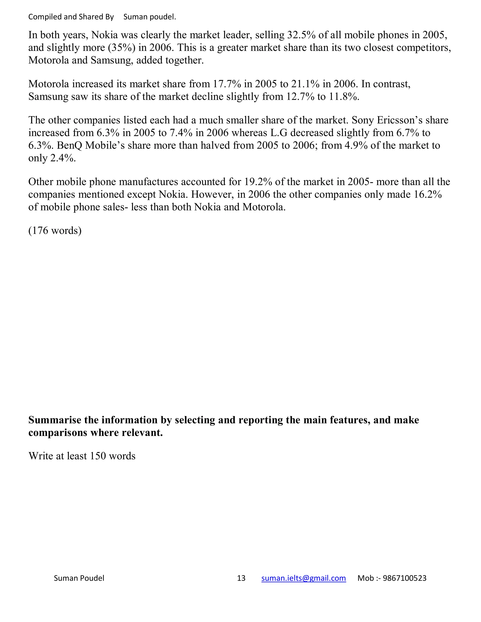
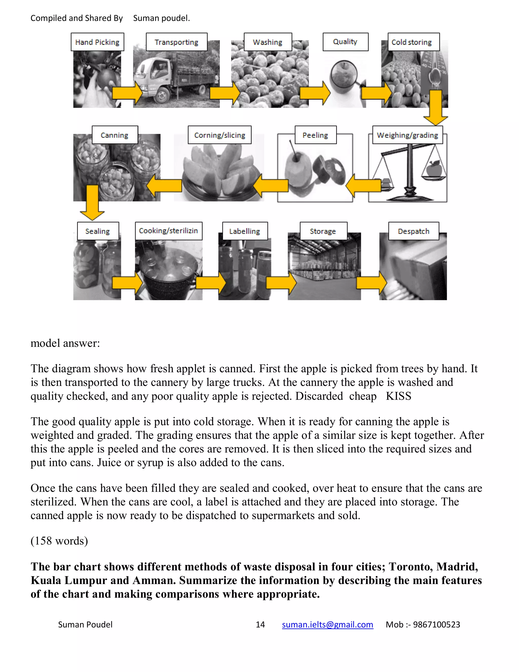
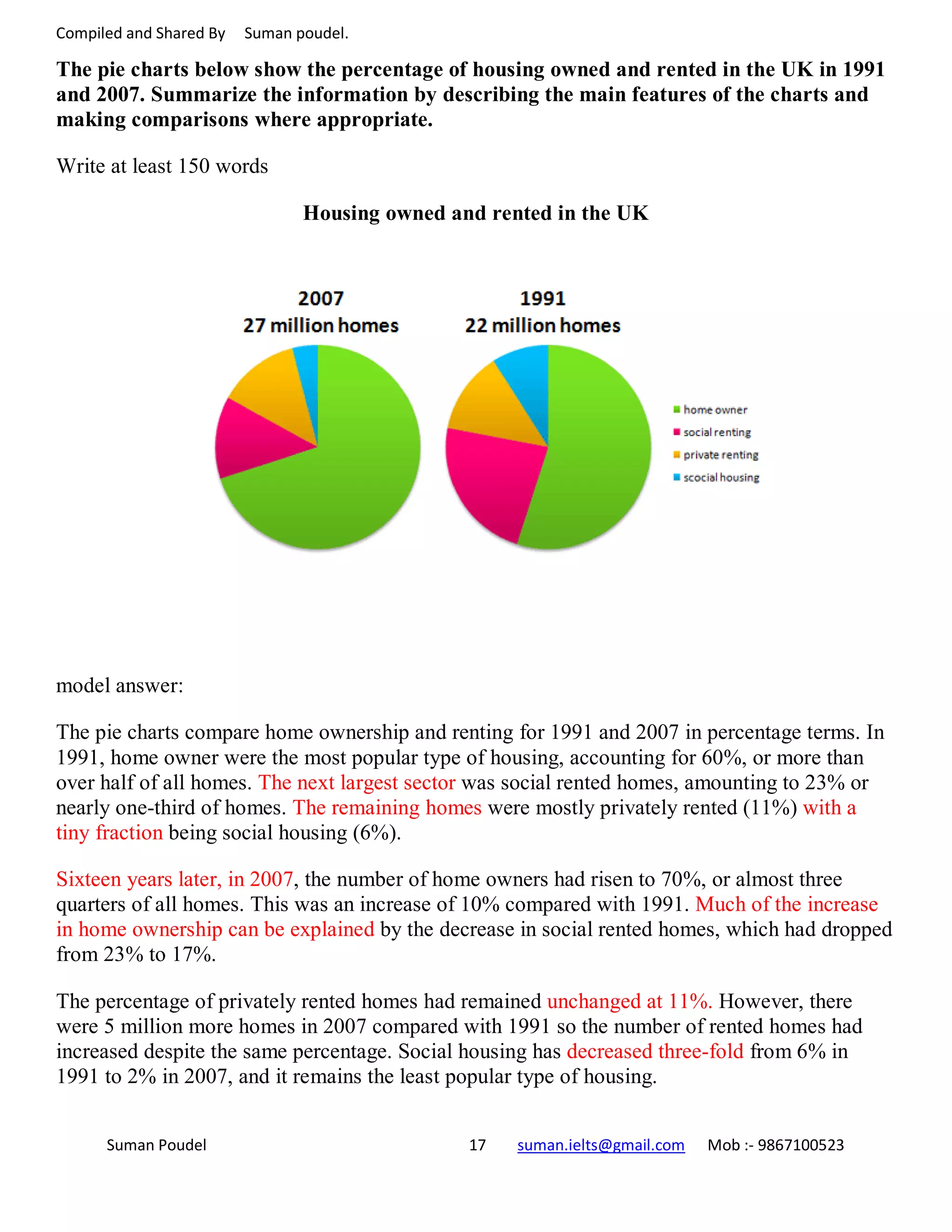
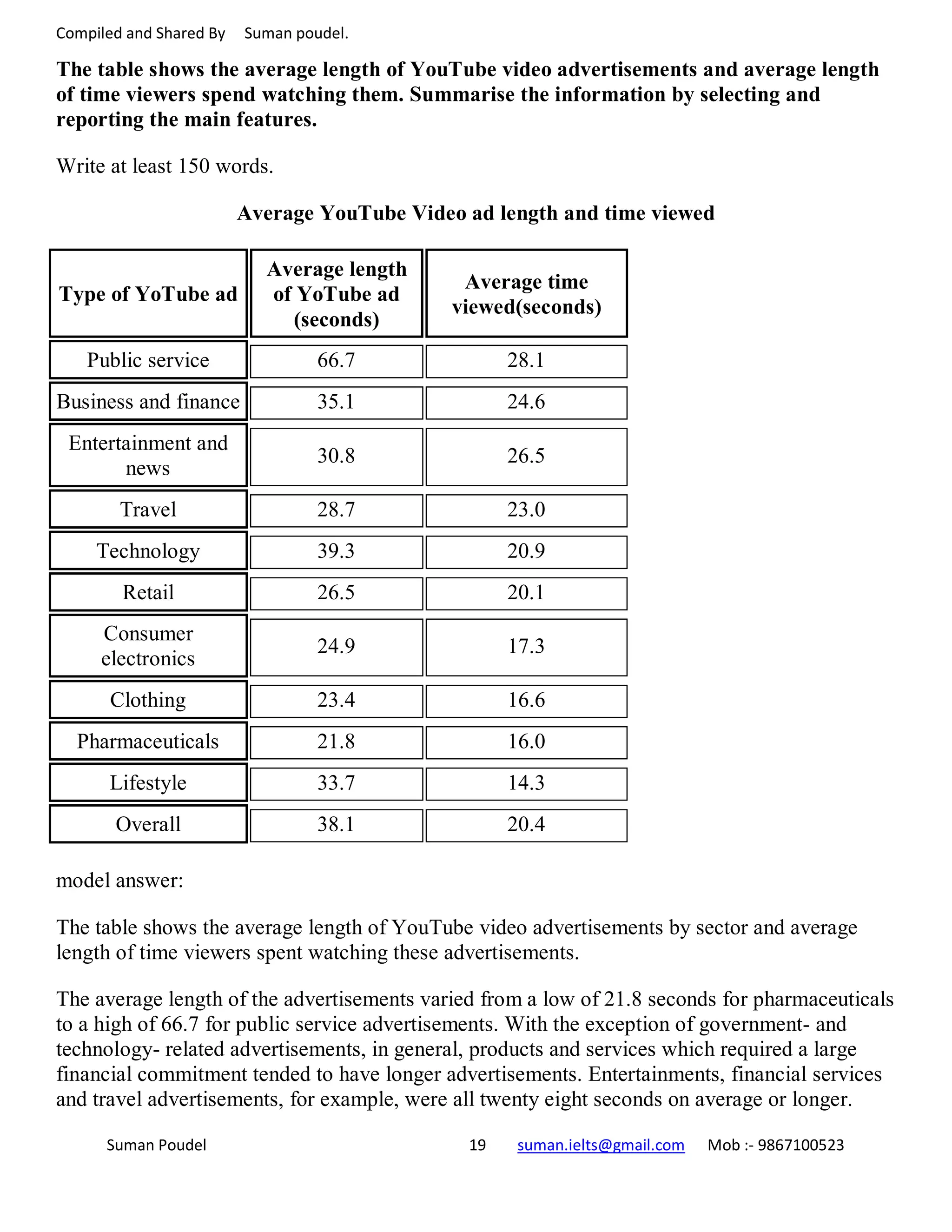
The document provides information about writing task 1 in IELTS academic writing. It discusses the types of materials that can be presented such as line graphs, bar graphs, pie charts or tables. It emphasizes comparing and contrasting information from two graphs or charts and writing a summary of at least 150 words. Sample answers are provided summarizing data about elephant populations, the brick manufacturing process, oil production, marriage/divorce rates, US household sizes, and UK students' financial organization. The summary highlights that task 1 involves selecting the key details from charts and writing a short report comparing trends, similarities and differences.


