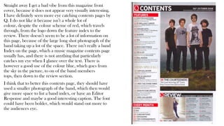
1. Straight away I get a bad vibe from this magazine front
cover, because it does not appear very visually interesting.
I have definitely seen more eye catching contents pages by
Q. I do not like it because isn’t a whole lot of
colour, despite the colour scheme of red, which travels
through, from the logo down the feature index to the
review. There doesn’t seem to be a lot of information on
this page, because of the large long shot photograph of the
band taking up a lot of the space. There isn’t really a band
Index on the page, which a music magazine contents page
usually has, and there is not anything that particularly
catches my eye when I glance over the text. There is
however a good use of the colour blue, which goes from
the sky in the picture, to on of the band members
tops, then down to the review section.
I think that to better this contents page, they should have
used a smaller photograph of the band, which then would
give more space to list a band index, or have an Editor
Response and maybe a good interesting caption. The font
could have been bolder, which would stand out more to
the audiences eye.
2. I think that this contents page from Billboard is so much
more visually interesting and appealing than the last one
from Q. I think this because straight away we see a strong
light florescent blue colour scheme, which is cleverly used
as writing subheadings, and divider lines on the page.
Although the blue lines aren’t writing, they just as easily
make your eye follow down to the bottom of the line and
then take in that text section. The blue is then seen in
divider lines on the band index on the left, which not only
shows us bands, but popular albums and songs also. The
‘No.1’ tells us that the listed music is the most popular
ones, so we get to read about the best.
There are numerous pictures on this page, which evens out
the amount of writing so the text isn’t too overpowering, and
the happy grin that the Asian girl has in the middle of the
page, automatically spreads on to you to put you in a happy
mood whilst you look over the magazine.
Different sizes and different fonts are used over the contents
page to draw in the reader to reader certain important parts
of the page, and I think this works vey well.
3. The ‘Rock Sound’ magazine title instantly tells the audience
that this contents page is for a rock magazine. This is later
elaborated on, when he viewers eyes drift over to the
photograph of the artist on the right. The black background to
the band index, the dark long hair black jacket and tattoos
support the idea that he is a rock artist because rock has a
rebellious nature to it, and his dark clothes and hair and tattoos
reflect this. This magazine is also very capturing, because
unlike many magazines, there is a witty comments down at the
bottom right hand corner, about Justin Bieber, who is entirely
the opposite to rock music, and generally not favoured by the
average rock music audience. The band index on the left refers
to other bands, like Cradle of Filth, Slipknot, Papa Roach and
Slayer which are also rock bands. This is good to attract an
audience, because if people are listening to the rocker on the
right then they are likely to listen to the rockers on the left.
There is a good blue colour scheme going this page. It is on the
border on the left and follows horizontally to the page
references next to it and then horizontally again to his striped
shirt and finally to the last page reference above the Justin
Bieber comment. I think that this is a good contents
page, because it is simple but effective in the way that I get to
observe all the information and am entertained by the funny
comment at the bottom.