1. I like the way the image
takes up the whole page, it
makes it seem less daunting
to read. It also draws the
reader in.
Like the contrast
between the text and
the background. It
makes it stand out
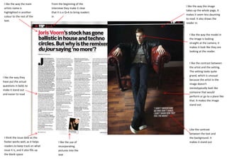
I like the way the model in
the image is looking
straight at the camera, it
makes it look like they are
looking at the reader.
I like the way the main
artists name is
highlighted in another
colour to the rest of the
text.
I like the use of
incorporating
pictures into the
text
I like the way they
have put the actual
questions in bold, to
make it stand out
and easier to read
From the beginning of the
interview they make it clear
that it is a Q+A to bring readers
in
I like the contrast between
the artist and the setting.
The setting looks quite
grand, which is unusual
because the artist in the
image doesn’t
stereotypically look like
someone that would
perform or go to a place like
that. It makes the image
stand out.
I think the issue date as the
footer works well, as it helps
readers to keep track on what
issue it is, and it also fills up
the blank space
2. I like the watermark in the
background I think it makes the
page look less boring, without
taking attention away from the
rest of the text
I like the pop of colour the
flag and the artists hair bring
to the page, it makes it seem
less plain, yet still simple
I like the use of different fonts for the
header and main body of text. It
makes the header stand out but it also
makes it look like more of a
sophisticated article
They’ve started the article
off with a question to
themselves, this is rather
intriguing which would
make people want to read
on.
As this is an American
magazine, the addition of
the American flag shows
their patriotism, which
might fair well with
American viewers
3. The colours used are quite
dark, this colour scheme
would go with an indie
magazine
The fact that the artist is shown
smoking connotes that it is for
adults, incorporating the dark
colours it looks like it would be
aimed at men aged between
18-35, because the team
member they are interviewing
is from quite an old band, which
would appeal to older readers.
The props in the image
connotes the age of the
artist and the band, with
the polaroid image and
old fashioned wallpaper
The use of a pull quote,
grabs the attention of
the viewer
I like the way they’ve added
the credentials of whose in
the picture, and where the
clothes he’s wearing are
from.
I like the way they’ve
highlighted the drop
capitals, however I
think the blue looks
slightly out of place on
the page
I like the boldness of
the font, it makes I
clear to read but it also
fills in some space on
the page making it look
less empty
4. I like the simplicity of
the image, with the
artist being the main
point
I like the grungy looking background
I think it adds to the connotation
that comes with growing up, that
nothing stays perfect forever
I like the brightness
of the main bits of
text in contrast to
the artists clothing
and the background
setting
I like the small range of colours, the colours that
they have chosen, connotes that it’s a pop
magazine
I like the use of a footer, which has the
magazines website and usually the issue
date