
Recommended
More Related Content
What's hot
What's hot (20)
Viewers also liked
Viewers also liked (20)
Similar to Album cover first draft analysis
Similar to Album cover first draft analysis (20)
Recently uploaded
Recently uploaded (20)
Album cover first draft analysis
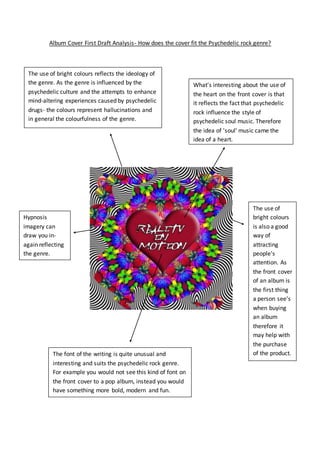
- 1. Album Cover First Draft Analysis- How does the cover fit the Psychedelic rock genre? The use of bright colours reflects the ideology of the genre. As the genre is influenced by the psychedelic culture and the attempts to enhance mind-altering experiences caused by psychedelic drugs- the colours represent hallucinations and in general the colourfulness of the genre. Hypnosis imagery can draw you in- again reflecting the genre. The font of the writing is quite unusual and interesting and suits the psychedelic rock genre. For example you would not see this kind of font on the front cover to a pop album, instead you would have something more bold, modern and fun. What's interesting about the use of the heart on the front cover is that it reflects the fact that psychedelic rock influence the style of psychedelic soul music. Therefore the idea of 'soul' music came the idea of a heart. The use of bright colours is also a good way of attracting people's attention. As the front cover of an album is the first thing a person see's when buying an album therefore it may help with the purchase of the product.