call girls in Kamla Market (DELHI) 🔝 >༒9953330565🔝 genuine Escort Service 🔝✔️✔️
Presentation1
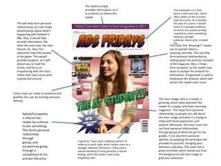
1. This skyline simply
provides information, as it The masthead is in a font
is a statistic to inform the which is bold and italic, which
reader. often relates to the common
style of a comic. As it dictates
This will help form personal the style of a comic, it would
relationships, as it will make relate to a younger audience
people gossip about what’s as comics are usually exciting.
happening with football in I wanted to create something
relating a younger
ABS. Also, it would help
audience, hence why I created
provide information, like
this.
what the score was, the next The cover line ‘Amazing!!!’ leaves
fixtures etc. Also, this you to wonder what is
advertises how they played amazing, and why. This can help
in the game. This would form personal relationship by
provide escapism, as it will talking about the pictures included
attract you to read the in the magazine. Also, it helps
article, and focus on form escapism, as the reader may
empathising with the story want to analyse the artwork for
rather than take notice with themselves. A hyperbole is used to
anyone else around. emphasise the artwork, which will
attract the reader even more.
Comic style can relate to audience and
gratifies the user by forming personal
The main image, who is a model, is
identity
grinning, which helps welcome the
reader to a happy, and heart-warming
magazine. This helps form personal
Splash/Competitio relationship, as people can talk about
n informs the the main image and what it is trying to
reader by a chance imply with facial expression, and
to win something. posture. Moreover, the main cover line
can form personal relationships
This forms personal
through gossip of what she got for her
relationship grades. It can also form personal
through identity, by applying the technique she
gossip, and In general, I have used a halftone pattern to
relate to a comic style, which relates more to a provides to yourself, changing your
escapism by going younger audience. Moreover, I have used a behavour and ways. The cover line is
through a natural backdrop to help generate a natural green and bold, which stands out from
competition to try feeling, which the reader could easily the background and main image to
and win the prize. empathise with. grab your attention.
2. The colours red and white contrast each other, which helps
Here, I have kept the consistent style make the background stand out. Also, it is placed in a rising
that I have in the front page not only to sun style, which is related to Japan, the origin of comics.
keep it professional, but to maintain the Most comic fans will be familiar with this, but if it
style of a comic. doesn’t, it helps the reader expand their knowledge about
comics, which helps form personal identity. The style is
continuous, as both pages are relevant to each other.
The different onomatopoeic terms
around the contents is often related to
fighting, which most superheroes would
do in a comic scene. This bit of Here, I have used a superhero, as comics The building put in here is to help the
knowledge helps form personal are usually based around superheroes. contents page be more creative and less
identity. Moreover, I’m keeping the Moreover, this will help create personal plain. This artistic edge helps attract to
typography around the contents the audience, as it is bold and stands
identity, as it shows what a superhero
attractive, by putting it in different out majorly from the backdrop.
bright colours and a black borderline. figure should look like.