1. Analyse one of your coursework productions in relation to the concept of genre.
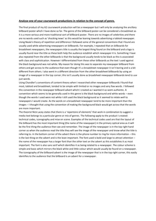
The final product of my A2 coursework production will be a newspaper but I will only be analysing the ancillary
billboard poster which I have done so far. The genre of the billboard poster can be considered a broadsheet as
it is a more serious and more traditional sort of billboard poster. There are no images of celebrities and there
are no words used such as ‘shocking news’ as this would be leaning towards advertising a tabloid newspaper.
Using Neale’s theory of repetition and difference I followed some of the general conventions that I found are
usually used while advertising newspapers on billboards. For example, I repeated that on billboards for
broadsheet newspapers, the newspapers title is usually the largest thing found on the billboard and a logo is
usually found near the title as these both help the audience establish which newspaper it is. Something I have
also repeated from the other billboards is that the background usually tends to be black as this is associated
with class and sophistication. However I differentiated from these other billboards as the text I used against
the black background was not white. My reason for doing this was to separate my newspaper billboard from
others and get across to the audience that even though it’s a broadsheet newspaper it isn’t boring and is a bit
different from others. I also went in a different direction from the other broadsheet billboards by using an
image of a newspaper in the top corner; this isn’t usually done as broadsheet newspaper billboards tend to use
just words.
Using Chandler’s conventions of content theory when I researched other newspaper billboards I found that
most, tabloid and broadsheet, tended to be simple with limited or no images and very few words. I followed
this convention in the newspaper billboard advert which I created as I wanted it so seem authentic. A
convention which seems to be generally used in this genre is the black background and white words – even
though the words I used were not white I still used the black background as it seemed to relate well to
newspapers I would create. As the words on a broadsheet newspaper tend to be more important than the
images – I thought that using the convention of making the background black would get across that the words
are more important.
The theorist Nick Lacey states that there is a ‘repertoire of elements’ that work in combination to suggest a
media text belongs to a particular genre or mix of genres. The following apply to the product I created:
technical codes, iconography and mise en scene. Examples of the technical codes used are that the layout of
the billboard has the most important thing (the name of the newspaper) in the primary optical area as it will
be the first thing the audience then see and remember. The image of the newspaper is in the top right hand
corner so when the audience read the title they will see the image of the newspaper and know what the title is
referring to. In the bottom corner of the advert there is the phone number to ring for more information – this
is the last thing on the advert and is the least important. The font used is bold and large to attract attention –
the name of the newspaper has a larger font than the other text on the advert as this establishes it as most
important. The font is also sans serif which identifies it as being related to a newspaper. The colour scheme is
simple and basic which mirrors the black white and little colour which would usually be found on a newspaper.
The iconography of the billboard advert is the image of the newspaper that is in the top right corner, this easily
identifies to the audience that the billboard is an advert for a newspaper.