
Recommended
More Related Content
What's hot
What's hot (19)
Similar to Kerrang! Magazine Cover Design Breakdown
Similar to Kerrang! Magazine Cover Design Breakdown (20)
More from AnthonyTeazdale
More from AnthonyTeazdale (16)
Recently uploaded
Recently uploaded (20)
Kerrang! Magazine Cover Design Breakdown
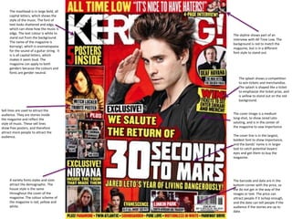
- 1. The masthead is in large bold, all capital letters, which shows the style of the music. The font of text looks shattered and edgy, which can show how the music is edgy. The text colour is white to stand out from the background. The name of the magazine is Kerrang!, which is onomatopoeia for the sound of a guitar string. It is is all capital letters, which makes it seem loud. The magazine can apply to both genders because the colours and fonts are gender neutral. Sell lines are used to attract the audience. They are stories inside the magazine and reflect the style of music. These sell lines show free posters, and therefore attract more people to attract the audience. A variety fonts styles and sizes attract the demographic. The house style is the same throughout the cover of the magazine. The colour scheme of the magazine is red, yellow and white. The skyline shows part of an interview with All Time Low. The background is red to match the magazine, but is in a different font style to stand out. The splash shows a competition to win tickets and merchandise. The splash is shaped like a ticket to emphasize the ticket prize, and is yellow to stand out on the red background. The cover image is a medium long-shot, to show Jared Leto saluting, and is in the center of the magazine to sow importance The cover line is in the largest, boldest font to show importance, and the bands’ name is in larger text to catch potential buyers’ eyes and get them to buy the magazine. The barcode and date are in the bottom corner with the price, so the do not get in the way of the images or text. The price can attract people if it ischep enough, and the date can tell people if the audience if the stories are up to date.
- 2. The contents page title is yellow to attract attention to it. It also contains the issue number and date so they do not take up room on the cover. The images show the more interesting pages. This will show the reader where to look first, which will convince them to read more. The editors’ message provides an informal feel to the magazine, and makes the reader feel welcome. It will reflect the magazine style, and is placed next to the main contents to be noticeable. The main image shows the main story of the magazine, and is larger to show its’ importance and makes it more noticeable, and it will be the first thing someone notices when opening the magazine. The contents are organised into columns to make them easier to read, and are separated by grey lines, which separate the columns. But are not too bright. Images are used in the contents to attract readers to the main stories. An advert for delivered magazines is placed at the end. It is large enough to be seen, but not too big so it is not intrusive.
- 3. The title is the largest thing on the page to attract attention and convince people to red the article. The font seems scratchy and strange, reflecting the style of the article. The main image takes up an entire page, showing how important it is, and to catch people’s eyes. It is a long shot to show Mark Hoppus’s full pose. The quote is used to convince people to read the article by taking a quote out of context, so the readers want to see it in context and what question I relates to. The introduction paragraph introduces readers to the article and gives some background. The main story is in columns to save space, and to be easier to read. The first letter of each paragraph is larger and orange to separate it from the other paragraphs.
- 4. The masthead is on the top of the magazine to show its importance. The font is simple so it doesn’t distract from the main image, and so it can fit with a variety of music styles. The main image of Roger Waters covers the logo, which shows that he is a big star. The main image is a medium shot, to shoe facial expression, but not feel too close. The image background is a wall to show the theme of the Pink Floyd album, The Wall. The puff is red to stand out out, but fit with the colour scheme. It shows the USP of the free CD, which will attract customers to buy the magazine. The skyline shows another article and an image to attract the audience. It does not have a background colour so it doesn’t distract from the main image. The articles are arranged in columns to fit more in and fill up the page. The house style is red, white and black. White and black are contrasts so they make each other pop, while red stands out on both. The barcode is placed in the bottom right hand side of the page so it doesn’t obstruct the main image.
- 5. The masthead is in solid black text, so it can fit with any music style. The date and issue number are on the contents page so they do not obstruct the main image. The contents page shows the main features in a column to organize the page easier. The cover story is separated to make it easier to see and find. This quote is taken out of context to make people want to read the article. The colour scheme has being inverted- the heading is black and the preview is golden- to make it stand out more. The main image is a high angle shot to make Terry Hall seem inferior, as if life is getting him down. The image has being brightened to make it seem like a light is coming down. This might be him looking at the sky and being annoyed at God.
- 6. The Image is in black and white to give it a Gothic feel. The angle is cantered to give off the same feel. Justin Vermon is in a relaxed pose to make him seen comfortable in his surroundings. The fonts and colours are used to give a gothic feel to the column. The fonts are disorderly and chaotic, which shows the feel of the article. It is the largest text on the page to attract the audience. The background is black, which has the connotation of mystery and horror, showing the gothic feel. The same font is used throughout to give the article consistency, and to continue the theme.
- 7. The magazine title is shown in large font and a classic font. This makes it more prominent an important. The font used makes it seem like a quality magazine, and the red background provides a contrast, making it pop. The main image is a long shot. This sows Noels’ pose as well as looking natural. The amplifier shows some of his main quotes from the article to attract people to see the quotes in context and what they relate to. The barcode is placed in the bottom left of the cover, so it does not obstruct the image or the articles. This makes it easier for the buyers to see. The articles are shown down the side in a column, so it is easier to fit more in. They all use the same font and color style. The style is reminiscent of a concert poster to link it to music. This is shown by the usage and font of the word ‘featuring’ at the top of the article. The colour scheme is red and black, which stand out on the gradient grey background. Quotes and images of band and band members are used to attract the audience to articles. The splash is used to attract the audience as it shows musicians and bands such as The Killers, Deadmau5 and Velvet Underground. It is shaped and coloured like a golden record label, which shows the theme of albums.
- 8. The contents are in a column to fit more on the page and make it easier to read. The house style is the same throughout the magazine. A box is used to separate the Oasis pages from the rest of the magazine. Gold text is used to make it feel special. The monthly features are separated from the rest of the magazine t make them easier to find. The image is the largest thing on the page to make it feel important. It is a straight shot to make them look casual. The review section are separated from the rest of the magazine t make them easier to find. An image is used to attract the audience.
- 9. The main image is a medium long shot to show his casual pose. It takes up the entirety of one page and the background of the other to show importance. The article is in columns to fit more on the page. The I is larger than the other text and has a red box, to make it seem important and to attract people to the article. The title fits the Q colour scheme and is a quote as well as a reference. It is in large text to attract the audience.