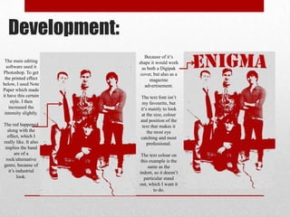
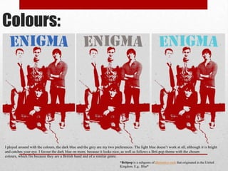
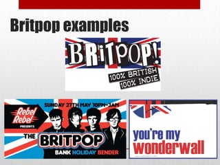
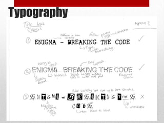
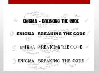
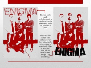
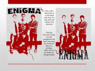
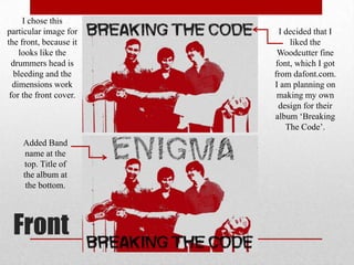
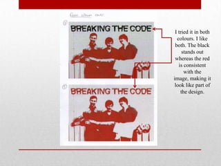
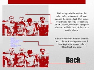
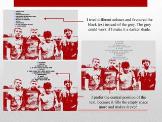
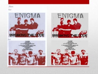
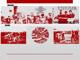
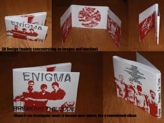
Print Material
Development
Alice Denmark

G324:
Magazine Advertisement
Development:
The main editing
software used it
Photoshop. To get
the printed effect
below, I used Note
Paper which made
it have this certain
style. I then
increased the
intensity slightly.
The red happened
along with the
effect, which I
really like. It also
implies the band
are of a
rock/alternative
genre, because of
it’s industrial
look.

Because of it’s
shape it would work
as both a Digipak
cover, but also as a
magazine
advertisement.
The text font isn’t
my favourite, but
it’s mainly to look
at the size, colour
and position of the
text that makes it
the most eye
catching and most
professional.
The text colour on
this example is the
same as the
indent, so it doesn’t
particular stand
out, which I want it
to do.
Colours:

I played around with the colours, the dark blue and the grey are my two preferences. The light blue doesn’t work at all, although it is bright
and catches your eye. I favour the dark blue on more, because it looks nice, as well as follows a Brit-pop theme with the chosen
colours, which fits because they are a British band and of a similar genre.
*Britpop is a subgenre of alternative rock that originated in the United
Kingdom. E.g.. Blur*
Britpop examples
Typography
This font works
really
well, because it is
consistent with the
background, giving
the illusion it is
print.

This is the band
current font
style, however
they are currently
in the process of
changing it. I like
it, however, I
think it is too
thick for what
designs I am
considering.
This works
effectively as
a rock band
style font. It is
big, bold and
catches your
attention.

I like the
font, but it looks
too old
compared to the
look I am going
for. It does its
duty as a
printing
effect, but its
too much of a
vintage design.
Other Designs
Digi pak
Development
I chose this
particular image for
the front, because it
looks like the
drummers head is
bleeding and the
dimensions work
for the front cover.

Added Band
name at the
top. Title of
the album at
the bottom.

Front

I decided that I
liked the
Woodcutter fine
font, which I got
from dafont.com.
I am planning on
making my own
design for their
album ‘Breaking
The Code’.
I tried it in both
colours. I like
both. The black
stands out
whereas the red
is consistent
with the
image, making it
look like part of
the design.
Following a similar style to the
other to keep it consistent I have
applied the same effect. This image
would work perfectly for the back
of a CD cover, because of the space
above to hold the titles of the tracks
on the album.

I have experiment with the position
and colours. Keeping consistent, I
have kept to the colours, dark
blue, black and grey.

Back
I tried different colours and favoured the
black text instead of the grey. The grey
could work if I make it a darker shade.

I prefer the central position of the
text, because it fills the empty space
more and makes it even.
Inside Ideas
Outside

Inside
3D Design (mainly concentrating on images and function)

Shape is too rectangular, needs to become more square, like a conventional album
•
•
•
•
•
•
•

Logos
Social Network Links
Quotations
Reviews
Consistent design theme
Conventional album shape and sizing
Inside sleeve – lyrical booklet

What is left to consider?

G324: A2 Media - Print Material Development

  • 1.
  • 2.
  • 3.
    Development: The main editing softwareused it Photoshop. To get the printed effect below, I used Note Paper which made it have this certain style. I then increased the intensity slightly. The red happened along with the effect, which I really like. It also implies the band are of a rock/alternative genre, because of it’s industrial look. Because of it’s shape it would work as both a Digipak cover, but also as a magazine advertisement. The text font isn’t my favourite, but it’s mainly to look at the size, colour and position of the text that makes it the most eye catching and most professional. The text colour on this example is the same as the indent, so it doesn’t particular stand out, which I want it to do.
  • 4.
    Colours: I played aroundwith the colours, the dark blue and the grey are my two preferences. The light blue doesn’t work at all, although it is bright and catches your eye. I favour the dark blue on more, because it looks nice, as well as follows a Brit-pop theme with the chosen colours, which fits because they are a British band and of a similar genre. *Britpop is a subgenre of alternative rock that originated in the United Kingdom. E.g.. Blur*
  • 5.
  • 6.
  • 8.
    This font works really well,because it is consistent with the background, giving the illusion it is print. This is the band current font style, however they are currently in the process of changing it. I like it, however, I think it is too thick for what designs I am considering.
  • 9.
    This works effectively as arock band style font. It is big, bold and catches your attention. I like the font, but it looks too old compared to the look I am going for. It does its duty as a printing effect, but its too much of a vintage design.
  • 11.
  • 13.
  • 14.
    I chose this particularimage for the front, because it looks like the drummers head is bleeding and the dimensions work for the front cover. Added Band name at the top. Title of the album at the bottom. Front I decided that I liked the Woodcutter fine font, which I got from dafont.com. I am planning on making my own design for their album ‘Breaking The Code’.
  • 15.
    I tried itin both colours. I like both. The black stands out whereas the red is consistent with the image, making it look like part of the design.
  • 16.
    Following a similarstyle to the other to keep it consistent I have applied the same effect. This image would work perfectly for the back of a CD cover, because of the space above to hold the titles of the tracks on the album. I have experiment with the position and colours. Keeping consistent, I have kept to the colours, dark blue, black and grey. Back
  • 17.
    I tried differentcolours and favoured the black text instead of the grey. The grey could work if I make it a darker shade. I prefer the central position of the text, because it fills the empty space more and makes it even.
  • 19.
  • 21.
  • 22.
    3D Design (mainlyconcentrating on images and function) Shape is too rectangular, needs to become more square, like a conventional album
  • 23.
    • • • • • • • Logos Social Network Links Quotations Reviews Consistentdesign theme Conventional album shape and sizing Inside sleeve – lyrical booklet What is left to consider?