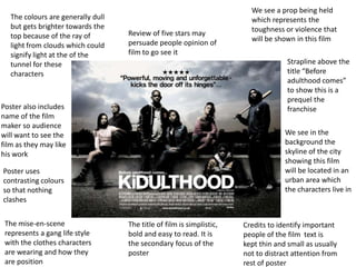
1. Review of five stars may
persuade people opinion of
film to go see it
The title of film is simplistic,
bold and easy to read. It is
the secondary focus of the
poster
The colours are generally dull
but gets brighter towards the
top because of the ray of
light from clouds which could
signify light at the of the
tunnel for these
characters
We see a prop being held
which represents the
toughness or violence that
will be shown in this film
The mise-en-scene
represents a gang life style
with the clothes characters
are wearing and how they
are position
Credits to identify important
people of the film text is
kept thin and small as usually
not to distract attention from
rest of poster
We see in the
background the
skyline of the city
showing this film
will be located in an
urban area which
the characters live in
Poster also includes
name of the film
maker so audience
will want to see the
film as they may like
his work
Strapline above the
title “Before
adulthood comes”
to show this is a
prequel the
franchise
Poster uses
contrasting colours
so that nothing
clashes
2. Name of film stands out
in different colour font
to the rest of the text
Page number at bottom
of page
Action shot of film
starring the two
protagonist of the film
lets audience know that
the cast consists of big
film actorsInformation and details
of film including the
director, cast and
certificate this is an
essential part of the
review
Text is formatted in
professional and easy on
the eye column system
for easy to read
paragraphs
Star rating included at
the end of review
Final verdict at the end
of the review
Justified text with sans
serif font
Having other films on
the page show that the
company reviews are
diverse and are not
limited to what they
want to get across the
audience