1. Adam Picton AS Media report:
Hidden in Plain Sight is a teen thriller/horror set in modern day London, Croydon
(2017). It is about a teenage girl named Angela who finds herself being stalked by
a mysterious, white-masked figure who she can’t seem to shake. She goes to her
friend, Ezekiel, for advice and he continuously discourages her attempts to go to
the authorities. As she gets closer and closer to him, she’s unknowingly getting
closer to the stalker as Ezekiel is the stalker.
The DVD cover and poster will both feature very mysterious metaphorical
imagery, such as a slightly opened door on the poster. This will elicit some of the
common themes and techniques I’ve discovered are commonly used in Thrillers
and Horrors. I have chosen to do this to resonate with an already existing audience
as much as possible, as it’s easier than creating an entirely new audience from
scratch. To do this, I’ve also included a close up shot on the DVD cover of the
antagonist, Ezekiel, who is included in the target audience’s age range. This will
resonate more with a teenage audience because they’ll relate to the characters
much more and feel included in the situation, evoking more emotion. My target
audience is 13-19 year olds so I think using these actors will aid me in grabbing the
attention of that age group. This relates to the Uses and Gratification and
Identifications theory; the audience can relate to the characters they are being
shown and therefore are more likely to be interested in them.
To effectively create a Thriller DVD cover and poster, there were a lot of different
conventions to research. The conventions of a DVD cover and poster, the
conventions of a thriller, and perhaps most notably, the conventions of a thriller
DVD cover and poster.
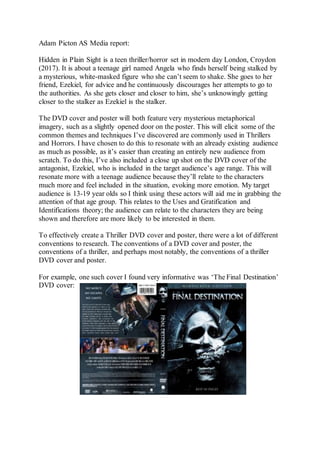
For example, one such cover I found very informative was ‘The Final Destination’
DVD cover:
2. Considering how popular this series was and still is, becoming a pop culture icon
for the thriller genre, still being referenced in modern day media, it’s obvious it
would have some amazing DVD cover art. But more so than that, what I found
most helpful was the meaning behind the box art. This series has often blurred the
line between thriller and horror, and considering the plot for Hidden in Plain Sight
does very much the same, this series in particular aids me well.
If we look closely at the front cover, we can see that the bottom half is very
obviously, a skull, however it is shrouded in darkness. This explicitly tells the
audience that the theme of death is ever present in the movie, but also hints at an
aura of mystery. Separating the bottom half of the image from the top is the effect
of shattered glass. Above the skull is the image of what appears to be a woman in
distress. This further connotes the idea that this movie is a thriller as it shows
danger. The tagline ‘Rest in Pieces’ also serves to connote danger and death. All of
these techniques and decisions serve their purpose expertly well and I have used
many of these conventions in my own DVD cover, such as using darkness to create
meaning and intrigue.
My pre-production featured a script compiling various scenes in the film. This
script only featured 2 characters and was heavily centred around stage direction,
and props, rather than focusing on a more dialogue reliant narrative.
My DVD cover features the antagonist, Ezekiel on the front and back. One with a
mask on, and the other without. However, they are very similar pictures, with the
same positioning, lighting, shot size, etc. The only difference between the front and
back images is the presence of the mask. The reason I decided not to change
anything else was to connote to the audience that Ezekiel is the one wearing the
mask. It shows there’s two sides to him. This follows the thriller-common trend of
juxtaposing themes, specifically light and dark, good and evil. The story is of
Ezekiel and his two sides; the one that Angela see’s, his caring and protective side,
and the side only we see, his secretive, malicious side. As the story progresses, we
also see Angela start to make the connection between her best friend and her
stalker, which is why I included all the similarities. I’ve also purposefully altered
the lighting so that half of Ezekiel’s face is shrouded in darkness, in both images.
This is to show that no matter what side of Ezekiel is showing, there’s always a
mask, be it metaphorically or literally. The use of the mask also has a sense of
irony, as when he is wearing it, that is when the audience sees his true self.
The poster makes use of similar techniques, however without the ability to contrast
two images as I did with the DVD cover, I decided to create mystery in another
way; with the image of a face very slightly peering through a cracked mask. The
poster is somewhat like the DVD cover in that it utilizes the same two images. The
reason I did this was to closely relate the DVD cover and poster, to ensure
audiences know it’s advertising the same film. I also didn’t want to risk giving too
3. much of the story away, and so I think the image of Ezekiel’s face ever so slightly
shown through the mask, reveals just enough about the story, as well as creating a
mysterious and sinister tone that’s become so common among Thrillers. The
amount of Ezekiel’s face that’s shown is very deliberate. I made sure to show
barely anything, to create a feeling of mystery among any who may look at the
poster. It teases the audience with a hint of who could be behind the mask, but
without seeing the film, it is near impossible to deduce who it is from just that
image alone, and so most audience members would want the answer, leaving them
no choice but to watch the film. It also hints at the main plot point of the film;
Ezekiel’s two personalities. It doesn’t give away nearly enough to ruin the plot
twist, but it perfectly represents Ezekiel’s fracturing psyche with a literal ‘crack’ in
his metaphorical mask. There’s also a feeling of irony in the fact that the mask is
cracking considering that it represents Ezekiel’s true personality. It shows that his
usual mental-state that he shows Angela is actually a mask he puts on and it’s
starting to break, revealing his true, twisted self. I blacked out the rest of the image
to draw as much attention to the mask and what’s behind it as possible, so as not to
accidentally give away any more than I needed about the plot.
Finally, the title’s for both my DVD Cover and Poster were made as big and bold
as possible. Since the images for both are relatively simple images, a lot of
attention is drawn to the main focus, and so I tried to implore a similar technique in
my usage of font and font size. In my poster, for example, the title ‘Hidden in Plain
Sight’ would obviously spark a lot of intrigue. Questions such as ‘What’s hidden?’
and ‘How can it be hidden in plain sight?’ may spring to mind. This works hand in
hand with the imagery of a crack in the mask, invoking feelings of wonder and
intrigue at what’s behind the rest. All these things create a sinister atmosphere
among the audience. It’s also quite literal in the sense that the mask is most likely
what the audience would see first, and so the title is hidden in plain sight, right in
front of the main focus.
Similarly, in my DVD cover, I made the font very big and bold, but to a lesser
extent. This is so as not to take away from the focus of both the front and back
cover images. I believe that the contrast between the two images tell enough of the
story and connote everything I need without the use of a huge title. I also made the
fonts of the titles on both my poster and DVD covers sharp, to connote the feeling
of danger. Another reason I kept the title much smaller on the DVD cover was to
allow more attention for the tagline ‘Everyone is different behind closed doors’.
Now to an audience member who has yet to see the film, this is very intriguing and
mysterious, although it’s a very good one sentence summary of the story. It aligns
with the thriller genre very well, without giving away too much of the story to a
new, unexpecting audience.
The reasoning behind my decision to change the poster font to a much more
obscure one was that the font contrasts very well with itself, varying between black
4. and white backgrounds with black and white letters, again pushing forward the
juxtaposing themes of light and dark, good and evil and represents Ezekiel’s split
personalities.
Overall, I did extensive research on various theory’s and the thriller genre to
ensure my DVD cover and poster both utilized as many techniques as possible to
reach out to my target audience and create the desired effects, such as the Uses &
Gratification theory to associate with my teenage target audience.