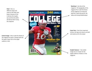
1. Masthead – the title of the
magazine. The typography of the
Flash – this is a
magazine fits in with the theme
different shape and
of the magazine its strong and
colour to the other text
bold fits in with the picture, the
boxes, because of this
bulky and strong football player.
it attracts the readers
eye and the text within
will attract them to buy
the magazine
Cover lines – lines from important
articles, the type and colours are bold
and stands out for the viewer
Central image – links in with the theme of
the magazine of sports, it being male and
the type of sport tell us the target
audience, male.
Graphic features – the smaller
image acts as a teaser for the
target audience of what is in the
magazine
2. Masthead – the title of the Pull quotes – the brief phrase
magazine normally at the top of
the magazine. The name of this
magazine ‘college lifestyle’ tells
the audience what the magazine is
about. Its eye grabbing, and the
colour fits in with the colour
Flash - the bright colour and
scheme of the magazine
odd shop attracts the viewer
and because of the brief
explanation it will entice the
audience to buy the magazine
and find out what it’s about
Cover lines – brief information
normally a bit of the headline
outlining the important articles on the Central image – this is the main image on the
magazine. It tells the audience what is cover of the magazine it draws the attention to
inside the magazine. With this the viewers and also gives them a hit what the
magazine the lines are different sizes magazine is about. In the case the name ‘college
and fonts. The lines fit in with the lifestyle’ links with the picture and he’s
colour scheme of the magazine stereotypically dressed like a student.
making the magazine consistent
Plugs
The books that he’s holding links with the theme of
college and learning.Bleed - the image carries on
down the page this makes it look more professional