1. -Textual Analysis-
Music videos allowing the audience and the fans to integrate with the band on
another level except for their musical work. However music videos are also used
to highlight and promote an artist. Music videos allow the artist to cross over
into another medium that they might not have considered before. Music videos
sole aim is to expand the audience of an artist by reaching them on a new
platform that allows them to identify them often creating a narrative that reflects
the content of the song. By entering a new market segment and platform the
artists can also increase their audience therefore resulting in an increase of sale
of their CD’s and related products. They can also be used during synergy to
connect two separate platforms into a single product that promote two products
simultaneously. For instance the use of Paramore’s song Decode that was used
for the soundtrack of Twilight so the music video featured clips from the film to
creative a narrative and to highlight the synergy between the two separate
products. Music videos also allow people to enter the platform with inventive
and creative ideas so the creation of music video’s can be a tool for entry into the
market through controversy or success.
Album covers are used to connect with the audience and to attract their
attention. Album covers can also be used to carry on an artistidentity or persona
for instance they may have a famous logo that they are known of which allows
the audience to see that it belongs to that artist. Album covers usually identify
what genre an artist is in and what their product may be like separating it from
other products. The design of the product may also increase sales, which will
benefit the artist and the producers, as well as possible increasing sales of other
artist products.
Magazine Adverts for digipaks are used to reach a larger audience as well as a
way of catching the audience’s attention and trying to increase them to buy the
product, which can be really effective. They allows the audience to identify with
the artist as well as informing the audience of a product they might of not been
aware of. By selecting a magazine that would not normally appeal to your
already formed audience you are able to find and form a brand new audience
allowing the product to reach a new audience. They also allow artists to form a
new appearance, which they may, not normally identified with allowing the
artist rebrand themselves and their music.
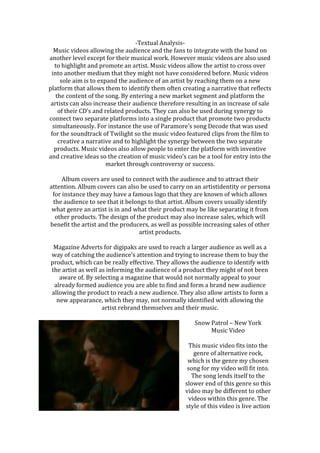
Snow Patrol – New York
Music Video
This music video fits into the
genre of alternative rock,
which is the genre my chosen
song for my video will fit into.
The song lends itself to the
slower end of this genre so this
video may be different to other
videos within this genre. The
style of this video is live action
2. so we create a relationship with the subject throughout the video. The song has a
solemn mood to it, which transcends into the music video; this allows a
connection to be formed and an in depth feeling to be shared between the
audience and the song.
The video is filmed within a bar which dark lighting which allows the mood to be
created and an atmosphere to develop. The use of lighting also fits to the genre
and the tempo of the song, which helps to create juxtaposition between the two.
However bright passing movement is shown in the shot so images have some
times been manipulated so that the lighting is lighter which allows the fun
atmosphere that is surrounding him
to be shown as the colours
connotation is excitement, lust and
passion which are all relevant to the
music video and its content. The
video also uses red lighting and
green lights to highlight the contrast
in lust and jealousy, which are both
being felt by the subject in the video.
The video incorporates multiple different codes and conventions that allow the
video to work well within the genre and within the video itself. The use of dress
codes within the video allows me to look at the connection in appearance with
the song. The use of dark clothing within the video reflects the nature and the
mood of the song and the subject. The dark greens and blacks of the subjects
clothing helps to point out that he is mysterious and emotional which links back
to the narrative of the
video. The mysterious
nature of the man links to
the storyline of the
narrative as we gain a
vague outline of why he is
upset but we never fully
understand the story to
his mood. The mise-en-
scene of the bar helps to
create a setting that juxtaposes the mood of the song and the subject, which I
think is really effective in the feel of the scene. The use of people in the video
helps to create a contrast between the mood and the actual events taken place.
The narrative follows a linear form allowing a story and sequence to form
highlight the subjects loneliness progression throughout the evening despite
being surrounded by a group of people. The narrative forms as we see the
camera diverting around the room showing the companionship and enjoyment
that is taking place in the room. The video keeps referring back to the main
subject allowing us to see the way in which his mood is effective as well as into
the way around the others have changed. The narrative of the video is fiction
however the narrative links back to the lyrics and the mood of the video and the
song allowing them to compliment each other.
3. The narrative of the video fits extremely well with the content and the lyrics of
the song that helps in the representation of the artist and of the song. The video
attracts the audience a sit allows them to identify and feel for the artist allowing
the song to become more powerful on more levels. The video contains the mood
and image that is reflected by the artists and their appearance that allows a
juxtaposition to be created. The video is filmed in live action, which allows it to
connect with the audience as if they were there as it is not abstract and
controversial. The main attraction of this video is that it creates a complete
products as well as identifying the story of the song, which will really engage
with the audience.
Although the video is not a
completely lip-synced and
doesn’t feature a band
elements of the song are still
used to show the connection
between the music video and
the song. Within the video
there is a shot of a man
playing the piano in time
with the track, which demonstrates synchronous sound, which I could use in my
music video. The music video also features lip syncing however it is not
continuous throughout the music video which allows the lyrics to be told like a
story of the character helping to highlight his emotions and traits which is
something I would like to use in my music video to create a connection with the
audience. As the music video begins a zoom shot is used to help identify that he
is the most important part of the video and the central figure as well as
highlighting the characters loneliness within video linking back to the content of
the song. It is shot as if it is from someone’s perspective as people cross paths
with the camera helping to highlight the amount of people making the man’s
loneliness and emotions become more apparent within the shot. An editing
technique is used to speed up the shoot to show the passing of time which is
really effective as it shows the correlation between the full bar and the empty
bar. This once again highlights the fact that the man is lost and lonely which is
links to the lyrics of the song and the songs meaning and message. People are
passing the cameras path and shot view once again to highlight the movement
and the mood of the bar, which helps to juxtaposition the characters emotions.
The video uses cutaways to show the contrast in the mood of the people in the
bar and the character, which is something I think, really works in the creation of
an atmosphere and a mood, which I think will be really effective if used in my
own music video. A panning establishing shot is used to show the environment
that that it is set in which really helps to identify the message and the theme of
the video.
4. Snow Patrol – Fallen Empires
Album Cover
The album I have chosen is Fallen
Empires by Snow Patrol as this is a band
that has a similar sound to the product I
hope to produce. This album fits under
the genre of Alternative Rock, which is the
genre I plan to use in my work. The name
Snow Patrol and the title of the album
Fallen Empires is placed at the top as a
way of identifying the CD as well as
identifying the genre the album falls
under through the font and the image
used. The album has a simple layout,
which is something that tends to lend itself to the rock genre, which supports the
use of it within this product. This will help the album to gain popularity as well
as being easily recognizable to its fans and its audience.
The use of the red and black in the text
are a convention of the rock genre in
album covers as it they have
connotations of love, passion, death and
mystery. It may also have connotation
danger that is also supported by the
chosen title, which identifies the album
as a fallen empire, which creates
juxtaposition between the name and the
use of the colour. The use of black for the title of Snow Patrol allows a
juxtaposition to be formed again as snow has connotations of white which may
represent youth and innocent however the black represents mystery which
when in placed with the red creates a completely new meaning for the text and
the album as a whole. The bold text face used fits well with the convention of the
album being straight rock, as it does not create any fuse or confusion through the
title. The basic font may also
indicate their music style, as it is
very basic and clean which links
to their use of simplistic and
gentle beats to create their
music. The size of the text also
helps the titles to stand out
without over powering the rest
of the cover. The size is dominant
on the page but it is not the main
part of the page, which really
works for the album cover. The
text follows the rule of thirds,
which allows it to fall into our
natural eye line, which will help
5. the title to stand out when looking at the album for purchase.
The use of the bird and the sun for the image on the album really helps to make it
stand out as it takes up the majority of the album cover whilst allowing the cover
not to be completely covered. The use of the bald eagle is extremely important to
the cover as it represents the band increasing their audience as well as spreading
their wings which links to the idea of them trying something new musically. The
eagle also has connotations of inspiration which links to the idea that they
received inspiration for this product that is extremely important to the creative
process that took place for this album to be created. The eagle may also link to
the idea of America as the album features a song called New York, which is in
America. The bald eagle is the American emblem, which creates a connection
between the album and the use of the eagle. The eagle also has connotations of
freedom, which also links to the use of the sun in the background as they both
symbolise life and growth, which are the main subjects of the album.
The colouring of the image helps us to identify that the eagle is the most
important part of the page through its large present on the cover as well as the
choice of the colouring to create mystery within the eagle as well as the use of
the orange to create a contrast between the orange and the browns. Both the
colours have a natural feeling and connation’s creating juxtaposition through the
page. The use of the orange and the red help symbolise passion and desire which
work well to form an emotion through the image. The album cover does not
feature a star or an icon on the album, which allows us to see that the artist, is
not caught up in the appearance of the them but in the content, which is the
music. The use of the grey as the background works well with the rest of the
colours and the images chosen for the cover as it has connotations of being
neutral and calm which creates a juxtaposition of the red, oranges and the
browns.
The representation of the album cover in the rock genre often don’t feature the
artist which is a convention that is followed within this album as it simply has a
piece of art on the front which is a convention that is followed a lot at the
moment as it allows the artists to focus on the work. I think this album reinforces
this ideal and this convention, which I think, really helps the audience to identify
which genre it is in. The audience of this CD will be someone who is already a fan
of Snow Patrol or a similar artist. People will buy the album as a source of
escapism, which is supported by the chosen image on the cover, as it is
something you would not see everyday as well as the idea of spreading your
wings into the unknown. Blumler & Katz (1974) stated in the uses and
6. gratification that people use media texts as a way of escapism which links well
with the context and the visuals for the album cover.
Snow Patrol – Fallen Empires
Magazine Advertisement
There is a clear correlation between the
album cover an the advertisement as they
both feature the eagle as the main point on
the page which allows the album cover and
the advert to follow a theme meaning that a
clear direction can be seen by the audience
allowing the two products to work together
and improve each others sales and effect.
However in the advert the sun is not at the
bottom of the image as the text has replaced
it making it the more prominent of the
advert. The replacement of the picture allows
the text to stand out at the bottom without
being cluttered which works well to help the
text stand out on the page and attract the
audience. The text at the bottom follows the
rule of thirds as it allows it to fall in the eye
line of the reader, which helps to draw in
their attention ultimately increasing sales
and interest in the product.
The advert is more spread out than the album cover, which allows the
information to be looked at in more detail, which helps the information at the
bottom to highlight what is on the CD and what other products are available
allowing the audience to have a greater choice, which will hopefully lead to more
purchases. The
information at the
bottom also helps
identify tracks that
have already been
released which
were successful
which helps the
reader to recognise tracks they might of already heard as well as the introducing
them to already released work. The use of the red text for the specific pieces of
information helps it to stand out which helps the advert highlight the key points
as well as to create a house style, which helps create conformity through out the
publication work and the sales work.
7. Back Down South – Kings of Leon
Music Video
This music video and the song fit into the genre alternative rock which is what
my chosen song fits into as it this may help me with ideas and plans for my own
music video. This video has a country side to it, which is evident in the music
video and in the
song itself. The
style of this
video is live
action, which
allows us to see
the progression
of a story, which
works well to
intrigue and
interest the
audience. The video combines the use of a storyline with shots of the band
playing their own instruments in a party environment. The video has a fun and
reckless feel to it which links to the lyrics and the context of the song creating
unification between the two products. The video is shot over a day so there is a
progression of time through the video, which works well to help develop the
storyline and theme of the narrative. The video also features multiple unnamed
characters, which allows a dynamic to be created in the video, which covers
multiple different circumstances and plans for the night ahead resulting in the
party scene at the end.
This video features a major convention of rock music videos as it shows the band
performing which appears in a lot of music videos. This allows the band to be
seen playing their instruments, which may result in people wanting to see them
live. The clothing warn but the majority of the male figures in the video have a
very strong country them to
them such as plaid and jean
which link back the setting
of the music video and the
context of the lyrics which
help to create a continuous
theme throughout the video
which helps identify the
genre of the song. The video
also features the use of women in shorts which may be seen as a use of the Male
Gaze theory stated by Laura Mulvey, which states that scantily clad dressed
women may draw an appeal to the male audience which can also be reversed in
the use of male figures in the video to attract the female attention so a large
audience is appealed to in the video. The songs prominent meaning is about
heading back to a home town or city and having a party and catching up with
friends and this is something that is show in the music video allowing the
audience to connect within the song and the band which helps to translate the
8. meaning indicating the use of the Encoding/Decoding theory stated by Stuart
Hall that producers encode a message into a media text and the audience decode
it taking what they need from the product. The use of it in this music video
indicates that the producers what the audience to decode the message of having
a fun atmosphere which is decoded within the video by the audience.
The narrative of the music
video follows the
progression of a variety of
peoples days as toward
the bands gig that they
attending later that day as
well as the cross cutting
between the bands gig and
the preparations for the
gig. The video follows a
linear narrative which
helps the audience to identify an order of events as well as key characters within
the plot. The narrative is fiction which allows the audience to travel on a journey
that may not have happened in real life developing a back story whilst allowing a
passage of time to be created allowing the video to show a journey in detail over
a prolonged period of time. The video shows multiple groups of people
performing various tasks throughout the day in preparation of the evening’s
events. The creation of an end setting in the video allows us to see the various
groups of people congregate in one place creating an complete equilibrium
which fits to Todorov’s Equilibrium which states that each narrative starts which
a balance in the equilibrium which is then unbalanced allowing the equilibrium
to be restored which allows the video to have a complete narrative.
The video contains iconography which allows the video to identify the artist of
the song whilst also allowing the audience to gain an interest as they may
already be fans of the band which means that they will appreciate the
iconography and the use of live instruments in the song to create a more realistic
view point. It also allows the
audience to understand the genre
of the song as well as the style of
the band both musically and
physically. It may also allow the
Male Gaze theory to appear as the
audience may be attracted to the
band which may help them to
create a more in depth interest of
the band which will help the band
with sales and interest. The video
has a clear representation of the
southern states of America which helps to create an identity for the music video
as well as allowing people from that region to identify with the event s and the
people in the video helping to create a clear depiction of the south. The use of
9. late teens and people in their 20’s allows a greater audience to identify with the
subjects of the video creating a common interest and knowledge between the
two allowing the audience to understand the mood and the style of the music
video more in depth.
The video uses a lot of cross cutting to show the various people that are featured
in the video as well as the band which allows a constant connection to be
reinstated within the video creating the progression in the story as well as
linking the beginning and the end of the video. The video features a lot of low
angle shot partially obstructed which allows the video to have a more realistic
feeling as well as giving the video a certain aesthetical feel which is allow
expanded through the use of lighting to create a unique feel and look to the
video. The camera has a continuous slight movement throughout the whole
music video which allows me to determine that a tripod was not in the films. The
slight movement helps to exaggerate the realistic element of the video allowing it
to connect with the audience better whilst creating a more in depth response
from the audience. The video consists heavily of tracking shots allowing the
audience to feel as if they are in the music video which allows the connection
between the audience and the video to be strengthened which may result in an
increase in sales and interest in their products and themselves.
Kings of Leon – Come Around Sundown
Album Cover
The album cover has the name of the album
at the bottom and the name of the band at
the top and these are the only pieces of text
upon the page allowing them to be
identifiable. The use of a single, simplistic
image is a convention within this genre on
music album covers as the bands tend to
identify themselves more with the music
then the visuals of the tracks. The use of the
single image and the style of the image
helps us to identify what genre and style the
tracks will be so from this we can guess that
the music may be rocky with a calm edge which is what the album consists of.
The lettering on the page allows us to see what genre that the music fits to as it
has a rock style to it allowing the audience to identify and understand what they
might be buying also allowing
them to increase their interest
which may lead to a purchase of
the product based on the style of
the cover. The lettering fits with
10. the image on the cover as it follow the theme by using the white whilst also not
distorting or changing the layout of the picture creating a central point of the
cover. The placing of the text also follows the rule of third which means that our
eye line naturally falls towards certain parts of the page utilizing the cover and
the artwork. The choice of font also allows the text to be clear and concise which
helps extend the style of the picture creating a complete style throughout the
cover.
The use of the orange, brown and beige colouring help to create an emotion
between the audience and the cover as well as highlighting the mood of the
album musically which may entice the audience to buy it. The orange helps to
emote a calming feeling which reflects the content of the CD allowing the
audience to understand the content of album without listening to it. The use of
the natural colouring also reflect the content of the CD and the where their music
is derived from and the nature in which
they live allowing a connection to be
formed between the music and the
audience. The colour brown has
connotations of simplicity which works
with the use of such a simple piece of art
work to create a clear and clean album
cover. Orange has connotations of luxury
which works with the idea of the palm
trees as they are often seen as a sign of
luxury within society allowing a
connection to be formed. The use of the
two palm tree’s helps to transcend a
message of relaxation and tropical nature which creates an idea of escapism
which may have been encoded by the producers to allow the audience to see the
album as a form of escapism which fits with the Uses & Gratification theory
stated by Blumler & Katz that people use media texts as a form of escapism as
well as the Encoding & Decoding theory stated by Stuart Hall.
The album cover does not contain much representation of the band themselves
which means that the product may appeal to a much larger audience then an
album cover with the bands pictures all over it as well as allowing the audience
to decided what they think about the music without any preconceived ideas
about what they think it might be. The album cover does reinforce the
convention of rock album covers not having much on the front allowing the
album to form its own identity.
11. Kings of Leon – Come Around Sundown
Magazine Advertisement
Once again there is a clear correlation
between the album cover and the
magazine advert as they feature
extremely similar colouring and the same
font. By using two media texts that have
such a clear correlation the two products
are connected and the target audience is
able to identify the two products and
create a connection themselves between
the two. Although the two products are
similar the advertisement contains a
different picture which depicts the edge
of the palm tree which is within the
album cover. The text however follows a
similar layout to the album cover by
placing the band name at the top and the
album name at the bottom which allows
the image to be a fundamental part of the
page once again. The replacement of the
picture allows the layout to be clearer as
it allows the text to be placed in a way that does not conflict with the image. The
palm tree once again symbolizes escapism and luxury which reinforces the
encoding and decoding theory allowing the audience to create their own idea
about what the product symbolizes.
The text at the bottom
indicates where and when you
can by the products which
allow the audience to know the
main details about the album
allowing the product to reach a
wider audience as well as
informing them of specific
details. The use of the white text on the background helps the albums text to
stand out which will allow the text to be more easily read as well as being clearer
from a distance allowing it to grab the attention of the audience as they flick
through the magazine. The placing of the text also allows it to follow the rule of
thirds which means that the reader’s attention will be drawn to the specific parts
of the page where the key information is. The use of the sales company logo also
allows people to create a visual memory of the product which may help them to
find the product when it is released on sale. The use of the website address on
the advert also means that the audience may go look on their website which may
result in them seeing other Kings of Leon products which allows the audience to
increase their interest as well as their purchasing habits.