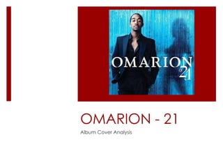
2. Omarion Front Cover Analysis There is a mid-shot displaying him from his torso upwards, he is dressed sexy/smartly in order to reinforce and display the genre he is involved in. Also he bears his chest in an attempt to draw more female audiences. There is a a shadow of a female behind a blue screen, this is typical of an R&B cover because the girl is always the object of the mystery. The effects used is quite unusual but the concept is still understandable, I can grasp the denotation that there is always the border or barrier between him and the female. The font in which his name is displayed in is very simple while there is a little change in font with the album name. The number 21 signifies his auspicious age and is meant to connote growing up after leaving B2K (his previous group).
3. Omarion Back Cover Analysis There is a big change of the back cover in terms of the array of colours used. Instead of the special effects, the back cover is very basic. The thing that has remained consistent is the clothes, Omarion is still dressed smart. This again signifies him growing up and moving up a stage in his life. The colours of the font is contrasting with what he is wearing as it is in black and white There is the production label and information on the artist, the back cover isn’t as detailed as other CD covers but it does it’s job in terms of supporting the title name
5. Omarion Front Cover Analysis 2 This front cover is very basic in terms of the colours it uses, there is the use of a black and white background. The artist himself is in black and white do the contrast is consistent. The ‘O’ represents his name and there is a crown on top, this links to the tattoo on his left shoulder. The title name is in brown so I can anticipate that the rest of the typing on the CD cover will be brown. We see the use of jewelry again to reinforce the use of royalty, this was already displayed the crown.
6. Omarion Back Cover Analysis 2 As anticipated the font is consistent with the title name while the colours remains brown. There is no real special effects used which is different from his ‘21’ album so this could be something we can use – keep it basic. The border is brown and the display of production teams is coveted in brown. We can see the crown tattoo on his left shoulder again and there’s the earring displayed again. Below we see the links and websites which the fans can go to and therefore increase their fan base.