
Recommended
More Related Content
What's hot
What's hot (20)
Viewers also liked
Viewers also liked (16)
Similar to Magazine conventions
Similar to Magazine conventions (20)
More from 10bertal
Recently uploaded
Recently uploaded (20)
Magazine conventions
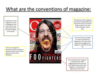
- 1. What are the conventions of magazine: The features of the magazine connotes to it being about the lives of the artists, it involves drugs as well as sex, even leisure activities such as golf.. The music magazine is general and varies in genre, it mentions artists such as Nicki Minaj as well as Arctic Monkeys. Use of red, black and white to create a professional appearance. The uses of the gold and red suggests the magazine is about fame and sex. The masthead of the magazine is covered by the artist, suggesting that the artist will most likely be discussed in the magazine. It also shows the significance of the artist. Commonly in music magazine an artist is displayed on the front. We can see what seems to be his band members in his mouth.
- 2. Masthead uses the colour gold. It could do this to contrast with the blue background or signify wealth. List of rock bands that indicate the magazine is about rock. Picture of what seems to be a member of a rock band. This magazine is most likely aimed at people who are into mainstream rock anywhere between the ages of 15-30. Rock magazine. The nature of the incomplete sentences may cause curiosity within the reader. The use of the colour turquoise, gold and dark blue fit nicely together, making the magazine aesthetically pleasing.
- 3. The font used for the title of the magazine makes the magazine look old, and therefore, more established. The picture was shot in a way that makes me old. The picture may be of one of the artists mentioned. The target audience is very hard to determine because there is a mention of a current artist like Jay-Z but also of an older artist like Willie Nelson. This makes me inclined to think that the there is no set demographic nor music taste being appealed, but current successful artists. The use of the names of famous people will catch the attention of the audience. Rock-influenced magazine.
- 4. The issue number suggests the newspaper, as well as acting as an index for frequent readers of Q, who own many issues of the magazine. The mixture of pictures with the page number as well as written features in the article (also indicated with a page number) is done deliberately to make the contents page look more interesting and less bland by having a variation in image in text. The contrasting use of the colours red, black and white make the magazine seem more professional, as the colours are often associated with formality. A Lot of the artists in this contents page are rather old, suggesting that this issue or the magazine as a whole, is aimed at people who are between the ages of 30-50. The use of headers make the contents page feel far more structured.
- 5. This contents page is different from many other ones in the sense that the contents of the magazine are not highlighted as clearly as one might expect. This contents page seems has a lot more focus on an image than most magazines do, this might be because the person who is in the picture maybe part of what the music magazine makes consider the most important story. The contents page has a color scheme of dark grey and light grey. This may be an attempt by the creators of the contents page to give a more modern image to the page, by using colours that can be attributed to metal and technology.
- 6. The fact that this woman takes up around about half of the double spread suggests the she is important to the story. The use of red tilted writing for “Lily Allen” in comparison to the rather plain and formal writing seen on the article suggests that Lily Allen is important to the story. The use of typography that is made to deliberately look like newspaper cut outs to catch the attention of the reader, as well as to go hand in hand with the rebellious and wild dress sense of the woman on the right (who is Lily Allen). The colour of scheme of red, black and white may be used to ensure that the picture stands out but also matches the attire the woman wears, making the music magazine look professional.
- 7. The J in the middle of the writing could be used to highlight the the importance of Jay Z. The picture of a black male dressed in full black with different lighting on both halves of the picture make the man in the image look cool and modern. The quote is in red in order in order to suit the colour scheme of the magazine, as well as to be eyecatching The use of bold capital letters for the beginning of the paragraphs is done to ensure that the reader stays interested. It may also be used to signify that the paragraph is important
- 8. The fact that the picture of this woman is so covering such a big amount of the page suggest she is important to the story Due to the size of the writing and the fact it is near the picture suggest that the picture is of Alexandra Burke, and that she is the main focus in the story. The use of pink, white and black may be prevalent in the article because, the black and white preserve the formality of the article but, the pink is used to make the double spread page less monotone (in terms of colour), therefore keeping the reader interested Page number to makes it easier for us to navigate, as well as making the magazine look professional.
- 9. The date of the magazine conflicts with the layout of the magazine because it says it was published in 2002, but the nature of the things on the contents page say otherwise. This is most likely because the creators of the contents page for Mojo wanted to recreate the feeling of a music magazine which was written 20 to 30 years ago. The use of a bold red background to harbour the titles of the articles makes the boxes stand out, the gold writing also complements the red colour, as well as standing out. The way in which the people who made Mojo’s content page placed the images, makes the contents page for more interesting for the reader to look at, but not too complex to detract from the importance of a summary of what will be found in the magazine, and on which pages. The typography used in the contents page for the titles of the articles contradicts the creative way in which images were presented on the contents page, with very formal and what one might deem uncreative writing.