1. Two doorcinema club - magazine advert
The two door cinema club are a northern Irish Indie rock band formed in 2007; the magazine
advert I am looking at is to advertise a tour for their debut album, released in 2010.
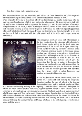
What originally drew my to this album advert was the strange and quirky main image of a cat
wearing a cardboard crown which is also used on the album cover; this image seems to stick with
me and is very memorable and recognisable for its oddity. I also like the aesthetic of the main
image in the style it is taken, it looks as though a Polaroid camera or film camera has been used
with flash and possibly aperture priority to give it that washed out and over exposed appearance
which only ads to the style of the image. I would like t similarly use film photography in my own
ancillary as I feel it resonates with the indie genre well in its style and vintage, worn out
appearance.
This image has also been edited with what appears to
be lines coming from the cats eyes, which look to be
hand drawn, again adding to the hand made and
personal style of the poster, this is again something I
would like to try with my ancillary. The lines add a
sort of comic, animated quality to the image an add
another layer of interest to the picture. Not only this
but the direct address given to the camera from the cat
captivate the audience, as well as this the lines
coming from the eyes outward almost give the
impression that the cat is trying to hypnotise the
audience; the cardboard crown adds to this effect, the
cat is crowned royal and puts the animal in a position
where it seems to be more powerful and important
than the viewer, which is rather humorous and
random when depicted in such a way.
I also like the layout of the album advert, with the
simple white sans serif font framing the image and
bringing together the over all advert at the top and
bottom of the page, it gives a classic quality and I find
it to be very aesthetically pleasing in its simplicity. There are several fonts used throughout the
advert, all rather similar in style and linked together in their colour of white which I think is
important in ultimately giving a professional appearance. The band name logo is a combination of
a bold square sans serif font and a much thinner and almost feminine font on the rounded letters
which creates diversity and makes the title more interesting to look at; the rest of the font on the
advert mirrors this with combining on the same line thin lettering on either side of the bolder
chunkier lettering, this centres the text and brings a balance to the text aligning it with the main
image and title above.