SlideShare a Scribd company logo
1 of 3
FilmMagazine Front Cover Overview.
The layout of this
Niche horror fanatical
magazine, somewhat
subverts traditional magazine
layout conventions. An example
of this is the sell limes, all magazines use sell lines, however that positioning of the sell lines
of the front covers of Fangoria is quite alternative. They don’t have any sell lanes down the
right-hand side of the page, this is left empty, the main image is in the centre if the page on
both Fangoria magazines and the right-hand side of the cover includes irrelevant parts of
the main image. More traditionally there are sell lines down the left-hand side of the
magazine cover however the way these are presented are not traditional either, there are
only three sell lines and they go beside an image. As well as this it’s not as if the smaller
images and the sell lines are just arranged down the left-hand side of the page in a way that
is designed to look aesthetically pleasing, they are positioned in wat looks like a roll of film,
referencing the fact it is a filmmagazine. It is unusually for a magazine to feature only three
sell lines on the front cover, usually a magazine will attempt to include as many as they can
(while trying to make the front cover look as aesthetically pleasing of course), this is to
showcase what the magazine includes and draw consumers to purchase the product.
However, Fangoria is a magazine aimed at horror film fanatics, as I previously mentioned it
has a very specific/niche market, therefore the individuals purchasing the magazine will be
regular readers, people won’t pick up Fagoria for a casual read because they saw it on the
shelf. It’ll be purchased by individuals loyal to the brand that regularly purchase the product.
Therefore, having sell lines to attract people to buy the magazine isn’t important to Fangoria
due to the fact their readership will purchase the product even if it doesn’t jump out at
them. Therefore, maintaining brand identity and subtly featuring the theme that it is a film
magazine is more important to the brand, this is why the sell lines are arranged in what
looks to be a roll of film.
Although I have indicated that Total Film and Empire have a more traditional ideas in terms
of their sell lines, this isn’t always the case, some of their designs are slightly more
alternative and I have included some of these in the selections of front covers featuring
above.
Another point of interest when comparing these magazine front covers is the main sell lines,
there is a different in style and size that is designed intentionally for specific reasons. for
example, on the front covers of magazines produced by Fangoria, the sell lines are relatively
small, they’re smaller than the sell lines on Total Film and Empire. This is because Fangoria
want you to focus on the image, when you see the magazine you should be first drawn to
the image, not text. This is because often the main image is iconography of horror and may
be very shocking. They don’t want to take anything away from the shocking image by
placing large text over it.
Empire have gone for a very different approach regarding the style and design of their sell
lines on the magazine featuring a front cover with a focus on inception. As usual there are
many sell lines down each side of the page, this is expected with an empire magazine,
however the style of the sell lines portray movement and references the movement if
people’s minds, thoughts and perception, which is what the narrative of the film is based
on.
Empires conventions regarding sell line layout is clearly dropped at the release of a big
blockbuster movie. Two empire front covers feature no sell lines at all, these are the font
covers for the new James Bond film and for the release of the new X-Men film. Neither of
these feature any sell lines other than a small line of text under the title of the film. The
reason for this is because both these films are iconic, the Bond franchise is one of the
biggest filmfranchises in the world, and filmenthusiasts will be excited for the release of
this film, therefore sell lines aren’t necessary to draw an audience in. Also they want to give
the idea that the whole magazine revolves around the new bond film, therefore the loyal
regular buyers of the magazine will purchase the copy, as well as any Bond fans that may
happen to see it on the shelf. The same goes for the X-Men themed copy of empire,
although the X-Me films themselves aren’t patricianly iconic films like the bond franchise,
they do belong to Marvel, which is the biggest brand of super hero movies in the world.
Therefore the same principle applies, keep the front cover minimalistic to ensure all
attention s drawn to the picture which will be recognised by everyone, therefore sell lines
are not only unnecessary but unwanted.
The mast head is something that every magazine features, and usually creativity regarding
the mast head design is limited, as the same mast head features in the same place of every
magazine as it is representative for the brands identity and I’ll be recognisable. However
there are some exceptions and I’ve featured the in the examples above the text.
Total filmhave a recognisable mast head that more often than not, is white in colour and
features the word ‘Film’ very large across the top of the page, it features the word total with
the letter ‘F’ of the large word film. This is a recognisable masthead and enables audiences
to grasp what genre of magazine it is at a glance. However, in the issue of Total Film that has
a focus on the release of Inception the design of the mast head was slightly different.
The filmInception is a science fiction based film and Total Film have attempted to reflect
this with a change in style to their mast head. The size, positioning and front are all the
same as they are on every other issue, this is where the brand identity is maintained.
However, the letters are usually block filled with one colour, normally white, yet this isn’t
not the case with this issue. This issue of Total Film magazine has changed the standard
white block fill text to the design of a science fiction lab. If you look at the letters, they
contain photographs of what looks to be a science fiction lab, this reflects the narrative of
the movie itself.
Total Film aren’t the only ones who have change the design of their masthead for the
release of a big film. Empire have also done this, this time, for the release of the Bond film.
their convention bright red mast head is replaced by a more classy and elegant gold. This
represents the bond franchise and the fact Bond is seen as a professional, classy character.
It also relates to the main image of the picture, which is a scrubbed up, clean shaven Bond
with a side parting and a suit on. The pure white background along with the gold mast head
reflect the classiness and professionalismsurrounding James Bond himself.
The classy gold masthead featuring on the cover of empire is a total contrast to the style of
mast head featuring on the Fangoria magazines. The Fangoria magazines have a mast head
with I suppose could almost be classed as unprofessional or tacky, however this appeals to
the target audience and reflects their brand identity as these criticisms are relevant to
horror. A total divergence to the mast heads featuring on Total Film and Empire, as readers
of these magazines seek a polished and professional film magazine, the mast heads of these
magazines reflect this with their simple bold style and red and white colours,

More Related Content

What's hot

Magazine covers
Magazine coversMagazine covers
Magazine covers
hamishtl
 
Media2014 front cover conventions
Media2014 front cover conventionsMedia2014 front cover conventions
Media2014 front cover conventions
Jake Shelvey
 
Empire Film Magazine Deconstruction
Empire Film Magazine DeconstructionEmpire Film Magazine Deconstruction
Empire Film Magazine Deconstruction
clairemedia1
 
magazine cover content page and double spread analysis
magazine cover content page and double spread analysismagazine cover content page and double spread analysis
magazine cover content page and double spread analysis
shazrehshahzad
 
Media2014 front cover overview
Media2014 front cover overviewMedia2014 front cover overview
Media2014 front cover overview
Jake Shelvey
 
Movie Magazine Codes & Conventions
Movie Magazine Codes & ConventionsMovie Magazine Codes & Conventions
Movie Magazine Codes & Conventions
dmckee711
 

What's hot (18)

Front Cover Overview
Front Cover OverviewFront Cover Overview
Front Cover Overview
 
Magazine covers
Magazine coversMagazine covers
Magazine covers
 
Media2014 front cover conventions
Media2014 front cover conventionsMedia2014 front cover conventions
Media2014 front cover conventions
 
Empire Film Magazine Deconstruction
Empire Film Magazine DeconstructionEmpire Film Magazine Deconstruction
Empire Film Magazine Deconstruction
 
Unit 51 page layout
Unit 51 page layoutUnit 51 page layout
Unit 51 page layout
 
Format research- Film magazine
Format research- Film magazine Format research- Film magazine
Format research- Film magazine
 
magazine cover content page and double spread analysis
magazine cover content page and double spread analysismagazine cover content page and double spread analysis
magazine cover content page and double spread analysis
 
Magazine overview.
Magazine overview.Magazine overview.
Magazine overview.
 
Magazine analysis
Magazine analysisMagazine analysis
Magazine analysis
 
Total film - Magazine Analysis
Total film - Magazine AnalysisTotal film - Magazine Analysis
Total film - Magazine Analysis
 
Media2014 front cover overview
Media2014 front cover overviewMedia2014 front cover overview
Media2014 front cover overview
 
Movie Magazine Codes & Conventions
Movie Magazine Codes & ConventionsMovie Magazine Codes & Conventions
Movie Magazine Codes & Conventions
 
Magazine overview
Magazine overviewMagazine overview
Magazine overview
 
Film mag analysis 2
Film mag analysis 2Film mag analysis 2
Film mag analysis 2
 
Coursework ppt 4
Coursework ppt 4Coursework ppt 4
Coursework ppt 4
 
Evaluation Question 1
Evaluation Question 1Evaluation Question 1
Evaluation Question 1
 
Magazine analysis
Magazine analysisMagazine analysis
Magazine analysis
 
Magazine assignment v2 2
Magazine assignment v2 2Magazine assignment v2 2
Magazine assignment v2 2
 

Similar to Film Magazine Front Cover Overview

Film magazines
Film magazinesFilm magazines
Film magazines
bir
 
Front cover analysis - Empire and Total Film magazine
Front cover analysis - Empire and Total Film magazineFront cover analysis - Empire and Total Film magazine
Front cover analysis - Empire and Total Film magazine
ChrisJDonnellan
 
Magazine research and planning
Magazine research and planningMagazine research and planning
Magazine research and planning
tc160797
 
Assignment media digital:printed magazine.. jack willoughby
Assignment media digital:printed magazine.. jack willoughby Assignment media digital:printed magazine.. jack willoughby
Assignment media digital:printed magazine.. jack willoughby
Emma Leslie
 

Similar to Film Magazine Front Cover Overview (20)

Front cover overview
Front cover overviewFront cover overview
Front cover overview
 
Magazine cover analysis one
Magazine cover analysis oneMagazine cover analysis one
Magazine cover analysis one
 
A2 Media Studies Ancillary task
A2 Media Studies Ancillary task A2 Media Studies Ancillary task
A2 Media Studies Ancillary task
 
Film magazines
Film magazinesFilm magazines
Film magazines
 
Magazine Overview
Magazine OverviewMagazine Overview
Magazine Overview
 
Magazine cover research
Magazine cover researchMagazine cover research
Magazine cover research
 
Front cover overview
Front cover overview Front cover overview
Front cover overview
 
Magazine Front Cover Analysis One
Magazine Front Cover Analysis OneMagazine Front Cover Analysis One
Magazine Front Cover Analysis One
 
Front cover analysis - Empire and Total Film magazine
Front cover analysis - Empire and Total Film magazineFront cover analysis - Empire and Total Film magazine
Front cover analysis - Empire and Total Film magazine
 
Magazine research and planning
Magazine research and planningMagazine research and planning
Magazine research and planning
 
Assignment media digital:printed magazine.. jack willoughby
Assignment media digital:printed magazine.. jack willoughby Assignment media digital:printed magazine.. jack willoughby
Assignment media digital:printed magazine.. jack willoughby
 
Magazine Overview
Magazine OverviewMagazine Overview
Magazine Overview
 
Magazine Front Cover Analysis One
Magazine Front Cover Analysis OneMagazine Front Cover Analysis One
Magazine Front Cover Analysis One
 
Magazine Front Cover Overview
Magazine Front Cover OverviewMagazine Front Cover Overview
Magazine Front Cover Overview
 
Codes and Conventions of Film Magazine Covers.pptx
Codes and Conventions of Film Magazine Covers.pptxCodes and Conventions of Film Magazine Covers.pptx
Codes and Conventions of Film Magazine Covers.pptx
 
Empire magazine- house styles and conventions
Empire magazine- house styles and conventionsEmpire magazine- house styles and conventions
Empire magazine- house styles and conventions
 
Magazine Overview.
Magazine Overview.Magazine Overview.
Magazine Overview.
 
Magazine overview.
Magazine overview.Magazine overview.
Magazine overview.
 
Magazine analysis
Magazine analysisMagazine analysis
Magazine analysis
 
Empire Magazine
Empire Magazine Empire Magazine
Empire Magazine
 

Recently uploaded

An Overview of Mutual Funds Bcom Project.pdf
An Overview of Mutual Funds Bcom Project.pdfAn Overview of Mutual Funds Bcom Project.pdf
An Overview of Mutual Funds Bcom Project.pdf
SanaAli374401
 
Gardella_PRCampaignConclusion Pitch Letter
Gardella_PRCampaignConclusion Pitch LetterGardella_PRCampaignConclusion Pitch Letter
Gardella_PRCampaignConclusion Pitch Letter
MateoGardella
 
The basics of sentences session 2pptx copy.pptx
The basics of sentences session 2pptx copy.pptxThe basics of sentences session 2pptx copy.pptx
The basics of sentences session 2pptx copy.pptx
heathfieldcps1
 
Gardella_Mateo_IntellectualProperty.pdf.
Gardella_Mateo_IntellectualProperty.pdf.Gardella_Mateo_IntellectualProperty.pdf.
Gardella_Mateo_IntellectualProperty.pdf.
MateoGardella
 

Recently uploaded (20)

Nutritional Needs Presentation - HLTH 104
Nutritional Needs Presentation - HLTH 104Nutritional Needs Presentation - HLTH 104
Nutritional Needs Presentation - HLTH 104
 
An Overview of Mutual Funds Bcom Project.pdf
An Overview of Mutual Funds Bcom Project.pdfAn Overview of Mutual Funds Bcom Project.pdf
An Overview of Mutual Funds Bcom Project.pdf
 
Application orientated numerical on hev.ppt
Application orientated numerical on hev.pptApplication orientated numerical on hev.ppt
Application orientated numerical on hev.ppt
 
Z Score,T Score, Percential Rank and Box Plot Graph
Z Score,T Score, Percential Rank and Box Plot GraphZ Score,T Score, Percential Rank and Box Plot Graph
Z Score,T Score, Percential Rank and Box Plot Graph
 
Advanced Views - Calendar View in Odoo 17
Advanced Views - Calendar View in Odoo 17Advanced Views - Calendar View in Odoo 17
Advanced Views - Calendar View in Odoo 17
 
microwave assisted reaction. General introduction
microwave assisted reaction. General introductionmicrowave assisted reaction. General introduction
microwave assisted reaction. General introduction
 
Accessible design: Minimum effort, maximum impact
Accessible design: Minimum effort, maximum impactAccessible design: Minimum effort, maximum impact
Accessible design: Minimum effort, maximum impact
 
Mattingly "AI & Prompt Design: The Basics of Prompt Design"
Mattingly "AI & Prompt Design: The Basics of Prompt Design"Mattingly "AI & Prompt Design: The Basics of Prompt Design"
Mattingly "AI & Prompt Design: The Basics of Prompt Design"
 
APM Welcome, APM North West Network Conference, Synergies Across Sectors
APM Welcome, APM North West Network Conference, Synergies Across SectorsAPM Welcome, APM North West Network Conference, Synergies Across Sectors
APM Welcome, APM North West Network Conference, Synergies Across Sectors
 
fourth grading exam for kindergarten in writing
fourth grading exam for kindergarten in writingfourth grading exam for kindergarten in writing
fourth grading exam for kindergarten in writing
 
Advance Mobile Application Development class 07
Advance Mobile Application Development class 07Advance Mobile Application Development class 07
Advance Mobile Application Development class 07
 
Basic Civil Engineering first year Notes- Chapter 4 Building.pptx
Basic Civil Engineering first year Notes- Chapter 4 Building.pptxBasic Civil Engineering first year Notes- Chapter 4 Building.pptx
Basic Civil Engineering first year Notes- Chapter 4 Building.pptx
 
Gardella_PRCampaignConclusion Pitch Letter
Gardella_PRCampaignConclusion Pitch LetterGardella_PRCampaignConclusion Pitch Letter
Gardella_PRCampaignConclusion Pitch Letter
 
Mehran University Newsletter Vol-X, Issue-I, 2024
Mehran University Newsletter Vol-X, Issue-I, 2024Mehran University Newsletter Vol-X, Issue-I, 2024
Mehran University Newsletter Vol-X, Issue-I, 2024
 
The basics of sentences session 2pptx copy.pptx
The basics of sentences session 2pptx copy.pptxThe basics of sentences session 2pptx copy.pptx
The basics of sentences session 2pptx copy.pptx
 
Gardella_Mateo_IntellectualProperty.pdf.
Gardella_Mateo_IntellectualProperty.pdf.Gardella_Mateo_IntellectualProperty.pdf.
Gardella_Mateo_IntellectualProperty.pdf.
 
Unit-V; Pricing (Pharma Marketing Management).pptx
Unit-V; Pricing (Pharma Marketing Management).pptxUnit-V; Pricing (Pharma Marketing Management).pptx
Unit-V; Pricing (Pharma Marketing Management).pptx
 
Holdier Curriculum Vitae (April 2024).pdf
Holdier Curriculum Vitae (April 2024).pdfHoldier Curriculum Vitae (April 2024).pdf
Holdier Curriculum Vitae (April 2024).pdf
 
Ecological Succession. ( ECOSYSTEM, B. Pharmacy, 1st Year, Sem-II, Environmen...
Ecological Succession. ( ECOSYSTEM, B. Pharmacy, 1st Year, Sem-II, Environmen...Ecological Succession. ( ECOSYSTEM, B. Pharmacy, 1st Year, Sem-II, Environmen...
Ecological Succession. ( ECOSYSTEM, B. Pharmacy, 1st Year, Sem-II, Environmen...
 
psychiatric nursing HISTORY COLLECTION .docx
psychiatric  nursing HISTORY  COLLECTION  .docxpsychiatric  nursing HISTORY  COLLECTION  .docx
psychiatric nursing HISTORY COLLECTION .docx
 

Film Magazine Front Cover Overview

  • 1. FilmMagazine Front Cover Overview.
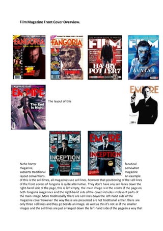
 The layout of this Niche horror fanatical magazine, somewhat subverts traditional magazine layout conventions. An example of this is the sell limes, all magazines use sell lines, however that positioning of the sell lines of the front covers of Fangoria is quite alternative. They don’t have any sell lanes down the right-hand side of the page, this is left empty, the main image is in the centre if the page on both Fangoria magazines and the right-hand side of the cover includes irrelevant parts of the main image. More traditionally there are sell lines down the left-hand side of the magazine cover however the way these are presented are not traditional either, there are only three sell lines and they go beside an image. As well as this it’s not as if the smaller images and the sell lines are just arranged down the left-hand side of the page in a way that
  • 2. is designed to look aesthetically pleasing, they are positioned in wat looks like a roll of film, referencing the fact it is a filmmagazine. It is unusually for a magazine to feature only three sell lines on the front cover, usually a magazine will attempt to include as many as they can (while trying to make the front cover look as aesthetically pleasing of course), this is to showcase what the magazine includes and draw consumers to purchase the product. However, Fangoria is a magazine aimed at horror film fanatics, as I previously mentioned it has a very specific/niche market, therefore the individuals purchasing the magazine will be regular readers, people won’t pick up Fagoria for a casual read because they saw it on the shelf. It’ll be purchased by individuals loyal to the brand that regularly purchase the product. Therefore, having sell lines to attract people to buy the magazine isn’t important to Fangoria due to the fact their readership will purchase the product even if it doesn’t jump out at them. Therefore, maintaining brand identity and subtly featuring the theme that it is a film magazine is more important to the brand, this is why the sell lines are arranged in what looks to be a roll of film. Although I have indicated that Total Film and Empire have a more traditional ideas in terms of their sell lines, this isn’t always the case, some of their designs are slightly more alternative and I have included some of these in the selections of front covers featuring above. Another point of interest when comparing these magazine front covers is the main sell lines, there is a different in style and size that is designed intentionally for specific reasons. for example, on the front covers of magazines produced by Fangoria, the sell lines are relatively small, they’re smaller than the sell lines on Total Film and Empire. This is because Fangoria want you to focus on the image, when you see the magazine you should be first drawn to the image, not text. This is because often the main image is iconography of horror and may be very shocking. They don’t want to take anything away from the shocking image by placing large text over it. Empire have gone for a very different approach regarding the style and design of their sell lines on the magazine featuring a front cover with a focus on inception. As usual there are many sell lines down each side of the page, this is expected with an empire magazine, however the style of the sell lines portray movement and references the movement if people’s minds, thoughts and perception, which is what the narrative of the film is based on. Empires conventions regarding sell line layout is clearly dropped at the release of a big blockbuster movie. Two empire front covers feature no sell lines at all, these are the font covers for the new James Bond film and for the release of the new X-Men film. Neither of these feature any sell lines other than a small line of text under the title of the film. The reason for this is because both these films are iconic, the Bond franchise is one of the biggest filmfranchises in the world, and filmenthusiasts will be excited for the release of this film, therefore sell lines aren’t necessary to draw an audience in. Also they want to give the idea that the whole magazine revolves around the new bond film, therefore the loyal regular buyers of the magazine will purchase the copy, as well as any Bond fans that may happen to see it on the shelf. The same goes for the X-Men themed copy of empire, although the X-Me films themselves aren’t patricianly iconic films like the bond franchise,
  • 3. they do belong to Marvel, which is the biggest brand of super hero movies in the world. Therefore the same principle applies, keep the front cover minimalistic to ensure all attention s drawn to the picture which will be recognised by everyone, therefore sell lines are not only unnecessary but unwanted. The mast head is something that every magazine features, and usually creativity regarding the mast head design is limited, as the same mast head features in the same place of every magazine as it is representative for the brands identity and I’ll be recognisable. However there are some exceptions and I’ve featured the in the examples above the text. Total filmhave a recognisable mast head that more often than not, is white in colour and features the word ‘Film’ very large across the top of the page, it features the word total with the letter ‘F’ of the large word film. This is a recognisable masthead and enables audiences to grasp what genre of magazine it is at a glance. However, in the issue of Total Film that has a focus on the release of Inception the design of the mast head was slightly different. The filmInception is a science fiction based film and Total Film have attempted to reflect this with a change in style to their mast head. The size, positioning and front are all the same as they are on every other issue, this is where the brand identity is maintained. However, the letters are usually block filled with one colour, normally white, yet this isn’t not the case with this issue. This issue of Total Film magazine has changed the standard white block fill text to the design of a science fiction lab. If you look at the letters, they contain photographs of what looks to be a science fiction lab, this reflects the narrative of the movie itself. Total Film aren’t the only ones who have change the design of their masthead for the release of a big film. Empire have also done this, this time, for the release of the Bond film. their convention bright red mast head is replaced by a more classy and elegant gold. This represents the bond franchise and the fact Bond is seen as a professional, classy character. It also relates to the main image of the picture, which is a scrubbed up, clean shaven Bond with a side parting and a suit on. The pure white background along with the gold mast head reflect the classiness and professionalismsurrounding James Bond himself. The classy gold masthead featuring on the cover of empire is a total contrast to the style of mast head featuring on the Fangoria magazines. The Fangoria magazines have a mast head with I suppose could almost be classed as unprofessional or tacky, however this appeals to the target audience and reflects their brand identity as these criticisms are relevant to horror. A total divergence to the mast heads featuring on Total Film and Empire, as readers of these magazines seek a polished and professional film magazine, the mast heads of these magazines reflect this with their simple bold style and red and white colours,