1. Rihanna – Loud Album Analysis
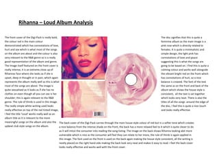
The front cover of the Digi-Pack is really bold, The disc signifies that this is quite a
the colour red is the main colour feminine album as the main image is a
demonstrated which has connotations of love, pink rose which is directly related to
hurt and sex which is what most of the songs females. It is quite a minimalistic and
on the album are about and the colour is also simple design, the light pink has
very relevant to the R&B genre so is a really connotations of love and peace
good representation of the album and genre. suggesting this is what the songs are
The Image itself featured on the front cover is going to be based on. I find this is quite a
really intense, it is an extreme close up of calming colour and works well alongside
Rihannas face where she looks as if she is the vibrant bright red on the front which
upset, deep in thought or in pain, which again has connotations of hurt, so a nice
represents the album really well as this is what balance is created. The font of the text
most of the songs are about. The image is the same as on the front and back of the
quite sexualised as it looks as if she has no album which shows the house style is
clothes on even though all you can see is her consistent, all the text is sat together
shoulder; this is again relevant to the R&B which looks very neat. There is also the
genre. The rule of thirds is used in this image. titles of all the songs around the edge of
The really simple white writing used looks the disc, I feel this is quite a nice touch
really effective on top of the red tinted image, and looks really effective.
I feel the title ‘Loud’ works really well as an
album title as it is relevant to the more
meaningful songs on the album and also the The back cover of the Digi-Pack carries through the main house style colour of red but in a softer tone which creates
upbeat club style songs on the album. a nice balance from the intense shade on the front, the back has a more relaxed feel to it which is quite clever to do
as it will intice the consumer into reading the song listing. The image on the back shows Rihanna looking abit more
vulnerable which is nice as the consumer will feel they can relate to her more, the rule of thirds is again applied in
this image. The font used on the front is used on the back again making the house style consistent, all the writing is
neatly placed on the right hand side making the back look very neat and makes it easy to read. I feel the back cover
looks really effective and works well with the front cover.