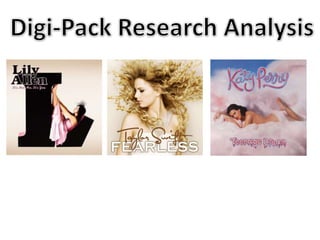
2. The large ‘L’ is the The ‘It’s not me, It’s you’ underneath the artists name catches your
main focus of the eye because its in a different colour too the rest of the font and is in
CD cover. It is in a a different style. The font style is in italics again giving a feminine feel
simple font not to the cover as well as the fact its in light pink again matching up
making it too fancy with the dress colour. The font used is a very soft
and in the black font but bold, I think that
which really stands the colour of the font is the
out off the dull reason its so eye catching. If
colour of the the font was a light colour
background cover. the cover would look un-
Obviously the large professional.
‘L’ is the artists first
initial which is a The Solo artist is shown
great way for brand near enough central on
identity because as the cd cover so she
soon as you see the stands out and buyers
‘L’ you would think know exactly who’s
Lily Allen straight album this is. She is
away. dressed in a pink dress,
The layout of the CD cover is very simple making the main very girly giving a very
focus been the ‘L’ with Lilly Allen sat on it stand out feminine feel to the
massively. Because there isn't much going on it making cover. The way that the
the cover look professional and different from other CD artist is sat in the large
covers. I think that the cover suites the style of music Lily letter ‘L’ suggests straight
Allen does which is away she is Lily Allen.
3. The same large Again the same background colour has been used as the front cover
letters have been which again shows clearly that there from the same album and links
used on the back them together. I think the colour of the background relates well to
cover as the large the artist as she is a female and her songs are very gentle but
‘L’ for Lily Allen on meaningful, the background gives a calm look to the cover.
the front cover. I The layout of the
think that this links back cover works
the two covers really well, it shows
together nicely and the songs on the
gives a certain album very clearly
house style to the and match's the
album case. For me front cover. The
it makes me back cover hasn’t
recognise them got to much on it
very well and if I and the large
saw them I would letters give a strong
straight away think statement.
of Lily Allen’s
album.
4. The layout of the front The dominant image is of the artist looking very pretty and girly.
cover doesn’t have The reason in which the dominant image is of the artist is so you
much on it this is know immediately who’s album it is as she is very recognisable. I
suitable for a music think the way her hair is very wild makes her look powerful and
album cover as they are important which her fans would look at her to be.
needed to, show who’s
album it is. Again the
cover is mainly covered
by the artist. With only ‘FEARLESS’ the word
her name and the fearless is in different
name of the album on don’t to the artist
it. I think this makes a name. its in a large
big effect and puts and bold font which
across clearing who the relates to the word
artist is and there ‘fearless’.
album.
The colours used on the
cover of the album are light
browns and whites, these
are real soft and gentle
‘Taylor Swift’ the artists name is in a different font from the
colours nothing to dramatic
‘fearless’ this looks good as I think that if they was both in
and bold. All the colours go
the same font then the cover wouldn’t look as good. The font
well together making the
is also in italics with looks feminine and girly relating to the
cover look professional.
artist.
5. The exact same font and colour has
been given for the artists name on the
The back cover has a back cover to maybe make it become
typical layout to it her brand identity and people
with the singles listed recognise it when they see the font.
down one side. The The artist has been
font used is the same shown again on the
as the front cover as back cover, looking
is the colour of the very lady like and the
font this shows some shot has almost been
house style to the taken looking up at
album. her making her look
powerful. She is
dressed in what looks
like a wedding dress
which may give some
clue to the story lines
involved in the
singles.
The colours of the whole background are the same as the
front cover, with gold's added to look elegant. There is no
typical girly colours which suggest she isn't the typical girly
pop star making the album different to the rest.
6. ‘Katy Perry’ like all the album The background of the album cover is made to look like
covers I have analysed the candy floss and clouds, again this shows the whole idea of a
name of the artist is in italics dream and teenagers. I think the way it looks like candy floss
which looks very girly. These and clouds is very clever and again it looks just like the music
has shown up on ever cover video. The dominant image on
as all albums I have analysed the cover is obviously the
have been female artists. artist she is naked and
The colours on the album looks very feminine and
cover are very girly pinks but sexy giving that
also sexy with the red. Both impression of the album
give a girly feel to the album. also suggests this is how
Red is a very strong and sexy fans see her as.
colour and the artist is ‘Teenage Dream’ the font
wearing red lipstick making teenage dream is made
her look sexy and feminine. has a sweet look to it
which relates well to
This album cover is different from the other two I have analysed teenagers and has a
as the dominant image is blending in with the background. The dreamy look and as a
layout is still simple with just the artist, artist name and the teenager you are always
name of the album on the front cover. I think everything goes dreaming about doing or
well together and it gives a certain house style to album cover. being something. So the
Also the cover goes well with the music video and if you have font gives off the correct
seen the video you would know straight away this is Katy Perry’s feel to what the words
album cover for Teenage Dream. mean.
7. The same style of font is
used for the back cover,
the sweet style is used
again for some of the
Again like the rest of the
letters using the same
album covers the same
house style as the front
back ground is used
cover of the album. It
making the album cover
gives a cute and teenage
look professional.
like effect to the album
case.
The layout of the back
cover is a typical cover
with singles listed down
the side plus any extras it All the colours and texts are the same as the front cover
makes it clear its an and I think this shows the house style of the album very
album cover and gives well. Not only do they go well together but matches the
the information it needs first single on the albums music video as if you’ve seen the
to give. video you would recognise this straight away.