
Recommended
More Related Content
What's hot
What's hot (20)
Viewers also liked
Viewers also liked (12)
Similar to Preliminary vs Final: Improved Understanding of Rap Magazine Conventions
Similar to Preliminary vs Final: Improved Understanding of Rap Magazine Conventions (20)
More from keeleyman
More from keeleyman (20)
Recently uploaded
Recently uploaded (20)
Preliminary vs Final: Improved Understanding of Rap Magazine Conventions
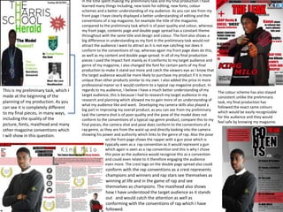
- 1. This is my preliminary task, which I made at the beginning of the planning of my production. As you can see it is completely different to my final pieces, in many ways, including the quality of the picture, fonts, masthead and many other magazine conventions which I will show in this question. In the time spent making my preliminary task and my final production I have learned many things including, new tools for editing, new fonts, colour schemes and a better understanding of my audience. As you can see from my front page I have clearly displayed a better understanding of editing and the conventions of a rap magazine, for example the title of the magazine, compared to the preliminary task which is of poor quality and colour, whereas my front page, contents page and double page spread has a constant theme throughout with the same title and design and colour. The font also shows a big difference in understanding as my font in the preliminary task would not attract the audience I want to attract as it is not eye catching nor does it conform to the conventions of rap, whereas again my front page does do this, as well as my content and double page spread. In all of my final production pieces I used the Impact font mainly as it conforms to my target audience and genre of my magazine, I also changed the font for certain parts of my final production to make it stand out more and catch the viewers eye as I know that the target audience would be more likely to purchase my product if it is more unique than other products similar to my own. I also added the price in more professional manor so it would conform to a typical rap magazine product. In regards to my audience, I believe I have a much better understanding of my target audience, this is because I had to research my target audience in my research and planning which allowed me to gain more of an understanding of what my audience like and want. Developing my camera skills also played a big part in improving my overall product, as you can see from my preliminary task the camera shot is of poor quality and the pose of the model does not conform to the conventions of a typical rap genre product, compare this to my final pieces, the camera shot and pose does conform to the conventions of a rap genre, as they are from the waist up and directly looking into the camera showing his power and authority which links to the genre of rap. Also the pose on the front page shows the rapper with a gun pose which is typically seen as a rap convention as it would represent a gun which again is seen as a rap convention and this is why I chose this pose as the audience would recognize this as a convention and could even relate to it therefore engaging the audience even more. The crest logo on the double page spread also could conform with the rap conventions as a crest represents champions and winners and rap stars see themselves as winning at life and in the game of rap and see themselves as champions. The masthead also shows how I have understood the target audience as it stands out and would catch the attention as well as conforming with the conventions of rap which I have followed. The colour scheme has also stayed consistent unlike the preliminary task, my final production has followed the exact same colours which would be easily recognizable for the audience and they would feel safe by knowing my magazine.