
Recommended
More Related Content
What's hot
What's hot (17)
Viewers also liked
Viewers also liked (20)
Similar to Film Poster Development
Similar to Film Poster Development (20)
More from hayat123
More from hayat123 (16)
Recently uploaded
Recently uploaded (20)
Film Poster Development
- 2. Initially, my ideas were mainly drawn from the the ‘Goodfellas’ and ‘A Bronx Tale’ movie posters incorporated with more contemporary films within the genre. I wanted to use a stormy sky background to connote a sense of foreboding and mystery. These were my first attempts at creating a film poster however, I didn’t think they looked realistic and audience feedback had similar comments.
- 3. Here I tried out a different layout to experiment with the images through inspiration of existing film posters however, I didn’t feel it captured the genre and the general role of the characters clearly. On the right, I used an image of an urban setting (Old Street) and the protagonist is partially visible. Feedback suggested it was too abstract for the genre. (original image)
- 4. My next attempts were of a different background image found online of an urban settings. I played around with the opacity again of the protagonist to set him apart from the other characters however, some didn’t find it effective as they were on the same ‘level’ when the antagonists should seem superior. It was also suggested that a third ‘mafia member’ be added to follow conventions.
- 5. Here I tried out the same concept and layout but experimenting with the characters positioning and the background image i.e. where the buildings were placed. The skyline I added to the poster was also more realistic in my opinion and suited the poster a lot more than the previous one. I had it in a colour to go with the colour scheme and the sky.
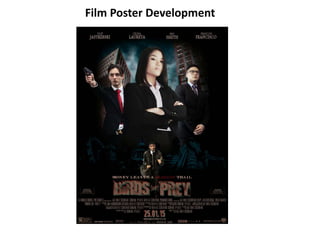
- 6. Once I had decided on a background and had all the photographs taken of the characters I needed, I added them in and received positive reviews so far. Thus I began to include all the text i.e. the starring character names, film title, tagline, credits, production logos, release date and website (I discarded the quote magazine review as it looked too crowded). Once I had the third ‘mafia’ character, it looked more fitting to have the protagonist below them and in a running stance in front of the skyline to connote his role. I also played around with the image brightness, contrast, colour balance and saturation to get the characters skin tones to match slightly and go with the colour scheme.
- 7. I used the blending options to create duplicate layers of the background in different colours to create the distorted effect of the buildings.
- 8. I also used the blending options and colour properties to select a certain area - the sky - to change its colour to the stormy look as the whole image was in a sepia effect.
- 9. I used the content-aware tool to take out objects in the background out of the way however, it didn’t really affect the image later as the characters covered the main part of the background anyway. (original image) I used the layer masks to create the black faded border around the image to look more like a poster, create a mysteriousness as well as having part of the image plain black to have room for the text which could be seen and read clearly and easily.
- 10. For the skyline, I changed its exposure till it was one colour in order for me to be able to change it into the teal colour as the image was originally blue and red.