This document evaluates a school magazine cover and contents page that the author created for a class assignment. The author analyzes strengths like using the school's colors and images of older students, but also identifies areas for improvement. For the next magazine cover, the author plans to use higher quality photos, a consistent color scheme, and additional design elements like straplines to make it more appealing and professional.
How to Troubleshoot Apps for the Modern Connected Worker
Main cover and contents
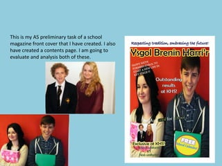
1. This is my AS preliminary task of a school
magazine front cover that I have created. I also
have created a contents page. I am going to
evaluate and analysis both of these.
2. Images
I chose to put two images on the front cover of my school magazine. I chose two sixth
formers and a sixth former and a key stage 3 pupil. I chose sixth formers because I
want to target my magazine at older viewers. I also chose a key stage 3 pupil just to
compare the uniform on school pupils lower down in the school and pupils in sixth
form who do not need to wear a uniform.
The two images I used on my front cover of my magazine are the main stories that
inside the magazine will be focussing on.
Both of the images I have taken are quite poorly taken, for my proper music magazine
cover photos I plan to take much better photos where the background is cut out,
where no pupils who are involved in the photo are cut out. I am not really happy with
the images on the front cover of the magazine, the main one I have cut the girls arm
out so she only has half an arm in the photo. In the photo with a student in sixth form
and a student in lower school the photo is not proportional there is a massive empty
white strip next to the girl pupil, which is where I did not take care of taking this
photo.
3. Colour
• On my front cover of my school magazine I used a variety of colours, I should of
kept to the same colour scheme. The reason I used a lot of colours was because I
wanted to try different things out using InDesign.
Some of the text I used is white, the colour white on my front cover looks boring
and plain. If I did this again I would use colours that would stand out more than
white. White does not attract an audience. Where I have put ‘too cool for school’
the too and the for are in white text, you can’t read them clearly because they mix
into the white background. On my music magazine cover I will need to think
carefully about the colours I will pick. In order to do this I will need to make sure
none of the colour font I use will camouflage into the background. The red
background I am quite happy with as it brings colour to the magazine cover. The
colour of the masthead also I would keep the same because they are the colours
that represent our school.
4. Language
The language I have used on my cover is appropriate for a school magazine, it is
readable for all ages. I chose to write my masthead in welsh because secondary
schools are trying to promote welsh language in their school, also I thought it looked
different to other magazines if I used both languages.
On my front cover of my magazine I have used a variety of different fonts, for my
music magazine cover I will only use about 3 different types of font that will be clear. I
will only choose 3 so the font will not become distracting to the readers. I have not
used strap lines on my front cover of my magazine, therefore on my music magazine I
must include at least 3. I have not used any alliteration on my front cover of my
magazine, on my music cover I might use alliteration to make it quirky and to incise
readers to my magazine. Also my font size is not the best, I have a mixture of sizes. I
have not thought carefully about certain stories need to be in larger font, I have just
put a variety of sizes as I was just playing around to see what looked best.
5. Masthead
I think the name of my magazine is very appropriate as it is the schools name but in
welsh, which is good as schools want to promote the welsh language. The colour
scheme of the masthead is appropriate because it is the main colours that represent
King Henry School. People who would see that title would know it resembles the
school colour. I personally think my masthead might need to be a larger font, but at
the moment it is at a size which stands out well, compared to the rest of the font.
7. Contents page
When I designed my contents page I was not happy from the first stage
but I didn’t know what to add. The contents page is very bland, with a
lot of empty space! For my music magazine I will make sure there are
no empty spaces and everything is full up with images, colour or texts.
The one positive fact on my school contents page is that I have a good
amount of images, and each image refers to an article in the magazine.
I have not used the convention codes of my front cover of my school
magazine, the colour of my front cover does not match my contents
page. I personally do not think this would not attract readers.
8. Strengths
I feel that there are not many strengths of my contents page and school magazine
front cover such as;
-Main image.. It was two sixth form students which is whom I wanted my magazine
to appeal to.
-I used a variety of different types on fonts and sizes.
-I used mainly yellow, black which is the colour that represents King Henry School.
9. Targets for improvement
There are a few areas of my magazine project that I think could be improved,
the main three areas that could be improved are;
- Putting more effort in to the front cover making it as perfect as possible and
also as appealing as I can put it by adding a variety of other photos.
-I would use a different logo, a unique logo/ masthead.
-I would take my photos much more clearly without anything cut out or
anything missing.