Beyond the EU: DORA and NIS 2 Directive's Global Impact
MS1 summer 2011 exam exemplar (Q1)
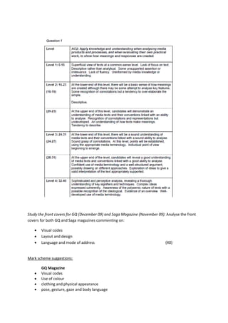
1. Study the front covers for GQ (December 09) and Saga Magazine (November 09). Analyse the front
covers for both GQ and Saga magazines commenting on:
Visual codes
Layout and design
Language and mode of address (40)
Mark scheme suggestions:
GQ Magazine
Visual codes
Use of colour
clothing and physical appearance
pose, gesture, gaze and body language
2. Layout and design
positioning of central image and gaze to readers
recognisable masthead
use of cover and sell lines
font styles
use of graphics
text positioning/design
colour design, graduated tint
Language and mode of address
use of informal language e.g. ‘badass’
name recognition
stories linked to target audience
Saga Magazine
Visual codes
Use of colour
clothing and physical appearance
pose and staged setting
gesture, gaze and body language
Layout and design
positioning of central image and gaze to readers
style of masthead
use of cover and sell lines
font styles
use of graphics
text positioning/design
conservative colour design
Language and mode of address
more formal mode of address appropriate to target audience
name recognition
stories linked to target audience
hyperbolic claims
MS1 Summer 2011 Exam Exemplar, Grade A (Level 4) Response (38/40)
Intertextuality is apparent in both covers through their use of famous actors and ‘personalities’ Clint
Eastwood and Michael Caine. Both of these men are viewed as iconic male role models and on their
own act as a selling point of the magazine. Despite the younger demographic of GQ, perhaps males
in their 20s to 30s, Eastwood’s picture is barely airbrushed; instead his greying hair and wrinkles,
both signifiers of old age, are presented proudly and connote an ideology of old age and wisdom ,
respect and accomplishment. This is also apparent in SAGA magazine cover, in which the same
ideology has been adopted, however perhaps with different reasoning behind it, as SAGA’s
demographic is generally older and mixed gender, compared to that of GQ.
3. The colour scheme of GQ is fairly simplistic, adopting a mainly red, white and blue theme. This subtle
acknowledgement to the American/British flag connotes masculinity and implies the demographic
for which GQ is intended. SAGA magazine also adopts a three tone colour scheme; however this is
more gender neutral, which is perhaps a reflection of its audience. As SAGA is a UK based magazine,
the black, white and red theme is almost representative of that of the British broadsheet
newspapers, ascertaining a prestige which the magazine adheres to.
Both men on the front covers are, although understated in their clothing, are styled, with GQ’s
Eastwood in denim, a nod to his film paradigms, and a match to the colour scheme. Michael Caine’s
clothing is also connoting that of one of his famous acting roles in the Batman franchise. This would
have been a deliberate decision as the intertextuality established by his inclusion, is reinforced. The
lack of airbrushing defies the hegemonic norm of youth and success it carries but instead promotes
older age as a positive, rather than the negative representation it usually receives.
Both magazines use a mid-shot as the covers focal point, with the use of writing to frame the central
image. Both men are ‘gazing’ into the camera lens which acts as a direct mode of addresses, drawing
in the audience. This is especially important as research has shown that direct eye contact positively
correlates the sale of the magazines as audiences feel personalised. Neither Caine nor Eastwood are
smiling, their expression however implying ‘thought’ and therefore wisdom, a connotation of older
age.
SAGA magazine combine the use of both ‘serif’ for Caine’s quote, reinforcing his prestige and
formality, with ‘san serif’ text for all other cover text, proving structured, easier to read typography
for its readership. Whilst SAGA’s use of san serif text is predominant, GQ uses san serif entirely,
appealing to that of its younger, more modern and technologically savvy demographic. The amount
of text on the GQ cover is high, implying a full and busy magazine, ranging in content, which its
audience would find appealing. SAGA is more minimalistic with the majority of the text in the lower
half of the page so as not to distract from the central figure of ‘Caine’.
The language used in both magazines reflects their demographic and creates a strong mode of
address. Both magazines use demographically suited ‘famous names’ for example chef ‘Delia Smith’
who indicates the gender neutral readership of SAGA. Barrack Obama for example is among the
names on GQ. The readers of GQ are more comfortable with technology, so intertextual references,
such as ‘twitter’ for examples would appeal to demographical interests.
In general, GQ is less formal and patriarchal colloquialisms such as ‘bros’, ‘guys’ and ‘badass’ are
used to create a ‘one of the boys’ tone and mode of address.
GQ’s use of sensationalism and male paradigmic interest, CARS! FOOD! GADGETS! reinforced with
capitalisation, grabs the attention of the audience, the subjects used allows for identification. Both
magazines employ personal pronouns, for example ‘our’ and ‘your’ to allow for audience relation
and identification. GQ’s tagline ‘Look sharp. Live smart’ uses alliteration and stereotypical male
descriptive connotations to sum up the magazine and in turn its audience.
To conclude both magazines address their demographic and respond to their needs and wants
through the use of iconography and celebrity endorsement, they also employ intertextuality
throughout to secure understanding and association.
4. 2a) A first audience for GQ magazine would be its intended demographic of 20-30 years of age, male
professionals, who could also be referred to as ‘achievers’. The ‘sharp, smart’ tagline would be
identifiable to them and the use of endorsements and content anchorage would no doubt appeal to
them.
A second audience could be fans of actor ‘Clint Eastwood’. Intertextuality would enable a fan base of
Eastwood, who would buy the magazine solely due to his endorsement and involvement. These
audience members may be referred to as ‘aspirers’ as they respect and aspire to be like their idol.