
Recommended
More Related Content
What's hot
What's hot (19)
Viewers also liked
Viewers also liked (9)
Similar to Magazine analysis
Similar to Magazine analysis (20)
Recently uploaded
Recently uploaded (20)
Magazine analysis
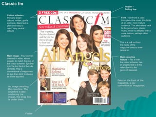
- 1. Classic fm Header – Selling line Colour scheme - Primarily bright Font – Serif font is used colours, whites, gold's throughout the cover, this hints and reds. Black text is at an older, more mature plain and easy to audience. This also refers back read. Very neutral to the genre here, classic colours music, which is affiliated with a more mature, perhaps older audience. This is a pull out from the inside of the magazine used to draw people in Main image – Four women Main coverline dressed in white, almost feature - Fits in with angelic, to match the rest of the colour scheme, has the colour scheme. Eye line an angelic feel to it this is in the top third of the rule refers back to the of thirds. This is genre of classical. conventional of magazines as eye lines tend to always be in the top third. Date on the front of the magazine, a key An image detailing convention of magazines the coverline. The coverline is also anchoring the image, the strap line is under them. Footer
- 2. Image Text Layout The masthead is Colour covered slightly as this Font Date, price is already an and issue established name, this Target Audience number, all is common for more essential to a famous magazines magazine This is used to draw people in as it is a special issue Main image – A coverline and A long shot of a strapline classical artist, anchoring an eye line on the image, the image upper section of is of an older the rule of Colour scheme man, perhaps thirds – A mix of blues hinting at an older and whites, very audience neutral colours, refers back to the genre This is showing These coverlines are that the audience implying that the reader has an idea of the knows of the genre and genre and knows of its terminologies and is some of the artists used to a more sophisticated vocabulary Footer
- 3. Image Masthead - They can Text Header afford to cover up the Layout masthead slightly because Colour they are already an Font established name. They are using a stylised font which Target Audience fits in genre. A pullout from the inside of the magazine advertising an article within. This draws Main image – The centre attention to the image on the cover is of magazine and gives the Dave Grohl, the front man reader an insight to of the Foo Fighters. He is what is inside. This is displayed in a medium common to music long shot. The image magazines as to matches the main advertise the genre. coverline underneath, which also anchors the image. Main coverline Serif font is used throughout the page, this is slightly more informal than coverline serif font. This fits in with the genre of Strap line the magazine Footer
- 4. Date and Masthead on website of the Image contents page magazine Text Layout Colour Font Target Audience Main image – A long shot of Madonna, the way she is dressed Colour matches the colour scheme, scheme matches the theme White text on black background – easy to read Main article stands out with larger text Layout has 3 tiers Sans serif font, informal
- 5. Magazine title Main images represent articles within and have the page number on them Organised and simple layout Images organised into columns Simple font which is easy to read because of the colours All the main images are, Advertising a anchored subscription to with the page the magazine, number and a save money, title entices the reader Free stuff draws the reader in
- 6. Dateline A personal note Images from the editor, advertising the makes the relevant articles magazine feel in the magazine more personal Mainly dark colours, matches Article the theme of the headlines are magazine, colours based around help the text the main stand out on the image black background Main image A subscription to is continuing the magazine is with the advertised, theme of the saving money, magazine draws reader in
- 7. Pink is used Group shot of the throughout, Tire tracks boy band, aimed hinting at a match the at female female theme audience audience Drop cap Images are anchored with text 1 column of text Quizzes to keep the Small font reader doesn’t draw attention away entertained from the images Page Competitions number entice the Very image dominated, not reader much text
- 8. Black and white, more artistic, fits the genre Two-shot midshot Headline A pullout from the article Not ominated y text or mage, fairly qual Drop-cap 6 columns of text Byline Stand Advertising the Page number with small font first documentary and magazine title
- 9. Half Headline in an abstract image, font Mid close up half text Byline Standfirst Drop cap Drop caps Page number and magazine title 2 columns of text, small Byline font to fit more in