How a student magazine challenges conventions of the Dance/Electropop genre
•
0 likes•77 views

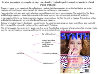
The document discusses how a media product adheres to conventions of the dance/electropop magazine genre. Specifically, it uses a large blue masthead filling the page width, bright colors instead of dull tones, and rough fonts rather than rounded styles seen in other genres. Close-up celebrity shots on the cover are also used, as they are important for this genre. Overall, the document aims to emulate the sharp, clean style of real dance/electropop magazines through techniques learned in Photoshop.

Recommended
More Related Content
What's hot
What's hot (16)
Viewers also liked
Viewers also liked (18)
Similar to How a student magazine challenges conventions of the Dance/Electropop genre
Similar to How a student magazine challenges conventions of the Dance/Electropop genre (20)
More from Jessica Cantell
Recently uploaded
Recently uploaded (20)
How a student magazine challenges conventions of the Dance/Electropop genre
- 1. In what ways does your media product use, develop or challenge forms and conventions of real media products? The genre I chose for my magazine is Dance/Electropop, I realized that other magazines of this style had big bold text for the masthead, with bright colours rather than dark dull colours you might see on a rock magazine. I also noticed the fonts were quite rough rather than rounded like you might see in a pop magazine. The whole style of the Dance and Electropop magazines I researched were quite similar to pop however, but a bit more rough and less girly and pretty. In my magazine, I tried to use these conventions, by using a large masthead that filled the width of the page. The masthead is blue and looks like what you might see on another Dance/Electropop magazine. Because of including the genre Electropop, I needed to make the pages look quite sharp and clean, which I found quite hard but I think I managed it by using skills I had learned from practicing with Photoshop. A lot of the magazine front covers for my genre were close ups of the celebrities, as opposed to long/medium shots of bands. I made sure that my main image was a close up, as I knew this was an important element for the genre. Big bold masthead Images both close up, showing mainly face and shoulders QuickTimeª and a Contrasting colours decompressor are needed to see this picture. Bright colours