1. In what ways does your media product use, develop or challenge forms and conventions of real
media products?
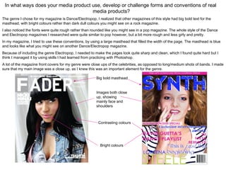
The genre I chose for my magazine is Dance/Electropop, I realized that other magazines of this style had big bold text for the
masthead, with bright colours rather than dark dull colours you might see on a rock magazine.
I also noticed the fonts were quite rough rather than rounded like you might see in a pop magazine. The whole style of the Dance
and Electropop magazines I researched were quite similar to pop however, but a bit more rough and less girly and pretty.
In my magazine, I tried to use these conventions, by using a large masthead that filled the width of the page. The masthead is blue
and looks like what you might see on another Dance/Electropop magazine.
Because of including the genre Electropop, I needed to make the pages look quite sharp and clean, which I found quite hard but I
think I managed it by using skills I had learned from practicing with Photoshop.
A lot of the magazine front covers for my genre were close ups of the celebrities, as opposed to long/medium shots of bands. I made
sure that my main image was a close up, as I knew this was an important element for the genre.
Big bold masthead
Images both close
up, showing
mainly face and
shoulders
Contrasting colours
Bright colours