Call Girls in Delhi, Escort Service Available 24x7 in Delhi 959961-/-3876
Presentation5
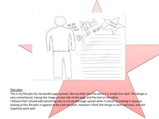
1. Flat plan
This is my flat plan for my double page spread. Like my other two flat plans it is simple but clear. The design is
very conventional, having the image on one side of the page and the text on the other.
I believe that I should add something else to my double page spread when it comes to making it, because
looking at this flat plan it appears to be a bit too plain, however I think this design is clear and neat, and will
hopefully work well.
2. 1st Draft
This is the first draft of my double page spread. It is similarly laid out to my flat plan, with the text on one side and
the image on the other. In addition, I have added a bold pink box on the right hand side to create and added
interest to the pages, plus I have placed the statement ‘Exclusive Interview’ into a box instead of the circle, in
which I place a pull quote. I believe this looks better because the pull quote will encourage people to read the
magazine more than the other statement would do, so putting it in the circle makes it stand out more.
I believe this double page spread is neat and clear following the conventions or a real magazine well. I particularly
like the Title I have chosen, however I do feel the text I have chosen is slightly more formal than it should be for
this magazine.
3. Here is a screen shot of when I was working on my double page spread in Photoshop, the editing programme I
have being using. This screenshot shows my using a colour chart to choose which particular colours I shall use
for my double page spread. Colours are vital throughout my magazine, they complete most of my design,
making it ideal for my target audience.
There is also a close up image of the circle that contains a pull quote. This was placed onto my double page
spread because it is eye-catching and enticing, encouraging the audience to read this article. It is also a
convention used by many music magazines to engage the audience, so I thought it would be appropriate to use
it on my double page spread.
I am glad I used Photoshop, I thought it was a very clear, detail programme to use, that produces food quality
work.
4. Final Version
This is the final version. I am very please with this double page spread, I especially like the colours and effect
I have used. I have added in a star shape in the background to emphasise the style of this magazine and this
artist. I have also changed the layout of the pages, putting the image in the centre so that it would be the
main attraction, therefore having the text at the side so it is the second thing you look at. I have also
changed the font of the text to a much less in-formal style, which I feel fits the tone of the magazine much
better.
Over all I am very please with my double page spread and feel that I have produced a successful piece of
work that follows the conventions well.