Israel Palestine Conflict, The issue and historical context!
Adele fornt cover evaluation
1. Billboard
I have also begun to look at Billboard which is a multi genre music magazine. I
have chose this because i don’t really listen to pacific genre of music so i
decided this would be the best magazine for my back up research.
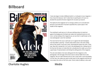
The skyline for this magazine isn’t as strong as others as it is not well seen
because it just looks like it has been squashed into a spare space in the
header of the magazine.
The masthead is well seen as it is the eye catching colours to stand out
against the background, the black also makes the masthead stand out a lot
more. Just by looking at the magazine you can see that it is well known as the
main photograph is over the masthead.
The main line for this issue is well seen as it is against the dark black/grey
coat that Adele is wearing. It clearly states which artist is the main selling
point of the month’s issue and a main, interesting fact about the artist. It also
says ‘Now She’s Eyeing the U.S.A’ and in the photograph she is hiding most of
her face but the eyes so it looks like she is actually eye the reader up so this is
a good type of representation and linking the selling points of the magazine.
The solo artist Adele is the main selling point for this magazine as the
photograph is the full page of the front cover to attract Adele fans to the
magazine. She isn’t well noticed at first as she is cover with a coat and holding
it to her face, this makes you want to look closer to the magazine and find out
more about the artist on the front cover. Direct mode of address is also used
Charlotte Hughes Media
2. Billboard
as she is like glaring at the reader but in a sexual way to invited you to the magazine.
The magazine layout has well pin pointed the main selling stories as they have been highlighted in red which is a colour to represent dangerous so it makes
you more attracted and interested in the magazine. I don’t think that the magazine has well laid out this issue as there is a lot of space around the bottom
of the page.
The Route of Eye has been created well as your eye is first drawn to the long curly hair and across to Adele’s eyes and down her hand to her coat and down
to the main selling point. This is a strong route of eye as it makes the reader look at the main selling point of the issue and around the magazine.
Overall this issue is ok. I would say they could have done the lay out better by spreading the writing around Adele instead of bundling all the cover stories at
the top of the page. But the main focus (Adele) is a good eye focus for attracting readers and inviting them to the magazine.
Charlotte Hughes Media