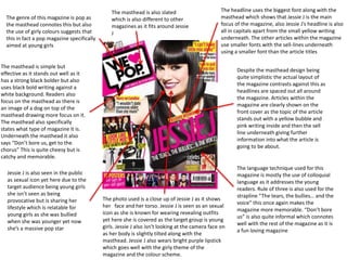
1. The genre of this magazine is pop as
the masthead connotes this but also
the use of girly colours suggests that
this in fact a pop magazine specifically
aimed at young girls
The masthead is simple but
effective as it stands out well as it
has a strong black bolder but also
uses black bold writing against a
white background. Readers also
focus on the masthead as there is
an image of a dog on top of the
masthead drawing more focus on it.
The masthead also specifically
states what type of magazine it is.
Underneath the masthead it also
says “Don’t bore us, get to the
chorus” This is quite cheesy but is
catchy and memorable.
Jessie J is also seen in the public
as sexual icon yet here due to the
target audience being young girls
she isn’t seen as being
provocative but is sharing her
lifestyle which is relatable for
young girls as she was bullied
when she was younger yet now
she’s a massive pop star
The masthead is also slated
which is also different to other
magazines as it fits around Jessie
J
The language technique used for this
magazine is mostly the use of colloquial
language as it addresses the young
readers. Rule of three is also used for the
strapline “The tears, the bullies… and the
voice” this once again makes the
magazine more memorable. “Don’t bore
us” is also quite informal which connotes
well with the rest of the magazine as it is
a fun loving magazine
Despite the masthead design being
quite simplistic the actual layout of
the magazine contrasts against this as
headlines are spaced out all around
the magazine. Articles within the
magazine are clearly shown on the
front cover as the topic of the article
stands out with a yellow bubble and
pink writing inside and then the sell
line underneath giving further
information into what the article is
going to be about.
The headline uses the biggest font along with the
masthead which shows that Jessie J is the main
focus of the magazine, also Jessie J’s headline is also
all in capitals apart from the small yellow writing
underneath. The other articles within the magazine
use smaller fonts with the sell-lines underneath
using a smaller font than the article titles
The photo used is a close up of Jessie J as it shows
her face and her torso. Jessie J is seen as an sexual
icon as she is known for wearing revealing outfits
yet here she is covered as the target group is young
girls. Jessie J also isn’t looking at the camera face on
as her body is slightly tilted along with the
masthead. Jessie J also wears bright purple lipstick
which goes well with the girly theme of the
magazine and the colour scheme.