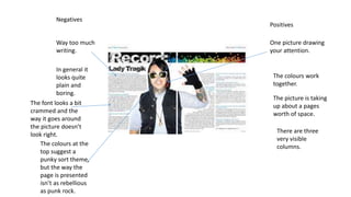
1. Negatives
Way too much
writing.
Positives
One picture drawing
your attention.
The colours work
together.
In general it
looks quite
plain and
boring.
The font looks a bit
crammed and the
way it goes around
the picture doesn’t
look right.
The colours at the
top suggest a
punky sort theme,
but the way the
page is presented
isn’t as rebellious
as punk rock.
The picture is taking
up about a pages
worth of space.
There are three
very visible
columns.
2. Negatives Positives
Three columns.
A substantial about
of writing.
One picture that
catches the eye.
A noticeable title.
The picture takes up
allot of room.
The columns are
quite jammed,
making it
rebellious.
3. Negatives Positives
Very noticeable
headline, with a font
that gives an idea of
rebellion as none of it
is on the same scale.
One big picture that
takes up a big fraction
of space.
An alright amount of
writing.
The colours work and
it doesn’t look plain.
There are four
columns, which gives
the idea of not
following the rules.