SlideShare a Scribd company logo
1 of 3
Looking back I have learned most about the layout of magazines. I learned that different
types and genres of magazines will have different layouts in order to stand out to their target
audience. Looking back at my preliminary task I can see that my layout is poor. I also learned
about conventions, photography, mise-en-scene, image editing, layout, font, colour and
mode of address. For conventions I learned that in a pop magazine everything has to be very
feminine and girl based because that's who the target audience are. For photography I have
learned that in the pop genre the images are all of attractive individuals or the latest most
popular boy bands. Mise-en-scene is once again feminine and included bright lighting to
show innocence. I learned in image editing that I need to remove all the background so that
it looks as professional as possible. The layout needs to be cluttered and cram as much
information on the front cover to appeal to the target audience. The fonts and colours both
need to be feminine and a handwritten font is very often used in a girly colour. Finally the
mode of address is fun and bold with the house colours been whites, pinks and blues.
The masthead is in a very
The Neale wade logo       unsuitable font and looks out of
could be bigger so        place with the rest of the                 The cover lines are
that it stands out        magazines overall look.                    in a basic boring
more compared to                                                     font
the rest of the front                                                            The main image
cover                                                                            is taking up
                                                                                 pretty much the
                                                                                 whole page so
   There are lots of
                                                                                 hasn't left much
   spaces on the front
                                                                                 room for and
   cover where more
                                                                                 other details
   detail could of
   been included but
                                                                              The props that
   the main image is
                                                                              were used look
   just to big
                                                                              old and tacky

  Once again the
  cover lines font                                                          Although the
  is very basic                                                             actor is wearing
  and doesn't                                                               school PE kit it
  stand out                                                                 still is
                                                                            unprofessional
                                                                            looking

            The other image of a student               The background could of had
            looks staged rather than an                more actors enjoying the
            actual action shot                         facilities in the background
The banner at the top of the magazine                        My masthead is
              gives an incite to what will be included                     much more bold
              free with the magazine                                       and stands out to
                                                                           my target audience

Instead of having just
text I added images                                                             The use of
wit my cover lines to                                                           images are
make my magazine                                                                much more
look more appealing                                                             professional
                                                                                than the ones
   The main image is                                                            used in my
   supposed to be a                                                             preliminary
   successful artist                                                            task
   and the fact its in
   the middle of the                                                            My use of
   page shows this to                                                           language is
   my target audience                                                           more
                                                                                appealing
                                                                                to the
                My use of syntax is short                                       target
                and to the point as well      There are cover lines that        audience
                as drawing the target         make the magazines overall
                audience in                   look more cluttered

More Related Content

What's hot

Development of my magazine front cover
Development of my magazine front coverDevelopment of my magazine front cover
Development of my magazine front covertaurnknapp
 
Magazine cover analysis worksheet the big cheese
Magazine cover analysis worksheet  the big cheeseMagazine cover analysis worksheet  the big cheese
Magazine cover analysis worksheet the big cheeseadamtimms22
 
Analysis of nme
Analysis of nmeAnalysis of nme
Analysis of nmeasmediaf12
 
Analysis of nme
Analysis of nmeAnalysis of nme
Analysis of nmeasmediaf12
 
Analysis of nme
Analysis of nmeAnalysis of nme
Analysis of nmeasmediaf12
 
Anaylsis of double page spreads
Anaylsis of double page spreadsAnaylsis of double page spreads
Anaylsis of double page spreadsLandellr2
 
Magazine cover analysis_worksheet nme
Magazine cover analysis_worksheet nmeMagazine cover analysis_worksheet nme
Magazine cover analysis_worksheet nmekruane95
 
Magazine cover analysis_worksheet nme
Magazine cover analysis_worksheet nmeMagazine cover analysis_worksheet nme
Magazine cover analysis_worksheet nmekruane95
 
Evalutation Q1
Evalutation Q1Evalutation Q1
Evalutation Q1asmediaf12
 
Presentation of magazine design
Presentation of magazine designPresentation of magazine design
Presentation of magazine designashleighkingmedia
 
Analysing contents pages prep for blog
Analysing  contents pages prep for blogAnalysing  contents pages prep for blog
Analysing contents pages prep for blogasmediag12
 
NME front cover analysis
NME front cover analysisNME front cover analysis
NME front cover analysisLaraMedia
 
Music magazine evaluation11 15
Music magazine evaluation11 15Music magazine evaluation11 15
Music magazine evaluation11 15maheshii
 
Resaearch
ResaearchResaearch
ResaearchEvo11
 
Analysing double page spread 1+2
Analysing double page spread 1+2Analysing double page spread 1+2
Analysing double page spread 1+2asmediac12
 
Magazine Cover Analysis
Magazine Cover AnalysisMagazine Cover Analysis
Magazine Cover Analysisemilygrimshaw
 

What's hot (20)

Development of my magazine front cover
Development of my magazine front coverDevelopment of my magazine front cover
Development of my magazine front cover
 
Magazine cover analysis worksheet the big cheese
Magazine cover analysis worksheet  the big cheeseMagazine cover analysis worksheet  the big cheese
Magazine cover analysis worksheet the big cheese
 
Analysis of nme
Analysis of nmeAnalysis of nme
Analysis of nme
 
Analysis of nme
Analysis of nmeAnalysis of nme
Analysis of nme
 
Analysis of nme
Analysis of nmeAnalysis of nme
Analysis of nme
 
Anaylsis of double page spreads
Anaylsis of double page spreadsAnaylsis of double page spreads
Anaylsis of double page spreads
 
Magazine cover analysis_worksheet nme
Magazine cover analysis_worksheet nmeMagazine cover analysis_worksheet nme
Magazine cover analysis_worksheet nme
 
Magazine cover analysis_worksheet nme
Magazine cover analysis_worksheet nmeMagazine cover analysis_worksheet nme
Magazine cover analysis_worksheet nme
 
Evalutation Q1
Evalutation Q1Evalutation Q1
Evalutation Q1
 
Presentation of magazine design
Presentation of magazine designPresentation of magazine design
Presentation of magazine design
 
Evaluation
EvaluationEvaluation
Evaluation
 
Analysing contents pages prep for blog
Analysing  contents pages prep for blogAnalysing  contents pages prep for blog
Analysing contents pages prep for blog
 
NME front cover analysis
NME front cover analysisNME front cover analysis
NME front cover analysis
 
Evaluation Q1
Evaluation Q1Evaluation Q1
Evaluation Q1
 
Music magazine evaluation11 15
Music magazine evaluation11 15Music magazine evaluation11 15
Music magazine evaluation11 15
 
Contents page analysis 2
Contents page analysis 2Contents page analysis 2
Contents page analysis 2
 
Resaearch
ResaearchResaearch
Resaearch
 
Analysing double page spread 1+2
Analysing double page spread 1+2Analysing double page spread 1+2
Analysing double page spread 1+2
 
Evaluation q1
Evaluation q1Evaluation q1
Evaluation q1
 
Magazine Cover Analysis
Magazine Cover AnalysisMagazine Cover Analysis
Magazine Cover Analysis
 

Viewers also liked

Technology question
Technology questionTechnology question
Technology questionThomas Evans
 
Album ancillary products
Album ancillary productsAlbum ancillary products
Album ancillary productsThomas Evans
 
Classes vertes
Classes vertesClasses vertes
Classes verteszanniadl
 
1336957 634650437566436250
1336957 6346504375664362501336957 634650437566436250
1336957 634650437566436250laxmai
 
Summary of pitch reasearch
Summary of pitch reasearchSummary of pitch reasearch
Summary of pitch reasearchThomas Evans
 

Viewers also liked (8)

Draft album 2
Draft album 2Draft album 2
Draft album 2
 
Technology question
Technology questionTechnology question
Technology question
 
Homework 2
Homework 2Homework 2
Homework 2
 
Album ancillary products
Album ancillary productsAlbum ancillary products
Album ancillary products
 
Classes vertes
Classes vertesClasses vertes
Classes vertes
 
1336957 634650437566436250
1336957 6346504375664362501336957 634650437566436250
1336957 634650437566436250
 
Summary of pitch reasearch
Summary of pitch reasearchSummary of pitch reasearch
Summary of pitch reasearch
 
Still image
Still image Still image
Still image
 

Similar to Question 72

Double page spread analysis
Double page spread analysisDouble page spread analysis
Double page spread analysisbethwatson95
 
Evaluation
EvaluationEvaluation
Evaluationahiya888
 
Music magazine’s front cover analysis
Music magazine’s front cover analysisMusic magazine’s front cover analysis
Music magazine’s front cover analysislukelong5
 
Nme music magazine
Nme music magazineNme music magazine
Nme music magazineaaronb258
 
Nme music magazine
Nme music magazineNme music magazine
Nme music magazineaaronb258
 
Magazine cover anylysis billboard
Magazine cover anylysis   billboardMagazine cover anylysis   billboard
Magazine cover anylysis billboardamybrackenridge
 
Magazine cover anylysis billboard
Magazine cover anylysis   billboardMagazine cover anylysis   billboard
Magazine cover anylysis billboardamybrackenridge
 
Music magazine front cover analysis[1]
Music magazine front cover analysis[1]Music magazine front cover analysis[1]
Music magazine front cover analysis[1]lukelong5
 
Evaluation question 1
Evaluation  question 1Evaluation  question 1
Evaluation question 1ChloeHicks
 

Similar to Question 72 (20)

Task 2
Task 2Task 2
Task 2
 
Double page spread analysis
Double page spread analysisDouble page spread analysis
Double page spread analysis
 
Evaluation
EvaluationEvaluation
Evaluation
 
Presentation2h
Presentation2hPresentation2h
Presentation2h
 
Music magazine’s front cover analysis
Music magazine’s front cover analysisMusic magazine’s front cover analysis
Music magazine’s front cover analysis
 
Magazine analysis film 1
Magazine analysis film 1Magazine analysis film 1
Magazine analysis film 1
 
Mag analysis
Mag analysisMag analysis
Mag analysis
 
Nme
NmeNme
Nme
 
Nme music magazine
Nme music magazineNme music magazine
Nme music magazine
 
Nme music magazine
Nme music magazineNme music magazine
Nme music magazine
 
Q1
Q1Q1
Q1
 
Magazine cover anylysis billboard
Magazine cover anylysis   billboardMagazine cover anylysis   billboard
Magazine cover anylysis billboard
 
Magazine cover anylysis billboard
Magazine cover anylysis   billboardMagazine cover anylysis   billboard
Magazine cover anylysis billboard
 
Music magazine front cover analysis[1]
Music magazine front cover analysis[1]Music magazine front cover analysis[1]
Music magazine front cover analysis[1]
 
Evaluation
EvaluationEvaluation
Evaluation
 
Evaluation
EvaluationEvaluation
Evaluation
 
Evaluation Q5
Evaluation Q5Evaluation Q5
Evaluation Q5
 
Question 1.
Question 1.Question 1.
Question 1.
 
Question 7
Question 7 Question 7
Question 7
 
Evaluation question 1
Evaluation  question 1Evaluation  question 1
Evaluation question 1
 

More from Thomas Evans

Questions for audience feedback question (1)
Questions for audience feedback question (1)Questions for audience feedback question (1)
Questions for audience feedback question (1)Thomas Evans
 
Summary of feedback on ancillary and main production
Summary of feedback on ancillary and main productionSummary of feedback on ancillary and main production
Summary of feedback on ancillary and main productionThomas Evans
 
Questionnaire results
Questionnaire resultsQuestionnaire results
Questionnaire resultsThomas Evans
 
Target audience question 4
Target audience question 4Target audience question 4
Target audience question 4Thomas Evans
 
Conventions of a magazine
Conventions of a magazineConventions of a magazine
Conventions of a magazineThomas Evans
 

More from Thomas Evans (11)

Questions for audience feedback question (1)
Questions for audience feedback question (1)Questions for audience feedback question (1)
Questions for audience feedback question (1)
 
Summary of feedback on ancillary and main production
Summary of feedback on ancillary and main productionSummary of feedback on ancillary and main production
Summary of feedback on ancillary and main production
 
Random work
Random workRandom work
Random work
 
Storyboards
StoryboardsStoryboards
Storyboards
 
Int script
Int scriptInt script
Int script
 
Shot number
Shot numberShot number
Shot number
 
Questionnaire results
Questionnaire resultsQuestionnaire results
Questionnaire results
 
Still image
Still image Still image
Still image
 
Presentation1
Presentation1Presentation1
Presentation1
 
Target audience question 4
Target audience question 4Target audience question 4
Target audience question 4
 
Conventions of a magazine
Conventions of a magazineConventions of a magazine
Conventions of a magazine
 

Question 72

  • 1. Looking back I have learned most about the layout of magazines. I learned that different types and genres of magazines will have different layouts in order to stand out to their target audience. Looking back at my preliminary task I can see that my layout is poor. I also learned about conventions, photography, mise-en-scene, image editing, layout, font, colour and mode of address. For conventions I learned that in a pop magazine everything has to be very feminine and girl based because that's who the target audience are. For photography I have learned that in the pop genre the images are all of attractive individuals or the latest most popular boy bands. Mise-en-scene is once again feminine and included bright lighting to show innocence. I learned in image editing that I need to remove all the background so that it looks as professional as possible. The layout needs to be cluttered and cram as much information on the front cover to appeal to the target audience. The fonts and colours both need to be feminine and a handwritten font is very often used in a girly colour. Finally the mode of address is fun and bold with the house colours been whites, pinks and blues.
  • 2. The masthead is in a very The Neale wade logo unsuitable font and looks out of could be bigger so place with the rest of the The cover lines are that it stands out magazines overall look. in a basic boring more compared to font the rest of the front The main image cover is taking up pretty much the whole page so There are lots of hasn't left much spaces on the front room for and cover where more other details detail could of been included but The props that the main image is were used look just to big old and tacky Once again the cover lines font Although the is very basic actor is wearing and doesn't school PE kit it stand out still is unprofessional looking The other image of a student The background could of had looks staged rather than an more actors enjoying the actual action shot facilities in the background
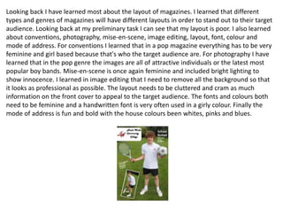
  • 3. The banner at the top of the magazine My masthead is gives an incite to what will be included much more bold free with the magazine and stands out to my target audience Instead of having just text I added images The use of wit my cover lines to images are make my magazine much more look more appealing professional than the ones The main image is used in my supposed to be a preliminary successful artist task and the fact its in the middle of the My use of page shows this to language is my target audience more appealing to the My use of syntax is short target and to the point as well There are cover lines that audience as drawing the target make the magazines overall audience in look more cluttered