
Recommended
More Related Content
What's hot
What's hot (18)
Viewers also liked
Similar to Kerrang magazine layout guide
Similar to Kerrang magazine layout guide (20)
Recently uploaded
Recently uploaded (20)
Kerrang magazine layout guide
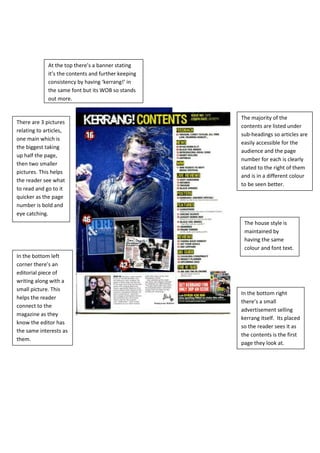
- 1. At the top there’s a banner stating it’s the contents and further keeping consistency by having ‘kerrang!’ in the same font but its WOB so stands out more. The majority of the There are 3 pictures contents are listed under relating to articles, sub-headings so articles are one main which is easily accessible for the the biggest taking audience and the page up half the page, number for each is clearly then two smaller stated to the right of them pictures. This helps and is in a different colour the reader see what to be seen better. to read and go to it quicker as the page number is bold and eye catching. The house style is maintained by having the same colour and font text. In the bottom left corner there’s an editorial piece of writing along with a small picture. This In the bottom right helps the reader there’s a small connect to the advertisement selling magazine as they kerrang itself. Its placed know the editor has so the reader sees it as the same interests as the contents is the first them. page they look at.