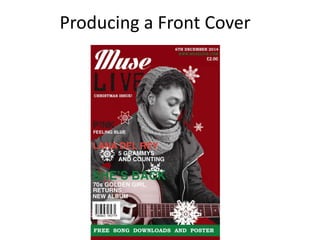
2. Logo Designs and Colour
• By experimenting with different styles of order and fonts for my logo, I
decided on using colours that would be gender neutral to my audience.
Referring back to my audience research, the majority of those interested
in the genre of my magazine were female. However, I decided on using
gender neutral colours for the logo: red, black and white for the logo as I
think this colour scheme suits the genre of my magazine. Whereas if I used
colours that are more specific to femininity, it would not fit the genre of
my magazine.
4. I took several photos of Han-sun, the main focus of my magazine. I wanted to
make it clear that my magazine was mainly an indie pop poster, so I had her
dressed in stereotypical indie styled clothing, and an acoustic guitar – which,
referring back to my research of alternative rock to indie pop, is a main
instrument in indie pop. Furthermore, I liked this photo because she is
looking directly at her guitar, and it was a close-up shot of her with her guitar.
I also looked back to my
research, and looking back
to my research of indie pop
magazines, I wanted the
image and style of my front
cover to be similar in terms
of style of an indie pop
magazine.
5. Editing the Main Image on Photoshop
The first step was to resize the image, and editing the image to black and white. I
then edited basic adjustments such as the brightness, sharpness and contrast of
the photo.
6. For the background, I experimented with
different brush styles of my chosen colour
scheme. However, after a few attempts I
decided I wanted to create a certain
theme to the magazine’s issue. As the
magazine’s issue was a December issue, I
downloaded snowflake brushes to create
a Christmas styled background.
I experimented with the
different kinds of brushes for
the background, however, I
found that the snowflake
patterns were too intricate for
a background, and the text was
too difficult to see.
7. I edited the background of the original photo by using the Quick Selection
tool, and zoomed in closely to edit the smaller parts of the background.
Next, I also used the Quick Selection tool to select the guitar and edit the
colour of the guitar to red, to bring more significance to the guitar and to
suit the colour scheme of my magazine.
8. Using Quark
Page Guides
Quark was helpful in
order of the layout of
the magazine. I used
these guides in order
to set the correct
alignment of the text.
Background
I used the background tool and
colour tool to include the
background of the photo, and also
for the banner at the bottom.
I downloaded
different fonts from
dafont.com and used
up to three different
typefaces on my
front cover.