SlideShare a Scribd company logo
The colours used in this 
magazine are red white 
and black I think they have 
used the red to fit in with 
the love hearts on the 
page. 
The fonts are all the same size 
the only thing that changes 
on the page is the boldness of 
the writing which is used the 
emphasise the side heading 
of each page in the magazine. 
The writing is used at the left of 
the page and at the bottom 
they have chosen to put the 
writing so that It doesn't 
interfere with the image. 
This magazine would be 
targeted towards teenagers I 
know this because of the 
name of the magazine and 
people who are intrested in 
fashion because this is one of 
the genres the magazine is 
associated with. 
The magazine editor 
decided to use a wide 
shot to show the 
whole of the model I 
notice that the model 
is in a very fashionable 
dress which links into 
the genre of the 
magazine and is sat 
infront of a black board 
which would 
commonly be 
associated with 
schools which helps 
the target audience 
who are teens be able 
to relate to the photo. 
The most effective thing I think 
is used in the magazine is the 
image as it relates to the target 
audience massively.
The main colours used on this 
page are blue and yellow these 
colours are used because they fit 
together well and give the 
magazine a professional look. 
The fonts vary they have used and 
this is mostly because of the target 
audience which are younger kids 
they have varied the fonts so that 
the page isn't boring and all the same 
they have also kept the amount of 
writing small so that it isn't to much 
for them to read. 
The writing is spread out in the top 
right corner and down the left and 
right of the page revolving around 
the images. 
This magazine would be targeted 
at the younger age groups I know 
this because the content isnt in 
much detail It would also be 
targeted at people intrested in 
football I know this because there 
are numerous images of 
footballers. 
There are two major models 
one is Gary Lineker who is 
shown reading the magazine 
they have used a medium close 
up of him the main think I 
notice that he's reading the 
magazine with a smile on his 
face which would make the 
reader think what he is reading 
is good. 
The most effective thing used in this 
magazine is how they have limited the 
amount of writing to apply to there 
audience age.
The colours used on this 
magazine page are red white 
and black mainly. These are 
used the emphasise certain 
parts of the magazine to the 
reader 
The fonts change in size 
the sub headings are in 
red and big and the extra 
information is in a smaller 
font in black underneath 
it. 
The writing I spread out all 
across the page this is used 
so that all the images and 
headings on the pages have 
extra information to explain 
them. 
The target audience of this 
magazine would be 
football fans or sports fans 
in general I know this 
because all the images on 
the page are of footballers 
or related to the sport. 
The main image is in the left top 
corner the reason I believe this is 
the main image is because it is 
the biggest. It shows a midshot of 
the model running towards the 
camera I also noticed the model 
has a football kit on and looks mid 
game the reason this image 
would have been chosen is 
because it relates to the genre of 
the magazine. 
The most effective thing I think has been 
used on the magazine is the image because it 
massively relates to the genre of the 
magazine and shows you of first impressions 
what the magazine is about.
The colours used are very 
dark they have used black 
silver and grey the reason 
these colours have been sued 
are the emphasise what the 
models wearing which is very 
colourful. 
There is one main big font 
which states that the page 
is a contents page then 
underneath that the writing 
it mostly the same the main 
subtitles are in bold and the 
extra information is in a 
normal font. 
The writing is all mainly based on 
the left side of the page they have 
done this so that you can see a 
clear shot of the model. 
The target audience would be 
for masculine men who are 
into going gym and doing 
sports I know this because the 
title of the magazine is called 
men's health. 
A wide shot is used of the 
model to show her whole 
body. The model is dressed in 
a bikini and has high heels on 
this would be used in a men's 
magazine as men would be 
interested in the model if they 
were attracted to women. 
The most effective thing used on this 
page is the dim colours used to show off 
the model as the men would most likely 
be attracted to a women in a bikini.
The colours used are red 
orange white and black 
these colours are used to 
go with what the model is 
wearing. 
The main title is written in in a 
big font which varies in colours 
this makes the title eye 
catching. The writing 
underneath this is a lot smaller 
using orange for sub titles and 
black writing for extra 
information. 
All off the writing is on the 
left side of the page no 
wear near the model so 
that the image is clear and 
there is nothing in its way 
some writing is next to the 
model this is just to tell 
you who the model is and 
a small description of her. 
The target audience would be 
aimed at women and people 
who have a interest in fashion 
I know this because the genre 
of glamour magazine is 
fashion. 
The a wide shot has been used 
of the model. I noticed 
immediately that the model is 
using colours that fit in with 
the colours scheme of the 
magazine which gives the 
magazine a professional look. 
The most effective thing used on 
this magazine is the way the colour 
scheme fits in with what the model 
is wearing because this gives the 
magazine a very professional look.
The main colours used on 
this mag are white and grey 
these are quite dim colours 
and are used to emphasise 
what is in red on the page. 
The fonts on this pages are 
very plain the sub titles are 
in bold and the extra 
information is bellow in a 
plain font both in white 
this is used to fit in with 
what the models wearing. 
All off the writing is on the 
left side of the pages apart 
for the red writing which 
goes across the model. 
The target audience of this 
magazine would be 
people who are interested 
in movies or the actor who 
is showed modelling I 
know this because the 
main article will be on him 
if he is the main model on 
the content page. 
A wide shot has been 
used of the model to so 
that u can see the full 
outfit he is wearing 
which is also quite plain 
dim colours same as the 
general theme. 
The most effective thing on this page is 
all the dim colours being used to 
emphasise the main story which is in 
red.

More Related Content

What's hot (18)

Health Magazine Production Research
Health Magazine Production ResearchHealth Magazine Production Research
Health Magazine Production Research
 
Health Magazine Construction
Health Magazine ConstructionHealth Magazine Construction
Health Magazine Construction
 
Evaluation Question 1
Evaluation Question 1Evaluation Question 1
Evaluation Question 1
 
Newspaper pitch
Newspaper pitch Newspaper pitch
Newspaper pitch
 
Music magazine
Music magazineMusic magazine
Music magazine
 
Analyzing magazines
Analyzing magazinesAnalyzing magazines
Analyzing magazines
 
Question 1
Question 1Question 1
Question 1
 
Research
ResearchResearch
Research
 
Research
ResearchResearch
Research
 
Research
ResearchResearch
Research
 
Research
ResearchResearch
Research
 
House style & mode of address
House style & mode of addressHouse style & mode of address
House style & mode of address
 
Smash hits double page spread analysis edited version
Smash hits  double page spread analysis edited versionSmash hits  double page spread analysis edited version
Smash hits double page spread analysis edited version
 
Evaluation of 3 other music magazines nme q kerrang
Evaluation of 3 other music magazines nme q kerrangEvaluation of 3 other music magazines nme q kerrang
Evaluation of 3 other music magazines nme q kerrang
 
Music front cover mrs robbins
Music front cover mrs robbinsMusic front cover mrs robbins
Music front cover mrs robbins
 
4. Pre Production
4. Pre Production4. Pre Production
4. Pre Production
 
Research into roducts
Research into roducts Research into roducts
Research into roducts
 
Media studies= morrissey front cover
Media studies= morrissey front coverMedia studies= morrissey front cover
Media studies= morrissey front cover
 

Viewers also liked (17)

Costume and prop preperation
Costume and prop preperationCostume and prop preperation
Costume and prop preperation
 
Last 3 mixed double page spreads
Last 3 mixed double page spreadsLast 3 mixed double page spreads
Last 3 mixed double page spreads
 
Screen shots of progress front cover
Screen shots of progress front coverScreen shots of progress front cover
Screen shots of progress front cover
 
Magazine cover, contents page and dps
Magazine cover, contents page and dpsMagazine cover, contents page and dps
Magazine cover, contents page and dps
 
Casting
CastingCasting
Casting
 
Developments for magazine
Developments for magazineDevelopments for magazine
Developments for magazine
 
Final product
Final productFinal product
Final product
 
Evaluation
EvaluationEvaluation
Evaluation
 
Evaluation
EvaluationEvaluation
Evaluation
 
Final product
Final productFinal product
Final product
 
Kourtney and kim take new york analysis
Kourtney and kim take new york analysisKourtney and kim take new york analysis
Kourtney and kim take new york analysis
 
Institutions bbc
Institutions bbcInstitutions bbc
Institutions bbc
 
Most evil crime documentary
Most evil  crime documentaryMost evil  crime documentary
Most evil crime documentary
 
Documentary styles
Documentary stylesDocumentary styles
Documentary styles
 
Comparison between two documentaries
Comparison between two documentaries Comparison between two documentaries
Comparison between two documentaries
 
Frontline medicine analysis
Frontline medicine analysisFrontline medicine analysis
Frontline medicine analysis
 
Question 1
Question 1Question 1
Question 1
 

Similar to mixed contents analyisis (20)

mixed genre front pages
mixed genre front pagesmixed genre front pages
mixed genre front pages
 
Research and planning all 3
Research and planning all 3Research and planning all 3
Research and planning all 3
 
1. research
1. research1. research
1. research
 
Magazine and phots powerpoint1
Magazine and phots powerpoint1Magazine and phots powerpoint1
Magazine and phots powerpoint1
 
Student research
Student researchStudent research
Student research
 
Question 1
Question 1Question 1
Question 1
 
More double spreads
More double spreadsMore double spreads
More double spreads
 
Evaluation
EvaluationEvaluation
Evaluation
 
Evaluation question 1
Evaluation question 1Evaluation question 1
Evaluation question 1
 
Evaluation Question 1
Evaluation Question 1Evaluation Question 1
Evaluation Question 1
 
Question 1
Question 1Question 1
Question 1
 
Powerpoint
PowerpointPowerpoint
Powerpoint
 
Magazines 1
Magazines 1Magazines 1
Magazines 1
 
Evaluation Of My Music Magazine
Evaluation Of My Music MagazineEvaluation Of My Music Magazine
Evaluation Of My Music Magazine
 
Media Evaluation Lewis Cooke
Media Evaluation Lewis CookeMedia Evaluation Lewis Cooke
Media Evaluation Lewis Cooke
 
Evaluation
EvaluationEvaluation
Evaluation
 
Media coursework
Media courseworkMedia coursework
Media coursework
 
EVALUATION
EVALUATIONEVALUATION
EVALUATION
 
Evaluation question 1
Evaluation question 1Evaluation question 1
Evaluation question 1
 
Question 1 - Evaluation
Question 1 - EvaluationQuestion 1 - Evaluation
Question 1 - Evaluation
 

More from louis0141 (20)

Question 1 in what ways does your media evalutation
Question 1  in what ways does your media evalutationQuestion 1  in what ways does your media evalutation
Question 1 in what ways does your media evalutation
 
Research into newspaper double page spreads
Research into newspaper double page spreadsResearch into newspaper double page spreads
Research into newspaper double page spreads
 
Institution research
Institution researchInstitution research
Institution research
 
My institution
My institutionMy institution
My institution
 
Research into costume, props and location
Research into costume, props and locationResearch into costume, props and location
Research into costume, props and location
 
Weird or what
Weird or whatWeird or what
Weird or what
 
Fbi criminal pursiut
Fbi criminal pursiutFbi criminal pursiut
Fbi criminal pursiut
 
Change of photos
Change of photosChange of photos
Change of photos
 
Analysis
Analysis Analysis
Analysis
 
Analysis
Analysis Analysis
Analysis
 
Magazine front cover Analysis
Magazine front cover Analysis Magazine front cover Analysis
Magazine front cover Analysis
 
Media evaluation
Media evaluationMedia evaluation
Media evaluation
 
Media magazine evaluation
Media magazine evaluationMedia magazine evaluation
Media magazine evaluation
 
Coloured drawings analysis
Coloured drawings analysisColoured drawings analysis
Coloured drawings analysis
 
Drawings and analysis
Drawings and analysisDrawings and analysis
Drawings and analysis
 
Casting
CastingCasting
Casting
 
Magazine name analysis
Magazine name analysisMagazine name analysis
Magazine name analysis
 
Headlines of mag
Headlines of magHeadlines of mag
Headlines of mag
 
Media homework1 (3)
Media homework1 (3)Media homework1 (3)
Media homework1 (3)
 
Media hw
Media hwMedia hw
Media hw
 

Recently uploaded

一比一原版SDSU毕业证圣地亚哥州立大学毕业证成绩单如何办理
一比一原版SDSU毕业证圣地亚哥州立大学毕业证成绩单如何办理一比一原版SDSU毕业证圣地亚哥州立大学毕业证成绩单如何办理
一比一原版SDSU毕业证圣地亚哥州立大学毕业证成绩单如何办理
kywwoyk
 
一比一原版UVM毕业证佛蒙特大学毕业证成绩单如何办理
一比一原版UVM毕业证佛蒙特大学毕业证成绩单如何办理一比一原版UVM毕业证佛蒙特大学毕业证成绩单如何办理
一比一原版UVM毕业证佛蒙特大学毕业证成绩单如何办理
kywwoyk
 
NO1 Uk Amil Baba In Lahore Kala Jadu In Lahore Best Amil In Lahore Amil In La...
NO1 Uk Amil Baba In Lahore Kala Jadu In Lahore Best Amil In Lahore Amil In La...NO1 Uk Amil Baba In Lahore Kala Jadu In Lahore Best Amil In Lahore Amil In La...
NO1 Uk Amil Baba In Lahore Kala Jadu In Lahore Best Amil In Lahore Amil In La...
Amil baba
 
一比一原版SDSU毕业证圣地亚哥州立大学毕业证成绩单如何办理
一比一原版SDSU毕业证圣地亚哥州立大学毕业证成绩单如何办理一比一原版SDSU毕业证圣地亚哥州立大学毕业证成绩单如何办理
一比一原版SDSU毕业证圣地亚哥州立大学毕业证成绩单如何办理
eemet
 

Recently uploaded (7)

一比一原版SDSU毕业证圣地亚哥州立大学毕业证成绩单如何办理
一比一原版SDSU毕业证圣地亚哥州立大学毕业证成绩单如何办理一比一原版SDSU毕业证圣地亚哥州立大学毕业证成绩单如何办理
一比一原版SDSU毕业证圣地亚哥州立大学毕业证成绩单如何办理
 
一比一原版UVM毕业证佛蒙特大学毕业证成绩单如何办理
一比一原版UVM毕业证佛蒙特大学毕业证成绩单如何办理一比一原版UVM毕业证佛蒙特大学毕业证成绩单如何办理
一比一原版UVM毕业证佛蒙特大学毕业证成绩单如何办理
 
NO1 Uk Amil Baba In Lahore Kala Jadu In Lahore Best Amil In Lahore Amil In La...
NO1 Uk Amil Baba In Lahore Kala Jadu In Lahore Best Amil In Lahore Amil In La...NO1 Uk Amil Baba In Lahore Kala Jadu In Lahore Best Amil In Lahore Amil In La...
NO1 Uk Amil Baba In Lahore Kala Jadu In Lahore Best Amil In Lahore Amil In La...
 
MATHEMATICS BRIDGE COURSE (TEN DAYS PLANNER) (FOR CLASS XI STUDENTS GOING TO ...
MATHEMATICS BRIDGE COURSE (TEN DAYS PLANNER) (FOR CLASS XI STUDENTS GOING TO ...MATHEMATICS BRIDGE COURSE (TEN DAYS PLANNER) (FOR CLASS XI STUDENTS GOING TO ...
MATHEMATICS BRIDGE COURSE (TEN DAYS PLANNER) (FOR CLASS XI STUDENTS GOING TO ...
 
Memory compiler tutorial – TSMC 40nm technology
Memory compiler tutorial – TSMC 40nm technologyMemory compiler tutorial – TSMC 40nm technology
Memory compiler tutorial – TSMC 40nm technology
 
F5 LTM TROUBLESHOOTING Guide latest.pptx
F5 LTM TROUBLESHOOTING Guide latest.pptxF5 LTM TROUBLESHOOTING Guide latest.pptx
F5 LTM TROUBLESHOOTING Guide latest.pptx
 
一比一原版SDSU毕业证圣地亚哥州立大学毕业证成绩单如何办理
一比一原版SDSU毕业证圣地亚哥州立大学毕业证成绩单如何办理一比一原版SDSU毕业证圣地亚哥州立大学毕业证成绩单如何办理
一比一原版SDSU毕业证圣地亚哥州立大学毕业证成绩单如何办理
 

mixed contents analyisis

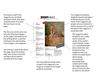
  • 1. The colours used in this magazine are red white and black I think they have used the red to fit in with the love hearts on the page. The fonts are all the same size the only thing that changes on the page is the boldness of the writing which is used the emphasise the side heading of each page in the magazine. The writing is used at the left of the page and at the bottom they have chosen to put the writing so that It doesn't interfere with the image. This magazine would be targeted towards teenagers I know this because of the name of the magazine and people who are intrested in fashion because this is one of the genres the magazine is associated with. The magazine editor decided to use a wide shot to show the whole of the model I notice that the model is in a very fashionable dress which links into the genre of the magazine and is sat infront of a black board which would commonly be associated with schools which helps the target audience who are teens be able to relate to the photo. The most effective thing I think is used in the magazine is the image as it relates to the target audience massively.
  • 2. The main colours used on this page are blue and yellow these colours are used because they fit together well and give the magazine a professional look. The fonts vary they have used and this is mostly because of the target audience which are younger kids they have varied the fonts so that the page isn't boring and all the same they have also kept the amount of writing small so that it isn't to much for them to read. The writing is spread out in the top right corner and down the left and right of the page revolving around the images. This magazine would be targeted at the younger age groups I know this because the content isnt in much detail It would also be targeted at people intrested in football I know this because there are numerous images of footballers. There are two major models one is Gary Lineker who is shown reading the magazine they have used a medium close up of him the main think I notice that he's reading the magazine with a smile on his face which would make the reader think what he is reading is good. The most effective thing used in this magazine is how they have limited the amount of writing to apply to there audience age.
  • 3. The colours used on this magazine page are red white and black mainly. These are used the emphasise certain parts of the magazine to the reader The fonts change in size the sub headings are in red and big and the extra information is in a smaller font in black underneath it. The writing I spread out all across the page this is used so that all the images and headings on the pages have extra information to explain them. The target audience of this magazine would be football fans or sports fans in general I know this because all the images on the page are of footballers or related to the sport. The main image is in the left top corner the reason I believe this is the main image is because it is the biggest. It shows a midshot of the model running towards the camera I also noticed the model has a football kit on and looks mid game the reason this image would have been chosen is because it relates to the genre of the magazine. The most effective thing I think has been used on the magazine is the image because it massively relates to the genre of the magazine and shows you of first impressions what the magazine is about.
  • 4. The colours used are very dark they have used black silver and grey the reason these colours have been sued are the emphasise what the models wearing which is very colourful. There is one main big font which states that the page is a contents page then underneath that the writing it mostly the same the main subtitles are in bold and the extra information is in a normal font. The writing is all mainly based on the left side of the page they have done this so that you can see a clear shot of the model. The target audience would be for masculine men who are into going gym and doing sports I know this because the title of the magazine is called men's health. A wide shot is used of the model to show her whole body. The model is dressed in a bikini and has high heels on this would be used in a men's magazine as men would be interested in the model if they were attracted to women. The most effective thing used on this page is the dim colours used to show off the model as the men would most likely be attracted to a women in a bikini.
  • 5. The colours used are red orange white and black these colours are used to go with what the model is wearing. The main title is written in in a big font which varies in colours this makes the title eye catching. The writing underneath this is a lot smaller using orange for sub titles and black writing for extra information. All off the writing is on the left side of the page no wear near the model so that the image is clear and there is nothing in its way some writing is next to the model this is just to tell you who the model is and a small description of her. The target audience would be aimed at women and people who have a interest in fashion I know this because the genre of glamour magazine is fashion. The a wide shot has been used of the model. I noticed immediately that the model is using colours that fit in with the colours scheme of the magazine which gives the magazine a professional look. The most effective thing used on this magazine is the way the colour scheme fits in with what the model is wearing because this gives the magazine a very professional look.
  • 6. The main colours used on this mag are white and grey these are quite dim colours and are used to emphasise what is in red on the page. The fonts on this pages are very plain the sub titles are in bold and the extra information is bellow in a plain font both in white this is used to fit in with what the models wearing. All off the writing is on the left side of the pages apart for the red writing which goes across the model. The target audience of this magazine would be people who are interested in movies or the actor who is showed modelling I know this because the main article will be on him if he is the main model on the content page. A wide shot has been used of the model to so that u can see the full outfit he is wearing which is also quite plain dim colours same as the general theme. The most effective thing on this page is all the dim colours being used to emphasise the main story which is in red.