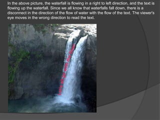
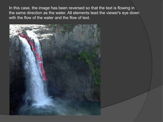
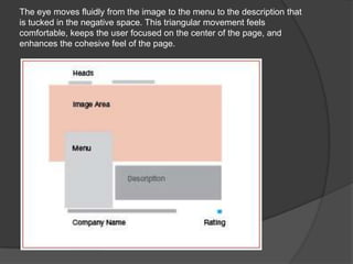
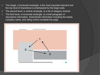
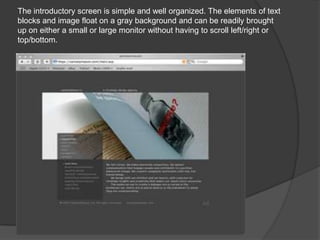
Visual Flow
   Visual flow carries the viewer's eye
    through the document in a way that all
    the important elements receive
    prominence, and nothing snags the
    vision or causes the viewer to lose
    sense of the piece.
 Size changes
 Motion in images
 Faces / images
 text elements
In the above picture, the waterfall is flowing in a right to left direction, and the text is
flowing up the waterfall. Since we all know that waterfalls fall down, there is a
disconnect in the direction of the flow of water with the flow of the text. The viewer's
eye moves in the wrong direction to read the text.
In this case, the image has been reversed so that the text is flowing in
the same direction as the water. All elements lead the viewer's eye down
with the flow of the water and the flow of text.
As you can see, the photo is placed next to some text. But the pic is
looking away from that text
the image will be on the right of content as well as the left, this could be a good
compromise. Remember, too, that while images of people's faces draw the most
attention.
The eye moves fluidly from the image to the menu to the description that
is tucked in the negative space. This triangular movement feels
comfortable, keeps the user focused on the center of the page, and
enhances the cohesive feel of the page.
   The image, a horizontal rectangle, is the most important element and
    the top level of importance is emphasized by the large scale.
   The second level, a vertical rectangle, is a list of category choices.
   The third level, a horizontal rectangle, is a brief paragraph of
    descriptive information. Subordinate information including the heads,
    company name, and rating control complete the page.
The introductory screen is simple and well organized. The elements of text
blocks and image float on a gray background and can be readily brought
up on either a small or large monitor without having to scroll left/right or
top/bottom.

Website composition

  • 2.
    Visual Flow  Visual flow carries the viewer's eye through the document in a way that all the important elements receive prominence, and nothing snags the vision or causes the viewer to lose sense of the piece.
  • 3.
     Size changes Motion in images  Faces / images  text elements
  • 4.
    In the abovepicture, the waterfall is flowing in a right to left direction, and the text is flowing up the waterfall. Since we all know that waterfalls fall down, there is a disconnect in the direction of the flow of water with the flow of the text. The viewer's eye moves in the wrong direction to read the text.
  • 5.
    In this case,the image has been reversed so that the text is flowing in the same direction as the water. All elements lead the viewer's eye down with the flow of the water and the flow of text.
  • 6.
    As you cansee, the photo is placed next to some text. But the pic is looking away from that text
  • 7.
    the image willbe on the right of content as well as the left, this could be a good compromise. Remember, too, that while images of people's faces draw the most attention.
  • 8.
    The eye movesfluidly from the image to the menu to the description that is tucked in the negative space. This triangular movement feels comfortable, keeps the user focused on the center of the page, and enhances the cohesive feel of the page.
  • 9.
    The image, a horizontal rectangle, is the most important element and the top level of importance is emphasized by the large scale.  The second level, a vertical rectangle, is a list of category choices.  The third level, a horizontal rectangle, is a brief paragraph of descriptive information. Subordinate information including the heads, company name, and rating control complete the page.
  • 10.
    The introductory screenis simple and well organized. The elements of text blocks and image float on a gray background and can be readily brought up on either a small or large monitor without having to scroll left/right or top/bottom.