Sarahah Growth Audit Identifies Opportunities to Improve Onboarding, Empty States
•Download as PPTX, PDF•
0 likes•206 views

Sarahah was designed as a way to “get honest feedback from your coworkers and friends.” It was #1 on the Appstore, ahead of YouTube and Facebook and Snapchat, on July 31st. The below powerpoint has a full walk through of the app annotated with in-depth feedback on how to grow faster.

Recommended
Recommended
More Related Content
What's hot
What's hot (17)
Similar to Sarahah Growth Audit Identifies Opportunities to Improve Onboarding, Empty States
Similar to Sarahah Growth Audit Identifies Opportunities to Improve Onboarding, Empty States (20)
Recently uploaded
Recently uploaded (20)
Sarahah Growth Audit Identifies Opportunities to Improve Onboarding, Empty States
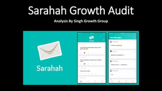
- 1. Sarahah Growth Audit Analysis By Singh Growth Group
- 2. For this growth audit, we’re primarily focused on the signup, onboarding, and first time user experience of the Sarahah app. We show pain points in the existing process and identify changes to the app that will help drive the app’s growth and retention.
- 3. Sarahah Background: • Send And Receive Feedback Anonymously • Sarahah means honesty in Arabic • Topped Appstore Charts late July, 2017 • 14M Registered Users As Of Late July according to the app creator
- 4. Let’s start with Sarahah’s landing iPhone app store page.
- 5. Use a company name instead of a personal name to improve credibility + legitimacy for the app.
- 6. App Store Screenshots Need A Ton Of Work. Good screenshots are an easy way to explain the app and entice the user to download the app.
- 7. Zoom In On App Store Screenshots:
- 8. What pops from the screenshots are an inbox and sent messages.
- 9. This look like any other messaging app. How is this different than Whatsapp or Messenger?
- 10. We need to show the unique value prop of the app. Lets hint more strongly to it’s anonymous nature.
- 11. ASKfm makes anonymous nature of the app pretty clear using text in the screenshot itself
- 12. In general, this design pattern of explaining core value prop of the app in the screenshots is pretty common and for good reason. Most people won’t read any further before deciding to download or leave.
- 13. More examples of good app screenshots which explain the value prop of the app.
- 14. Now for some feedback on the User Generated Content (UGC) that is featured in the screenshots.
- 15. For context: The app creator originally intended Sarahah to be used for honest workplace feedback.
- 16. For context: The app creator originally intended Sarahah to be used for honest workplace feedback. However the app quickly became a hit with teens who use the app in a more casual context.
- 17. So, lets remove the workplace content.
- 18. On the topic of teen adoption: Most of the messages don’t reflect how teens talk and the type of content that is actually posted on Sarahah. Make it more about crushes and gossip and drama. Use more emoji to make the app look more fun & vibrant.
- 19. There are also opportunities for localization of the UGC. Since this is being viewed on the US app store:
- 20. There are also opportunities for localization of the UGC. Since this is being viewed on the US app store: We can remove the Arabic text
- 21. There are also opportunities for localization of the UGC. Since this is being viewed on the US app store: We can use names and profile pictures that more closely mimic the US teen download base.
- 22. There are also opportunities for localization of the UGC. Since this is being viewed on the US app store: Having just two different people feature makes the app look unpopular.
- 23. NOW TIME TO REVIEW THE ACTUAL APP!!
- 24. On entry of the app first thing I’m hit with is a send notifications prompt.
- 25. SLOW DOWN! I don’t even know the value of the app yet – this feels too premature!
- 26. Could we prime the user first? Tell them the value of the app and its need for notifications. Then hit them with the actual prompt.
- 27. This should help increase notifications permission request acceptance rate. Push notifications are a great way to re-engage users so this could really help long-term retention.
- 28. Example of good permissions priming:
- 29. Text+ first tells you the importance of notifications and how it directly ties into the value proposition of the app before actually requesting the permission.
- 30. Notice how the design of the soft prompt mimics the look and feel of the native iOS notifications prompt
- 31. Back to Sarahah: On accepting the notifications prompt…
- 32. Finally! The actual value proposition of the app!
- 33. Finally! The actual value proposition of the app! Looking good so far in the onboarding flow.
- 34. Finally! The actual value proposition of the app! Looking good so far in the Confused as to why this is featured in the onboarding flow. The app later on doesn’t do a good job of searching for friend since they never ask for contacts information or use FB friends data so search isn’t special.
- 35. Finally! The actual value THIS IS WHERE WE SHOULD HAVE ASKED FOR NOTIFICATIONS! Only after the user understands the value proposition of the app.
- 36. We’re Done Onboarding! Let’s signup for Sarahah now.
- 37. Login page. Let’s hit register
- 38. Registration page. I like that we can easily navigate back to login if we accidentally got to this page.
- 39. Weird that our username looks like a website. This could be better explained. Brings privacy concerns to my mind. How public is my username? Who can visit?
- 40. Let’s use a generic name to see what username validation looks like.
- 41. Username taken. As the app scales, and most usernames get taken, we can add in username suggestions to lower account creation friction.
- 42. Used ‘SinghGrowth’ as my username. It wasn’t taken. How surprising!
- 43. For future work, Sarahah can experiment with phone number instead of email based account creation. SMS as a channel can be costly but can have much higher CTR than email notifications.
- 44. Done with name + email. Password creation time.
- 45. Do we really need the double confirmation for a lightweight social apps?! NO!
- 46. Considering how easy and common password recovery is double confirmation really only adds in extra friction for marginal benefit to a user in an app like this.
- 47. Entered my password. I’m done signing up. Let’s dive into the actual app.
- 48. After singing up this is the first screen I see.
- 49. The app looks barren. I’m confused on what I should do next. Not good!
- 50. Social apps really need to think about empty states since most of the time social apps are useless on start. Without any messages or friends this app is pointless. We need to get the user connected to content ASAP.
- 51. Example of an empty state. The Circle app encourages you to import contacts if you have no content to interact with.
- 52. More examples of empty states can be found on www.emptystat.es
- 53. Sarahah could use the empty state to prompt you to share the app or share your username link to start receiving feedback so that the app doesn’t remain empty for too long.
- 54. Let’s move on since I’m not sure what to do. Let’s click on this icon.
- 55. EMPTY AGAIN! A normal user at this point is going to be frustrated. We worked so hard to get onboarded on to this app...and then nothing!
- 56. We need some copy in the app to give the user some guidance as to 1) Why the app is empty 2) What it’s supposed to do / look like when app isn’t empty 3) How to achieve this non-empty state
- 57. Moving on let’s click the search button.
- 58. Searching for user’s isn’t any better. We could place an upsell here to import contacts or connect to a social network to find friends as a faster way to find friends.
- 59. Let’s hit the gear icon. Although I don’t have high hopes for finding much value in a settings page.
- 60. Finally! There’s actually something here!
- 61. It would be nice to have singhgrowth.sarahah.com also listed on here.
- 62. It would be nice to have singhgrowth.sarahah.com also listed on here. The web link would give both Sarahah users and friends from other networks the ability to give me feedback. Better thing to share than my in-app username which only helps other Sarahah users.
- 63. This could also be a great place to add in links to import your contact book. Could also be a great place to put a link to share your profile directly onto Facebook or Twitter.
- 64. So this page isn’t so helpful either for a new user. Let’s go back to our home inbox.
- 65. Now let’s check out what this heart icon does.
- 66. Again...not helpful. But at least this empty state is a bit better. Weird it doesn’t show up in other screens. Possible bug since the asset is clearly there, just not on all empty screens.
- 67. Time to actually get some honest feedback.
- 68. I shared the link with a friend on Messenger. Good that the website has their Open Graph (OG) meta tags set in order to show rich content when the link is shared on social platforms.
- 69. Maybe add a CTA into the snippet like ‘Give Singh Anonymous Feedback’
- 70. What someone receiving the link would see.
- 71. After submitting the feedback, there’s an upsell to download the app on the appstore. Nice.
- 72. We now have some anonymous feedback.
- 73. We now have some anonymous feedback. That’s pretty much it!
- 74. For more growth audits visit www.SinghGrowthGroup.com Get in touch team@SinghGrowthGroup.com