Download to read offline
![Defining datavisualization
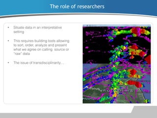
•
“The desire to take what normally falls
outside of the scale of human senses
and to make visible and manageable”
[Manovich 2002]
•
Common tropes emerge: maps,
natural metaphors (trees…),
timelines, graphs…
•
“Sensory expression -- most often
visual, sometimes sonic or tactile -- is
the only means to perceive many
contemporary data sets” [Diamond
2010]
Grant access to information in
an aesthetically informed,
sensorly appealing manner](https://image.slidesharecdn.com/anamiadatvizuog-131018041159-phpapp02/85/Visualizing-personal-network-data-Examples-from-a-study-on-EDs-websites-4-320.jpg)

![The role of end-users
•
The page-based paradigm of the
web has been interrupted by
database incursions[Liu, 2004].
•
Personal, everyday experience of
data immersion and navigation shape
individual “data-subjectivity”
[Manovich 2002]](https://image.slidesharecdn.com/anamiadatvizuog-131018041159-phpapp02/85/Visualizing-personal-network-data-Examples-from-a-study-on-EDs-websites-7-320.jpg)


The document discusses a study on personal networks in relation to websites about eating disorders. It highlights various methods for visualizing network data and emphasizes the significance of aesthetic presentation in data analysis. Additionally, it addresses the complexities of data representation and the politics surrounding quantified data in social contexts.


