INDIAN INSTITUTE OFINFORMATION
TECHNOLOGY KOTTAYAM
M.Tech. Programme (Artificial Intelligence & Data Science)
DSC 524 Data Visualization and Predictive analytics
Dr. Kalka Dubey
What Is DataVisualisation?
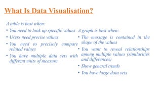
A table is best when:
• You need to look up specific values
• Users need precise values
• You need to precisely compare
related values
• You have multiple data sets with
different units of measure
A graph is best when:
• The message is contained in the
shape of the values
• You want to reveal relationships
among multiple values (similarities
and differences)
• Show general trends
• You have large data sets
6.
What Is DataVisualisation?
• As a viewer your task is simply to find the relevant row and column
intersection:
• A viewer to process clusters of multiple data points simultaneously to
identify the slopes and flats.
• Representation involves making decisions about how you are going to
portray data.
7.
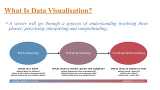
What Is DataVisualisation?
• A viewer will go through a process of understanding involving three
phases: perceiving, interpreting and comprehending.
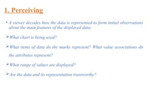
1. Perceiving
• Aviewer decodes how the data is represented to form initial observations
about the main features of the displayed data:
What chart is being used?
What items of data do the marks represent? What value associations do
the attributes represent?
What range of values are displayed?
Are the data and its representation trustworthy?
10.
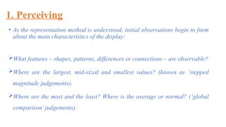
1. Perceiving
• Asthe representation method is understood, initial observations begin to form
about the main characteristics of the display:
What features – shapes, patterns, differences or connections – are observable?
Where are the largest, mid-sized and smallest values? (known as ‘stepped
magnitude judgements).
Where are the most and the least? Where is the average or normal? (‘global
comparison’judgements).
11.
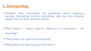
2. Interpreting
• Translatesthese observations into quantitative and/or qualitative
meaning. Interpreting involves assimilating what you have observed
against what you know about the subject.
What features – shapes, patterns, differences or connections – are
interesting?
What features are expected or unexpected?
What features are important given the subject?
12.
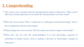
3. Comprehending
• Theviewers now consider what the interpretations mean to themselves. What can be
inferred as being important to you about the interpretations you have made?
What has been learnt? Has it reinforced or challenged existing knowledge? Has it
been enlightened with new knowledge?
What feelings have been stirred? Has the experience had an impact emotionally?
What does one do with this understanding? Is it just knowledge acquired or
something to inspire action, such as making a decision or motivating a change in
behaviour?
13.
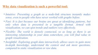
Why data visualizationis such a powerful tool:
• Intuitive: Presenting a graph as a node-link structure instantly makes
sense, even to people who have never worked with graphs before.
• Fast: It is fast because our brains are great at identifying patterns, but
only when data is presented in a tangible format. Armed with
visualization, we can spot trends and outliers very effectively.
• Flexible: The world is densely connected, so as long as there is an
interesting relationship in your data somewhere, you will find value in
graph visualization.
• Insightful: Exploring graph data interactively allows users to gain more
in-depth knowledge, understand the context and ask more questions,
compared to static visualization or raw data.
14.
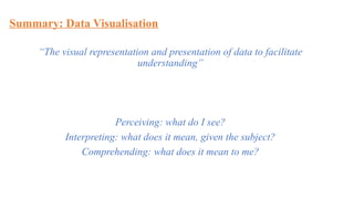
Summary: Data Visualisation
“Thevisual representation and presentation of data to facilitate
understanding”
Perceiving: what do I see?
Interpreting: what does it mean, given the subject?
Comprehending: what does it mean to me?
15.
Introduction of DataAcquisition
•Data acquisition is a process of automatically
obtaining data from one or more sensors or smart
devices directly into the computer system.
• A sensor is a device that responds to a physical
change and outputs an electrical signal.
16.
Introduction of DataAcquisition
• Signal Conditioning- The process of modifying the output of a sensor is
called signal conditioning.
• Signal condition is required for dealing with noisy signal.
• Dealing with Signal Condition
Modifying the system (expensive approach)
Using better quality sensor (expensive)
Ignoring the noise (not ideal)
Using a bunch of readings so that result can be averaged (using software)
Filtering the signal (hardware or software)
17.
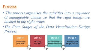
Process
• The processorganises the activities into a sequence
of manageable chunks so that the right things are
tackled in the right order.
•The Four Stages of the Data Visualisation Design
Process
18.
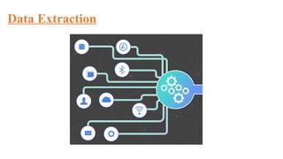
Data Extraction
• Dataextraction is the process of collecting or
retrieving disparate types of data from a variety of
sources, many of which may be poorly organized or
completely unstructured.
•It is makes possible to consolidate, process, and
refine data so that it can be stored in a centralized
location in order to be transformed. These locations
may be on-site, cloud-based, or a hybrid of the two.
Data Extraction
• Datais taken from one or more sources or systems.
•The extraction locates and identifies relevant data.
•Extraction allows many different kinds of data to be
combined and ultimately mined for business
intelligence
21.
Benefits of Usingan Extraction Tool
• More control.
•Increased agility
•Simplified sharing
•Accuracy and precision
22.
Set-Theoretical Definition ofApplication
• An application can be self-contained or a group of programs. The
program is a set of operations that runs the application for the
user.
•An operation on sets called “application” is defined by:
x[y] = [{w | z y (< z, w > x and z is finite)} (1)
∃ ⊆ ∈
•This is as an instance of a more general definition given relative to
a fixed relation R between sets:
x[y] = [w | z (< z, w > x and R(z, y))} (2)
∃ ∈


![Set-Theoretical Definition of Application
• An application can be self-contained or a group of programs. The
program is a set of operations that runs the application for the
user.
•An operation on sets called “application” is defined by:
x[y] = [{w | z y (< z, w > x and z is finite)} (1)
∃ ⊆ ∈
•This is as an instance of a more general definition given relative to
a fixed relation R between sets:
x[y] = [w | z (< z, w > x and R(z, y))} (2)
∃ ∈](https://image.slidesharecdn.com/lecturer2-250824015526-ef00341c/85/Data-Visualization-and-effect-of-AI-ML-on-22-320.jpg)


