Download as PDF, PPTX
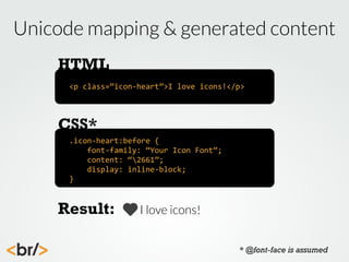
![Using the data-icon attribute
HTML
<p
data-‐icon=”♡”>I
love
icons!</p>
CSS*
*[data-‐icon]:before
{
font-‐family:
“Your
Icon
Font”;
content:
attr(data-‐icon);
display:
inline-‐block;
}
Result:
I love icons!
* @font-face is assumed](https://image.slidesharecdn.com/iconworkshop-131023152010-phpapp02/85/Hooray-Icon-Fonts-workshop-64-320.jpg)
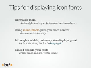
![Using the aria-hidden attribute
HTML
<p><span
data-‐icon=””
aria-‐hidden=”true”>
</span>I
love
icons!</p>
CSS*
*[data-‐icon]:before
{
font-‐family:
“Your
Icon
Font”;
content:
attr(data-‐icon);
display:
inline-‐block;
speak:
none;
}
Result:
I love icons!
* @font-face is assumed](https://image.slidesharecdn.com/iconworkshop-131023152010-phpapp02/85/Hooray-Icon-Fonts-workshop-65-320.jpg)
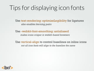
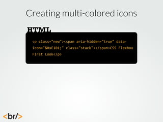
![Creating multi-colored icons
CSS*
.complete,
.new
{
font-‐size:
3em;
font-‐family:
LatoLight;
position:
relative;
}
.new
span[data-‐icon]:before
{
font-‐family:
myconic;
content:
"E003";
position:
relative;
speak:
none;
font-‐weight:
400;
color:
rgb(45,45,45);
}
* @font-face is assumed](https://image.slidesharecdn.com/iconworkshop-131023152010-phpapp02/85/Hooray-Icon-Fonts-workshop-70-320.jpg)
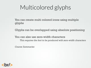
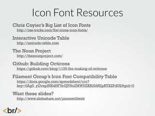
![Creating multi-colored icons
CSS*
.complete
span[data-‐icon]:after,
.new
span[data-‐icon]:after
{
content:
attr(data-‐icon);
font-‐family:
myconic;
position:
absolute;
top:
0;
left:
0;
color:
rgb(255,102,0);
}
Result:
* @font-face is assumed](https://image.slidesharecdn.com/iconworkshop-131023152010-phpapp02/85/Hooray-Icon-Fonts-workshop-71-320.jpg)

The workshop led by James Williamson focuses on designing and constructing icon fonts, covering best practices, glyph construction, and the use of online services for building fonts. It emphasizes the importance of simplicity, consistency, and proper use of grids when creating icons, as well as offers tips for exporting and structuring icon fonts in web development. The document also includes resources and challenges for further practice in icon and font creation.


![Beyond Responsive [18F 2015]](https://cdn.slidesharecdn.com/ss_thumbnails/beyondresponsive18f2015-150812140602-lva1-app6891-thumbnail.jpg?width=640&height=640&fit=bounds)
![Planning Adaptive Interfaces [RWD Summit 2016]](https://cdn.slidesharecdn.com/ss_thumbnails/planningadaptiveinterfacesrwdsummit2016-160330235919-thumbnail.jpg?width=640&height=640&fit=bounds)


![Planning Adaptive Interfaces [EnhanceConf 2016]](https://cdn.slidesharecdn.com/ss_thumbnails/planningadaptiveinterfacesenhanceconf2016-160303145802-thumbnail.jpg?width=640&height=640&fit=bounds)


![[@NaukriEngineering] Icon fonts & vector drawable in iOS apps](https://cdn.slidesharecdn.com/ss_thumbnails/iconfontsvectordrawableiniosapps2-161128054507-thumbnail.jpg?width=640&height=640&fit=bounds)


