Download to read offline
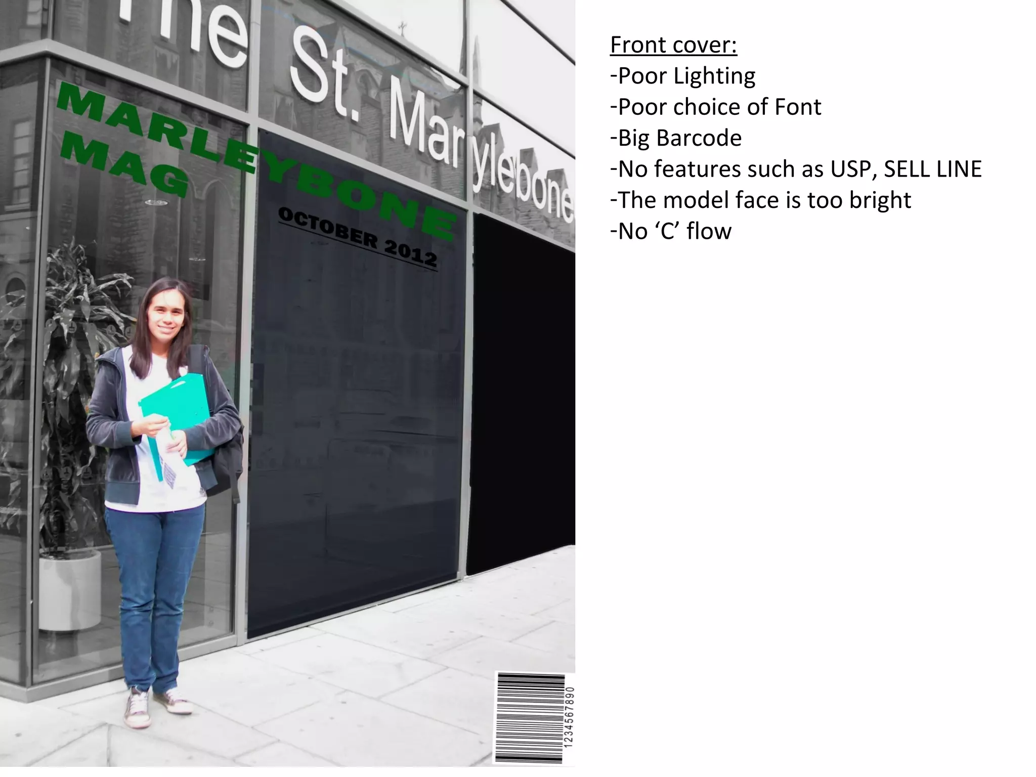

This document provides a critique of a magazine cover and contents page. It notes poor lighting and font choices on the front cover that obscure important details. The contents page is also critiqued for having a poor quality image, messy layout, fonts that are too big and cover the model's face, and lacking important editorial elements. Overall, the document identifies various design flaws that could be improved for both the front cover and contents page.


