The document provides guidelines for using 2Wire's corporate identity and trademark. It establishes:
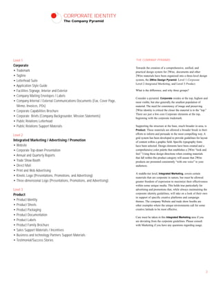
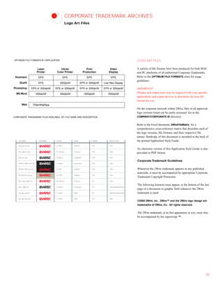
- Three levels for branding applications - Corporate, Integrated Marketing, and Product. Corporate receives the strictest guidelines while Product has more flexibility.
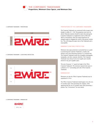
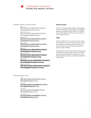
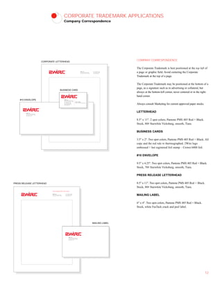
- Proportions, minimum clear space, and minimum size requirements for the corporate trademark logo to ensure consistency.
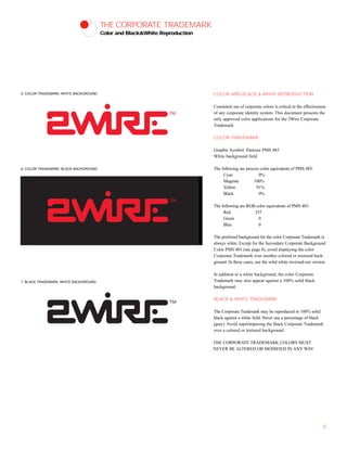
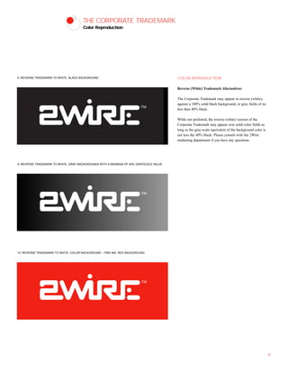
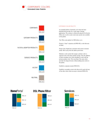
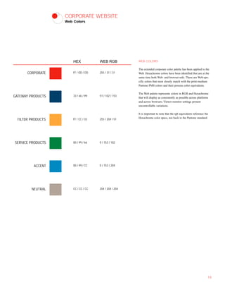
- Approved color versions of the logo - color on white or black backgrounds, and black and white. Guidelines for reverse/white versions are also provided.
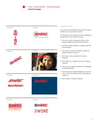
- The logo must never be altered or modified from the approved versions and colors. Strict adherence to the style guide ensures 2Wire's branding identity remains strong and recognizable.